What is a sales activity dashboard?
A sales activity dashboard is designed to monitor the quantity and quality of the day-to-day activities used by sales people, such as calls, emails, social-selling and product demos.
One reason companies use these dashboards is to support productivity. Sales people know that the best use of their time is to be out there, with customers, helping them solve problems. But often, other things get in the way. Dashboards help keep the whole team’s attention focused on how they prioritize their time.
Sales activity dashboards are usually also presented in the context of the sales pipeline (or funnel). Tracking sales activity helps you understand the link between new leads and new business. Spotting issues related to sales activity, early, means you can resolve them before they affect more important metrics further down the funnel, such as revenue.
Different examples of sales activity dashboards
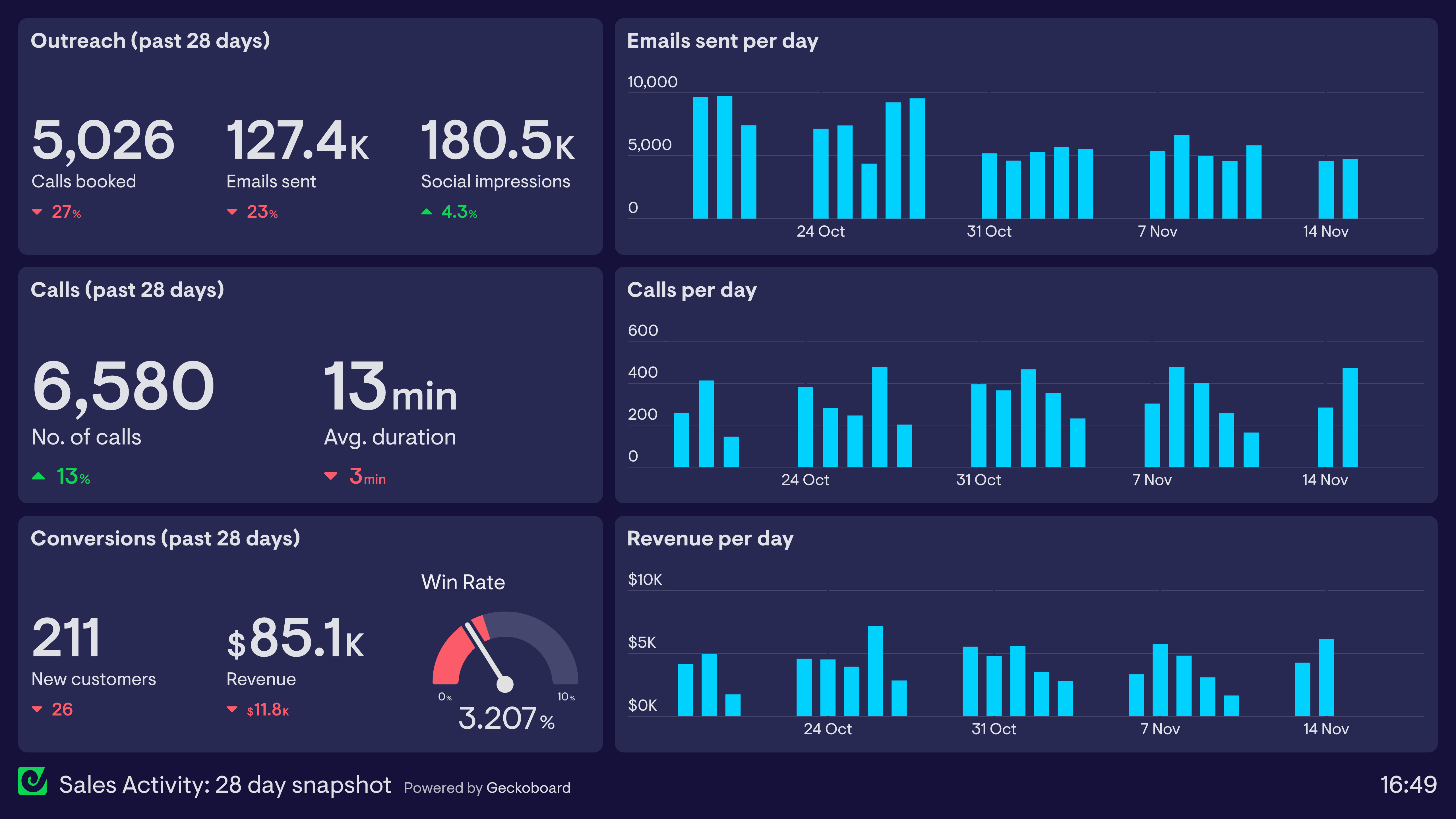
Sales Activity: 28 day snapshot
This dashboard displays a snapshot of this company’s sales activity over the past 28 days. It’s structured in the form of a sales funnel. With lead generation (called ‘outreach’ in this example) taking up the first third, lead nurturing (in the form of calls) taking the middle third, and lead conversion taking up the bottom third.
Of course, increased revenue is the ultimate goal. However, tracking sales activity helps them to understand how and why that revenue is changing. In this case, even though they are completing more calls than last month, those calls are proving less effective. (Could this be related to the drop in average call duration? Are sales reps rushing through calls to keep up with the volume?)
And although social media impressions are up, the overall effectiveness of sales outreach is down, with less calls booked for the coming weeks. By using this dashboard, they can quickly anticipate a decrease in activity further down the funnel at a later date, and potentially even start to address this now.
Focus area
Sales pipeline, productivity
Who looks at it?
Sales Manager, Sales Team
How often?
Several times a week
- HubSpotActiveCampaignLinkedInSalesforce
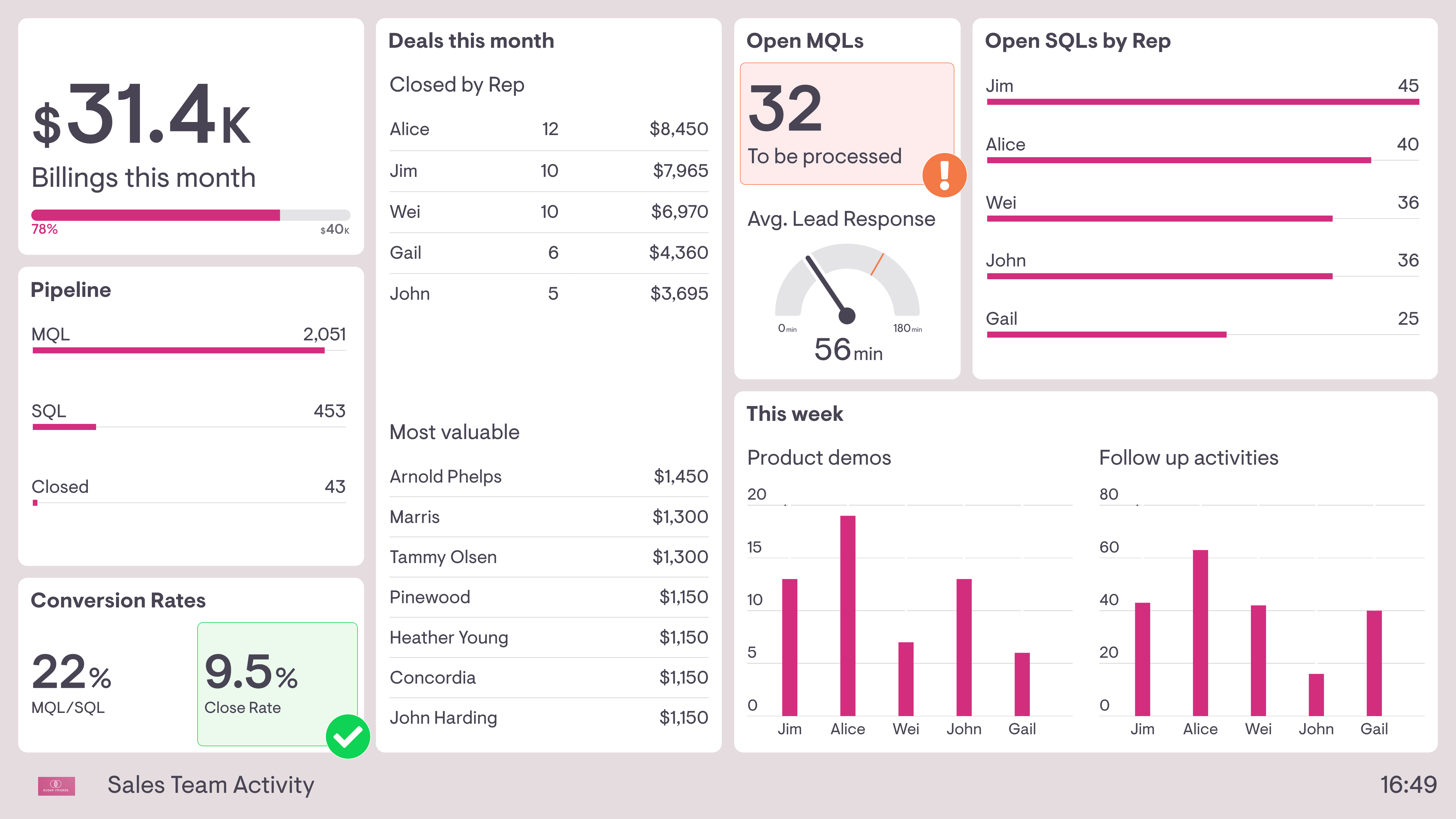
Sales Team Activity
This dashboard also shows sales activity in the context of the overall sales funnel, but there are two notable differences.
The first is that this sales team is not responsible for lead generation. Instead, it’s their responsibility to process leads generated by the Marketing Team (Marketing Qualified Leads – MQLs), take forward Sales Qualified Leads (SQLs) and convert them into new business. As a result, this dashboard includes some useful live status updates, such as the average time taken to respond to new leads as well as how many new MQLs have yet to be processed (in fact, a sudden increase to 32 open MQLs has triggered an alert warning).
This dashboard also breaks sales activities down by individual team member to support productivity. Not only does it show the most important metric (deals closed this month), it shows other activities such as product demos given, and follow up activities (in this case, a mix of emails and calls). This helps to understand how the team is spending their time, especially if other tasks are getting in the way.
Focus area
Individual productivity, pipeline conversion
Who looks at it?
Sales Director, CEO, Sales Team
How often?
Several times a week
- Google SheetsSalesforceHubSpot