What is a Customer Experience (CX) dashboard?
A customer experience dashboard highlights important metrics related to consumer interactions with a product or service, which help customer teams improve the overall experience.
Customer experience dashboards are used predominantly by Customer Experience (CX), Customer Service, and Product teams. These dashboards showcase KPIs such as Customer Satisfaction Score (CSAT), Net Promoter Score (NPS), Customer Effort Score (CES), and product/service specific metrics that inform whether customers are happy, engaged, and satisfied.
Different examples of Customer Experience dashboard
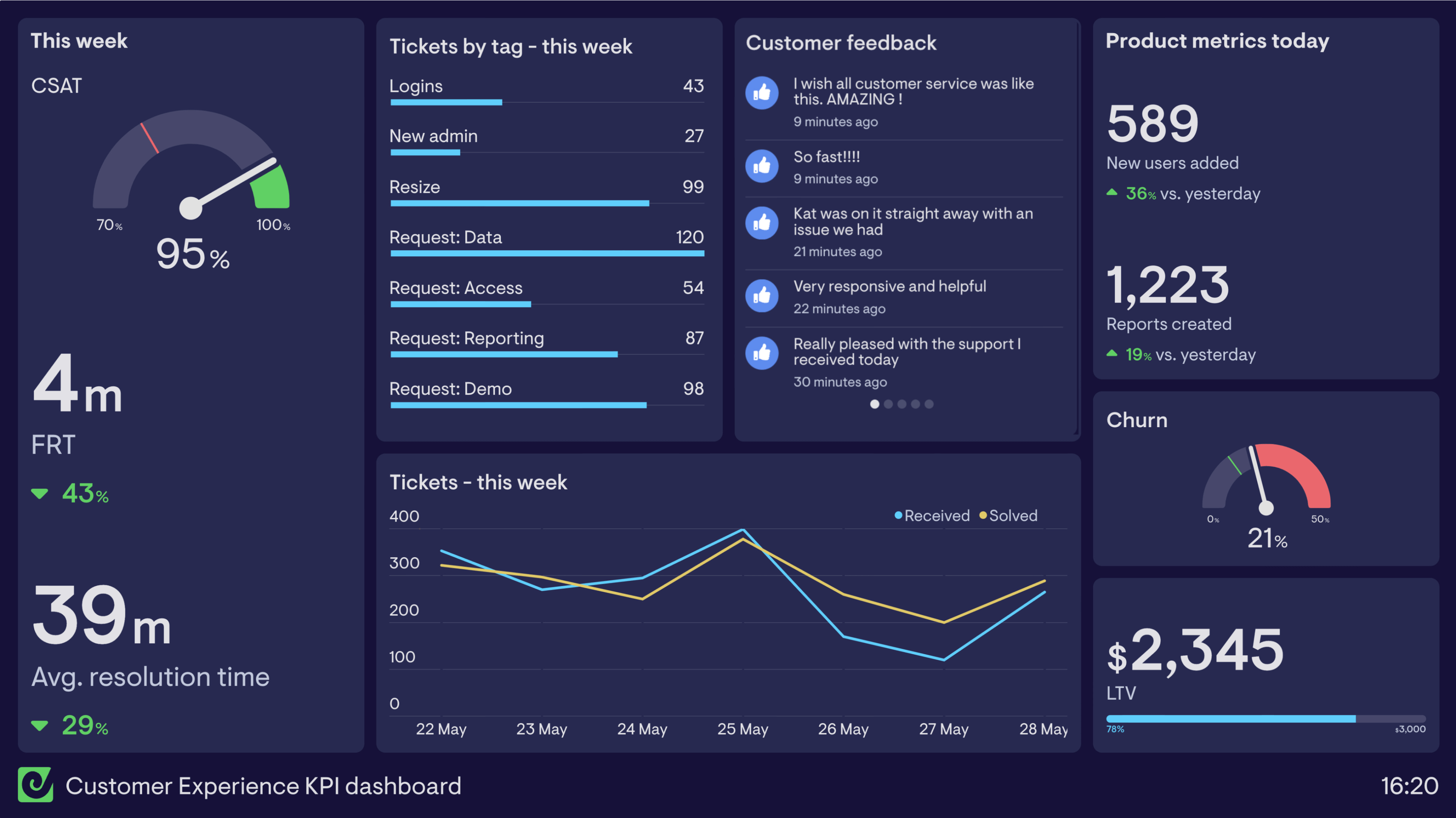
Customer Experience KPI dashboard
Customer Experience don’t just focus on providing customer service, they also identify and monitor key milestones in the customer journey, which are known to lead to happy customers. This dashboard includes information about customer service as well as key product metrics.
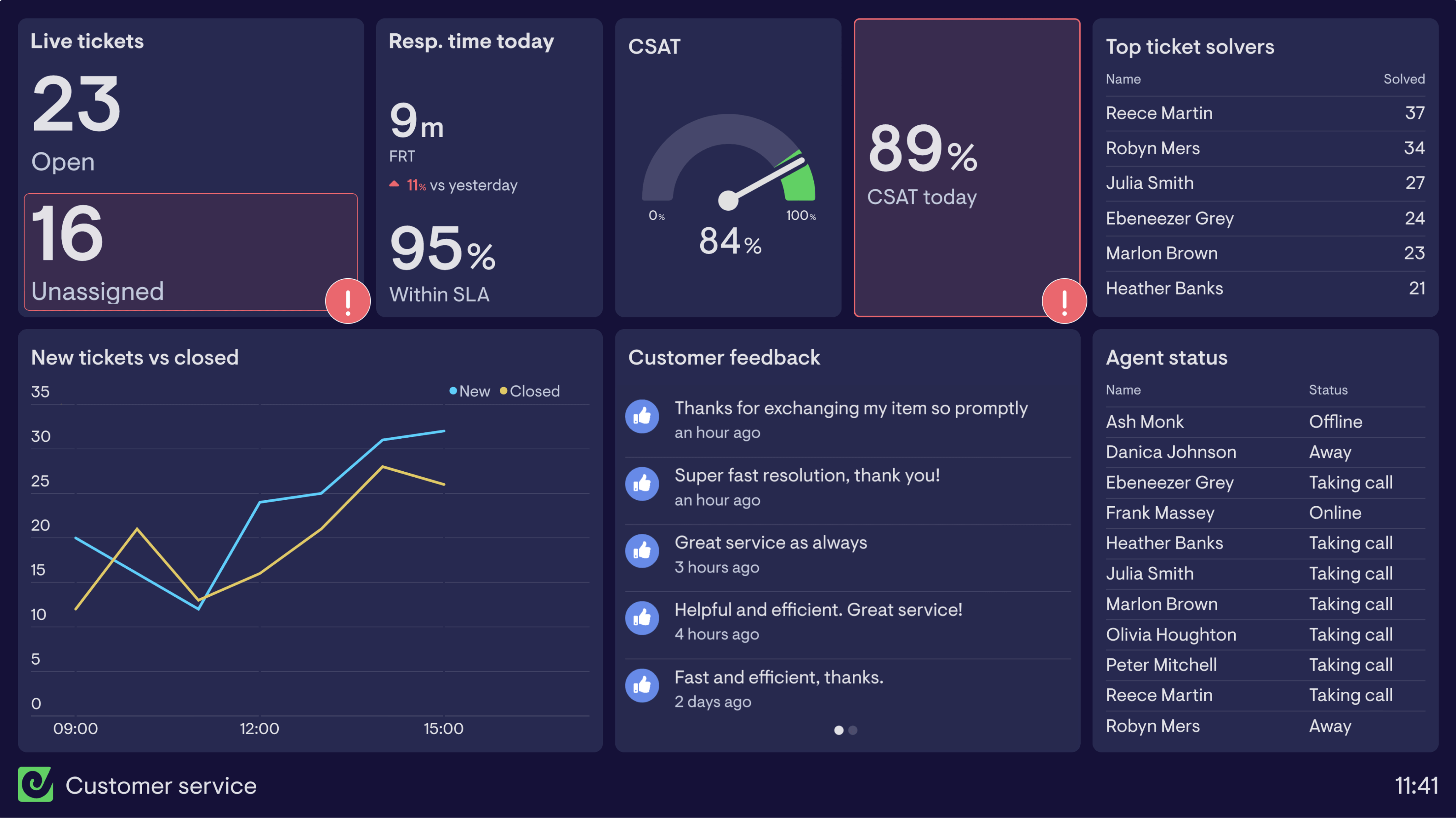
The left side of the dashboard is dedicated to customer service related metrics. The Customer Experience team has identified that customer satisfaction is directly linked to the speed of response and the time it takes for their queries to be resolved. Therefore First Response Time (FRT) has been included along with Average Resolution Time and Customer Satisfaction Score (CSAT).
Breaking tickets down by tag allows everyone to see the most common enquiries, and identify any issues with the product or service received.
The right hand side looks at key product milestones (new users added and reports created), which show to what extent customers are making progress. Beneath this are longer term metrics (Churn and Lifetime Value), which give the Customer Experience team perspective on the wider health of their customer base.
Focus area
Customer service, ticket types, product metrics
Who looks at it?
Customer Experience team, Product team
How often?
Daily
- Zendesk SupportAmplitudeGoogle Sheets
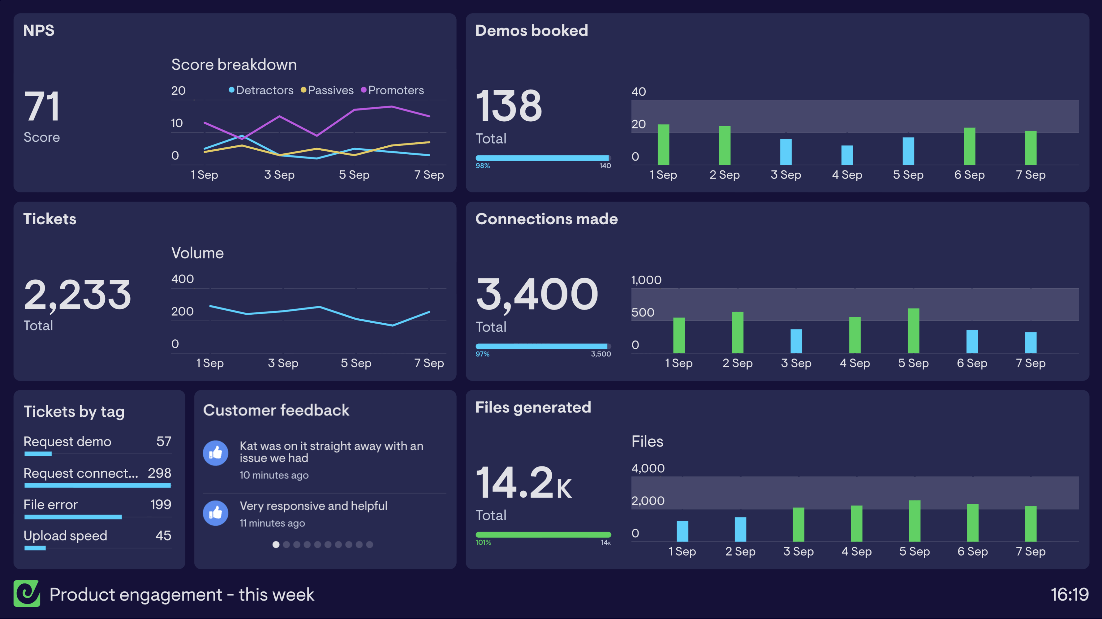
Product engagement dashboard
This weekly product engagement dashboard is used by the Product and Customer Experience teams to track customer sentiment and progress with the product.
By keeping an eye on NPS they’re able to see if customers are more likely to recommend the product. Data around tickets allows everyone to see if things are normal, particularly viewing the tickets by tag to see if there’s a sudden increase in a certain tag type.
They’ve also included key product milestones, which the teams know lead to more successful (and therefore satisfied) customers. By tracking demos booked, connections made and files generated over the course of the week, they’re able to spot if there are any issues within the product at important stages of the customer journey.
Focus area
Customer satisfaction, product milestones
Who looks at it?
Product team, Customer Experience team
How often?
Daily
- Zendesk SupportDelightedMixpanel