Financial metrics from ChartMogul
We’ve just added a new integration with ChartMogul. ChartMogul help you to make sense of your subscription business, computing a load of key metrics such as MRR, ARR, and churn for a wide range of billing systems. Our integration lets you pull those useful metrics straight onto your dashboard as either a number or a line chart.
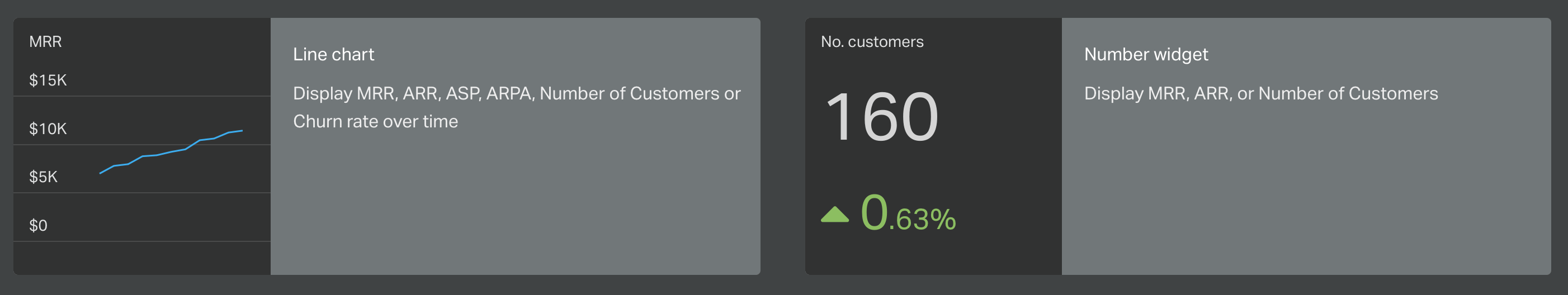
Learn more in their post here.