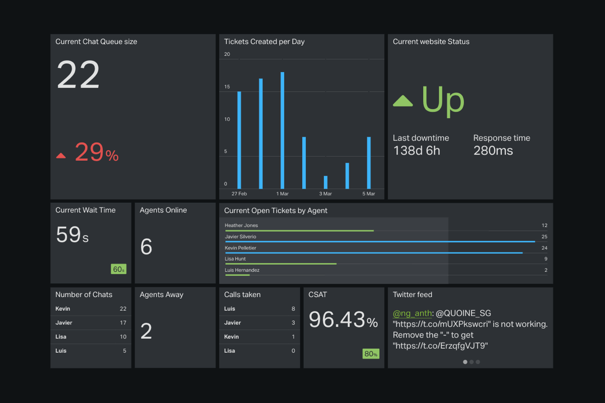
Avoid catastrophe with Warnings
Seeing your numbers up on a TV screen is the easiest way to keep an eye on what’s going on, but every once in a while there are moments when a team really need to pay attention to a particular number that’s not performing as well as you’d like.
Maybe marketing are coming close to exceeding their budget for a specific online ad campaign. Perhaps your support team’s response times are slow and putting you in danger of breaching your SLAs. Or possibly your sales team are underperforming in a particular area that urgently needs extra effort to avoid harming their pipeline of opportunities.
Whatever your ‘worst-case scenario’ might be, you can can now easily alert your team to poorly-performing numbers on your dashboard using Warnings.
Unlike Goals, which subtly highlight when a target has been met, Warnings make problematic metrics unmissable by turning the whole widget red when a specific value is reached.
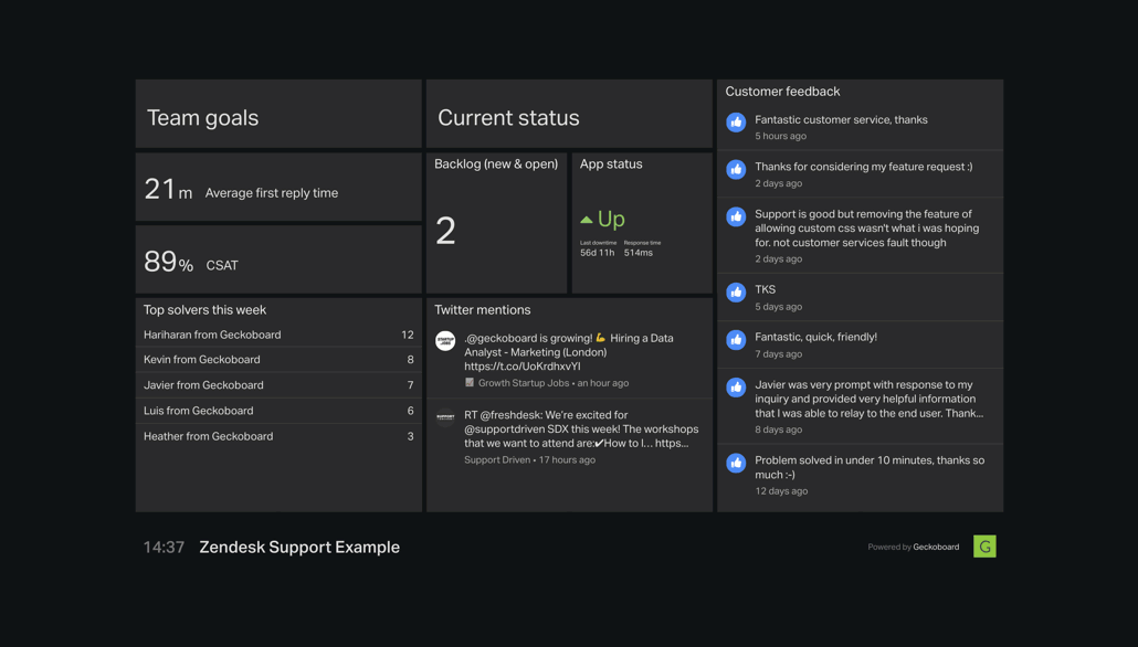
Warnings can be added to any number widget on your dashboards. Simply click the three dots in the top right of a number widget and then Add warning to set a warning to trigger at a specific value.