You can now tweak how a number displays directly from the dashboard. To access the feature, click the “Number formatting” option from a widgets’ menu.
The controls allow you to tailor the abbreviation, number of decimal places, and unit (including emojis!) to what’s appropriate for your metric.
Until now these options were only available from the “Fine-tune” tab in some our newer integrations, but this update brings configurable number formatting to almost all widgets, and it’s quick and easy to access directly from your dashboard.
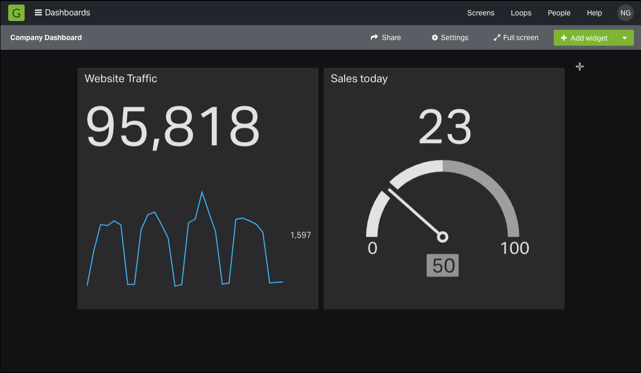
We’ve now made it much easier to resize your widgets. No more fixed sizes, simply drag the bottom right corner of any widget. This also means you can now find the edit widget menu from the top right corner.
And the best part? Your widgets can now be any size you like. This gives you much more flexibility over how to arrange your dashboards. Now layouts that were difficult to achieve before are much easier – useful, for instance, if your dashboard is dedicated to one or two widgets.
We’ll be continuing to make big improvements to your favourite widgets in the coming weeks.
Give drag resize a try and let us know what you think.
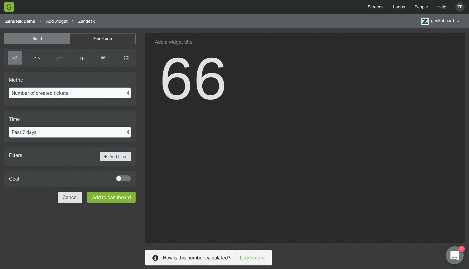
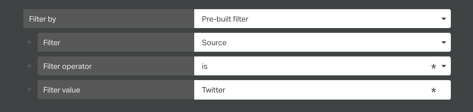
We’ve completely rebuilt our Zendesk integration from the ground up to give you more options and control over how you visualize support metrics. Login to try out the new visualization options, powerful filters and revamped widget-building workflow that make it quicker and easier to show exactly what you want on your dashboard, or read more here!
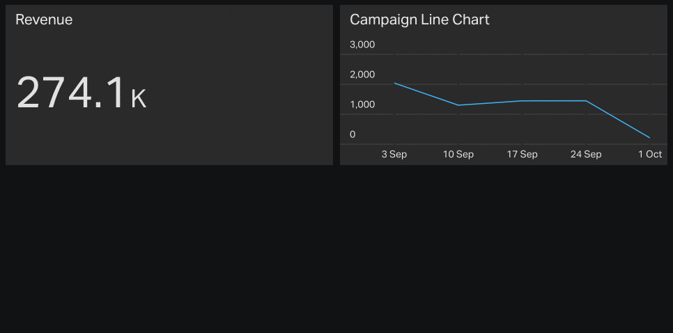
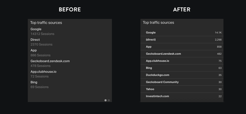
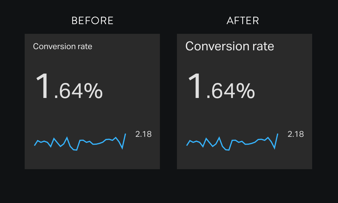
As part of our ongoing efforts to improve the effectiveness of your dashboards, today we’ve made some improvements to our number visualization…
The visualization now makes much smarter use of space. For landscape widgets (twice as wide as they are tall), labels and secondary visualizations are now positioned on the right. Font sizes also now decrease in fixed increments to make sure your data fits the available space – ideal for displaying a large number of digits and a long prefix or suffix.
Until today there were some subtle differences between integrations in how the number visualization handled currencies and decimal places. All integrations now use the latest version of the visualization.
Dashboard Loops are a great way to display several dashboards on a single screen.
For example, you might want to display some company-wide metrics alongside your team’s existing dashboard, have a project-specific dashboard you need to keep an eye on in addition to your day-to-day metrics, or have several teams who share a single screen.
A Dashboard Loop cycles through two or more dashboards you select from your Geckoboard account, pausing on each dashboard for an amount of time you choose. This allows you to display much more information on a screen without having to squeeze all your metrics onto a single dashboard.
Previously, building a Dashboard Loop involved digging into your account settings and negotiating a tricky set of menu options. This update makes it much easier to create, manage and adjust the timing of Dashboard Loops from right within the main dashboard interface.
In addition, you can also now effortlessly change the ordering of dashboards in a loop just by dragging and dropping your dashboards into the order you want.
Easily share Dashboard Loops with your team using a secure sharing link or by selecting your loop within our screens menu to broadcast it instantly onto your TV or large screen.
To give it a spin, click the new Loops option at the top of your screen the next time you log in to Geckoboard!
We’ve changed the way Google Analytics Number and Leaderboard widgets are set up.
Number widget: We’ve consolidated several number widgets into a single widget that allows you to choose from a much wider range of GA metrics to display on your dashboard. We’ve also added pre-built filters that allow you to easily fine-tune your widget, available in a simple drop-down.
Leaderboard widget: In similar fashion to our GA number widget, we’ve consolidated all our GA list widgets into a single leaderboard that offers access to many more metrics from Google Analytics. Pre-built filters have also been added, and we’ve made some tweaks to the design to make it easier to read the values.
Using the older versions of these two widgets? Don’t worry: these will continue to work and you can still copy and edit them.
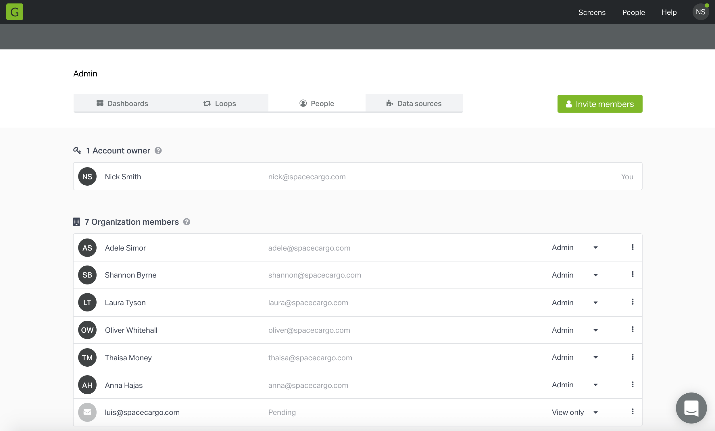
Today we’re launching an update that adds two new user types that give you more control over who has access to specific dashboards and features within Geckoboard. We’ve also given our Admin area a major overhaul to make important account-related tasks more straightforward.
We’ve made it much easier for developers to pull data from a database and visualize it in Geckoboard using our Datasets API. SQL-Dataset is a command line app that makes integrating your MySQL, PostgreSQL or SQLite database with Geckoboard as simple as filling out a config file, removing the need to work with client libraries or write bespoke code.
Our dashboards are designed for the wall of your office, to share key metrics with your whole team. To make widget titles easier to read from a distance we’ve increased their size on all new dashboards.
The size of titles on existing dashboards will remain unchanged, but you can switch over to the larger titles by checking “Use large widget titles” in your dashboard’s settings.