Product updates
Set chart granularity independently of your timespan
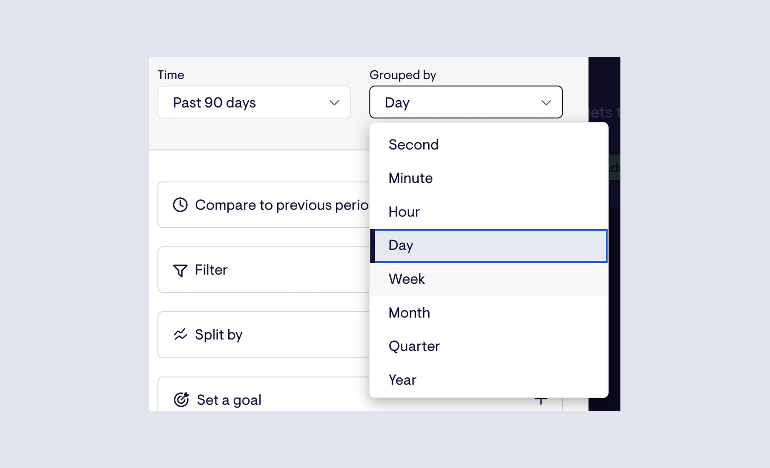
Timeseries charts can now have their bucketing — the granularity of each data point — set independently of the time range.
Previously, the two were linked: if you wanted 90 days of data, you were stuck with whatever grouping that implied. Now you can choose any combination that makes sense for what you're tracking. Last 90 days by week. Last 12 weeks by day. The Grouped by control is its own setting.
Available now for HubSpot, Zendesk, Aircall, Pipedrive, and Intercom, with Shopify and Stripe coming soon.
Faster updates for Zendesk Agent Status
If you're using Geckoboard's Zendesk Agent Status data source, your dashboards now reflect what's happening in Zendesk more quickly - making them more useful for teams who need an accurate, up-to-the-minute view of agent availability and workload.
Instant agent and channel status updates - Agent and channel status changes now appear on your dashboard the moment they happen in Zendesk, via webhooks. No more lag between an agent going on a break and your dashboard catching up.
Faster work item refresh - Data related to work items now refreshes every two minutes, down from before.
These improvements are rolling out now - no action needed on your end. If you have any feedback, get in touch via the in-app chat.
Stacked column charts
We've added a new visualization to Geckoboard: the stacked column chart.
It's the first entirely new visualization we've shipped in several years, and it opens up a type of analysis that wasn't previously possible - seeing both a total value and its breakdown in a single chart, without having to build two separate widgets.
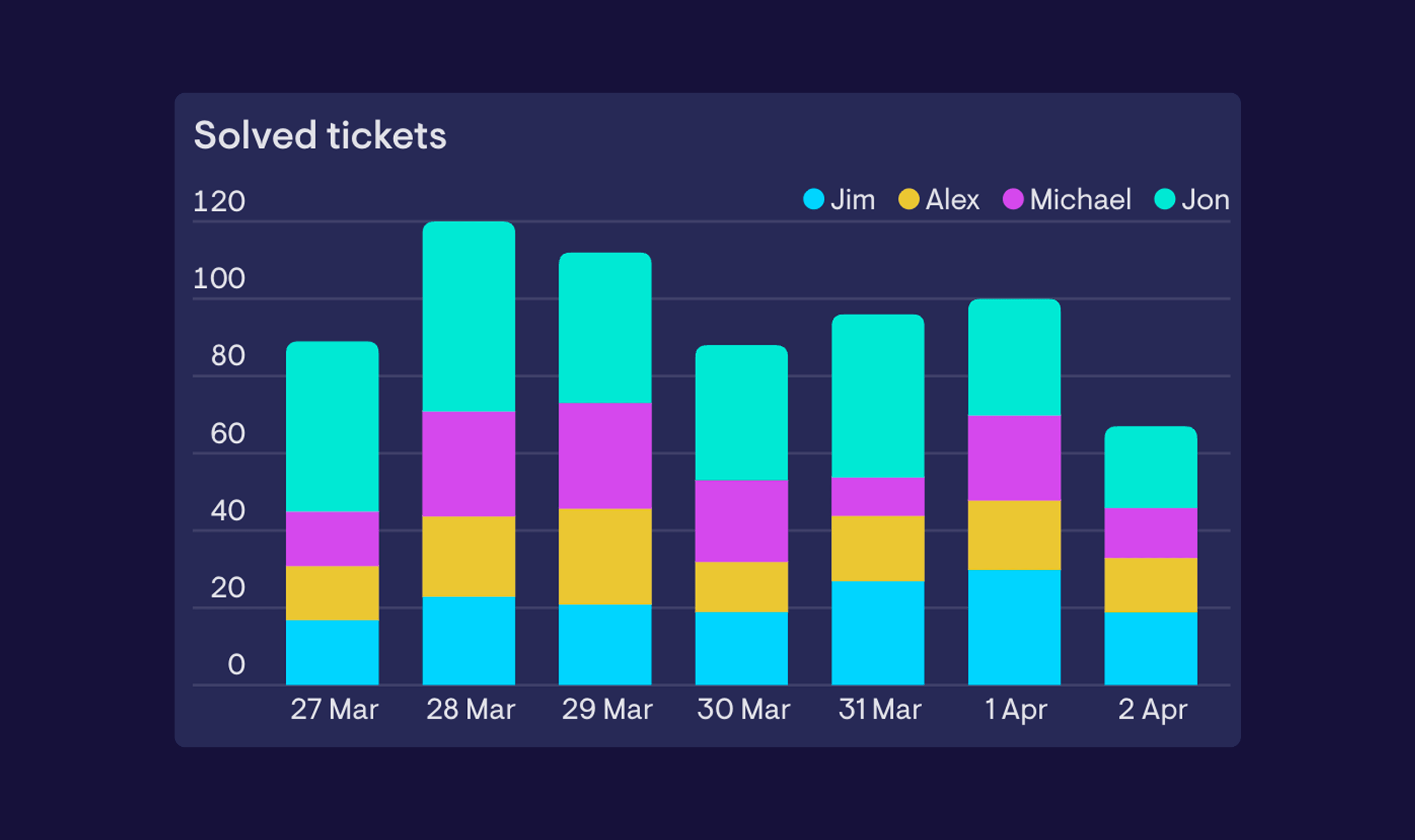
A stacked column chart works like a standard column chart, but instead of placing multiple series side by side, it layers them on top of each other within each column. That makes it easy to understand what a total is made up of - whether that's by category, stage, team, or any other dimension.
When to use it - Stacked column charts are a good fit when the relationship between the parts and the total matters as much as the individual values. For example, you might use one to track total support tickets per week while also showing how those tickets break down by type - making it easier to spot whether a spike in volume is being driven by one category, or spread across all of them. If you're more interested in comparing individual values side by side, a standard column chart is likely the better fit.
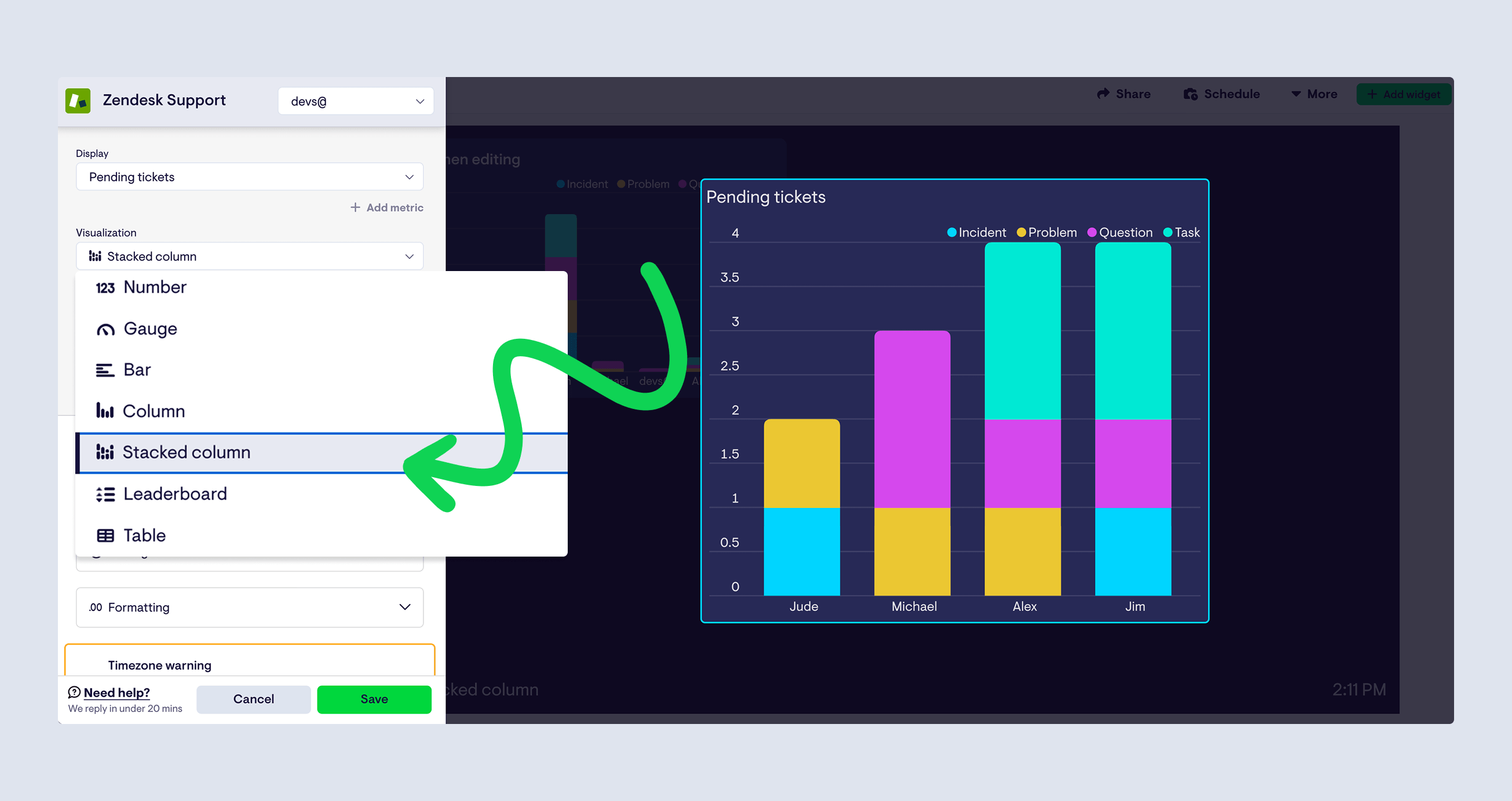
The stacked column chart is available now across most data sources. To use it, select 'Stacked column' from the visualization picker when building or editing a widget. Take it for a spin and let us know what you think.
Improved bar chart visualization
We've made several improvements to our bar chart visualization, making it easier to read and much better at presenting your data - particularly on big screens.
Improved use of space - Bar charts now scale more intelligently to fit your data, reducing unnecessary blank space and giving your metrics more room to breathe.
A friendlier look - Subtle rounded edges give bar charts a cleaner, more modern feel.
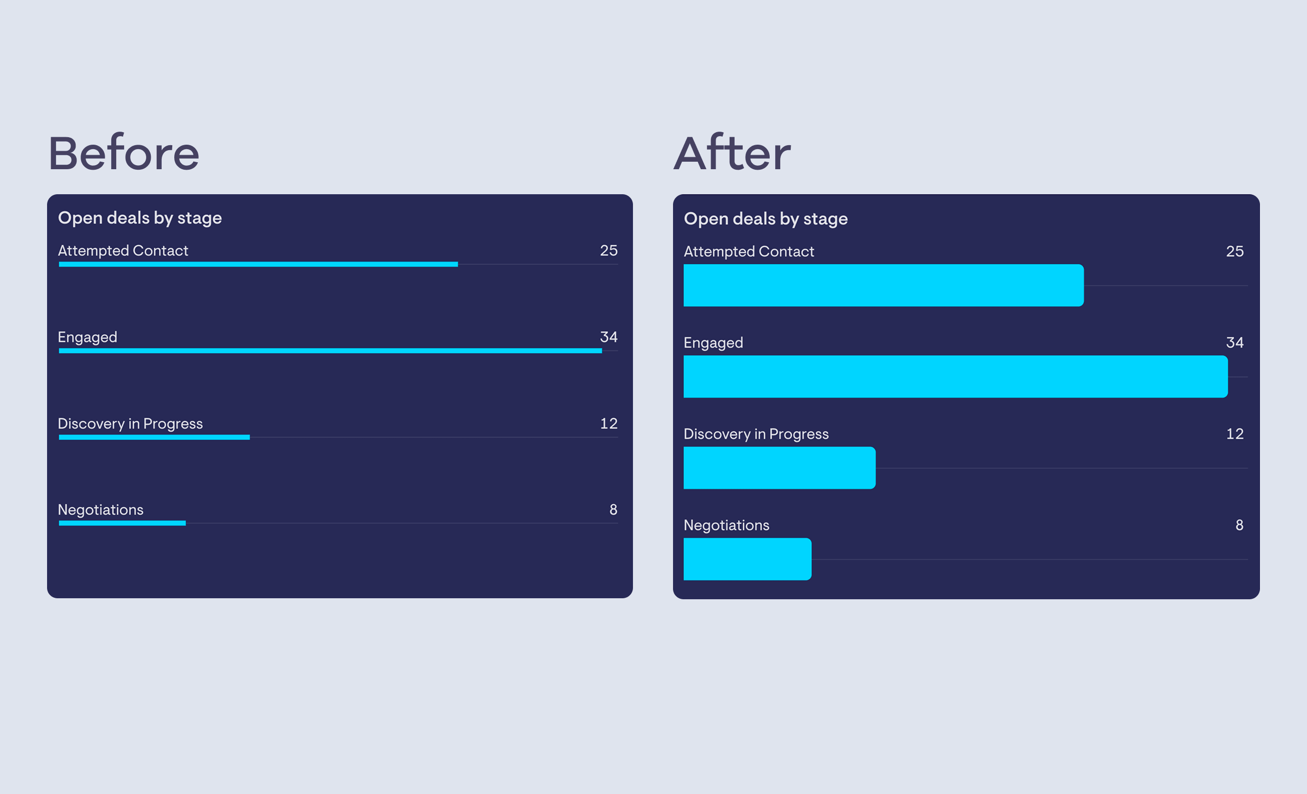
These improvements are rolling out now — no action is needed on your end, but do get in touch with any feedback.
Custom Dashboard Templates
As organizations grow, dashboard admin can become repetitive and inconsistent - dashboards for every team, individual dashboards for each support agent, one per phone number or support ticket form…
Before long, you might find yourself rebuilding the same dashboard again and again, and updating each version manually whenever something changes.
Today, we’re introducing Custom Dashboard Templates to fix that.
(Currently available for Zendesk, Aircall and HubSpot).
Build once. Roll out everywhere...
Custom Dashboard Templates let you create a dashboard once, and generate filtered dashboards that stay in sync whenever you make any changes.
Here’s how it works:
-
From the ‘New’ dropdown menu, choose to create a new Zendesk, Aircall or HubSpot template
-
Select the field you want dashboards to vary by (e.g. Support Agent, Group, Phone Number or Deal Owner)
-
Select the values you want dashboards for (you can add more later)
-
Click ‘create’
This will generate a collection of dashboards on your account for each value you selected.
Each dashboard shares the same layout and widgets, but filters data for the relevant agent, team, number or whatever other field you chose.
See it in action in this short video:
The real power of dashboards built this way is in how they stay in sync.
When you update one of these dashboards:
-
Any new widgets will appear across all dashboards built with that template
-
Time ranges update everywhere
-
KPI definitions and dashboard layouts stay aligned
So no more manual duplication. No more dashboard drift. No more inconsistent reporting across your team.
Custom Dashboard Templates are available for:
Zendesk - Create dashboards by Agent, Group, Brand, Channel, Status, or Priority.
Aircall - Create dashboards by User, Team, or Number.
HubSpot - Create dashboards by Owner, Team, Pipeline or Stage
Availability and pricing
Custom Dashboard Templates are available on Pro plans and above. A template will count towards your plan’s dashboard allowance, whilst the individual dashboards you create with it will not.
For more information on Custom Dashboard Templates, check out our help article.
Improved column chart visualization
We've made several improvements to our column chart visualization, making it easier to read and better at presenting your data.
Improved use of space - Column charts now scale more intelligently to fit your data, reducing unnecessary blank space and giving your metrics more room to breathe.
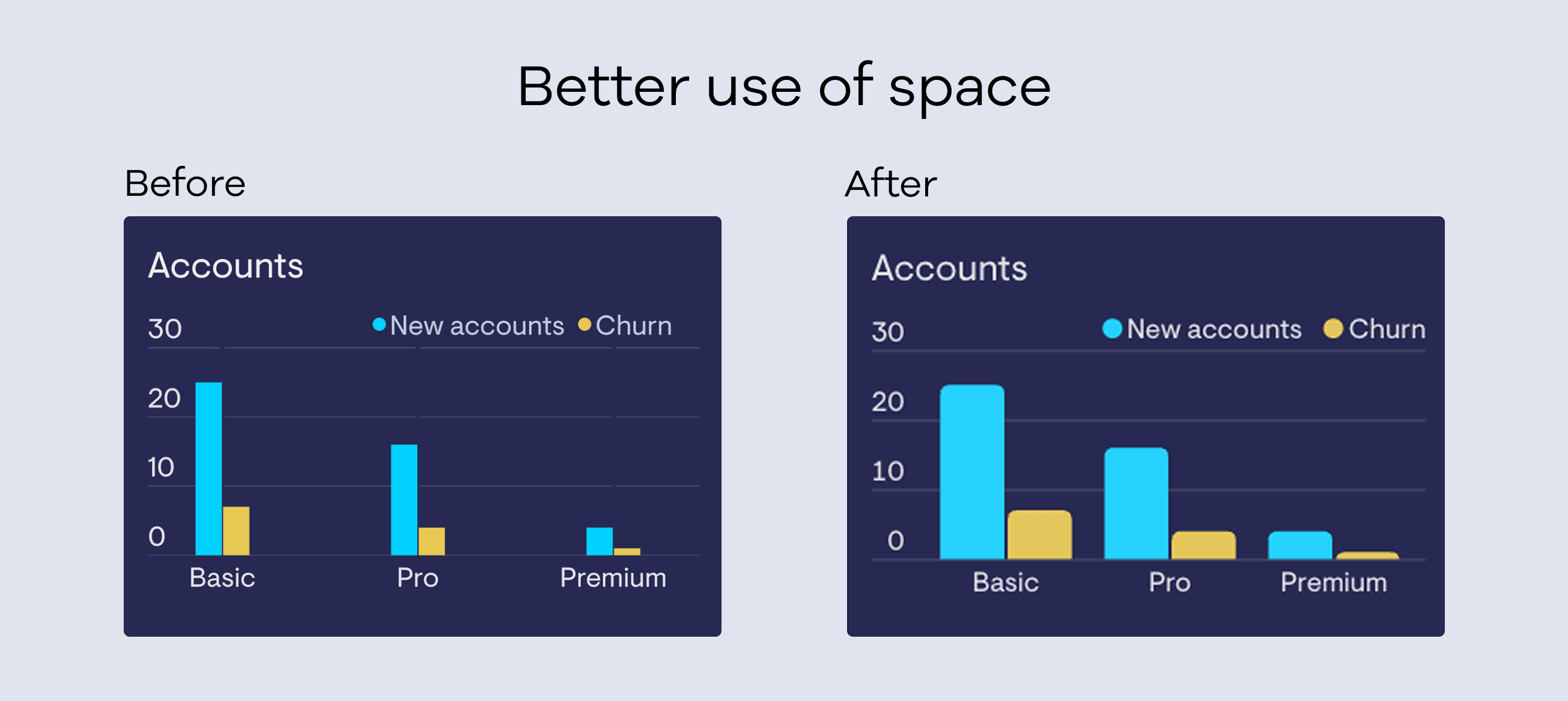
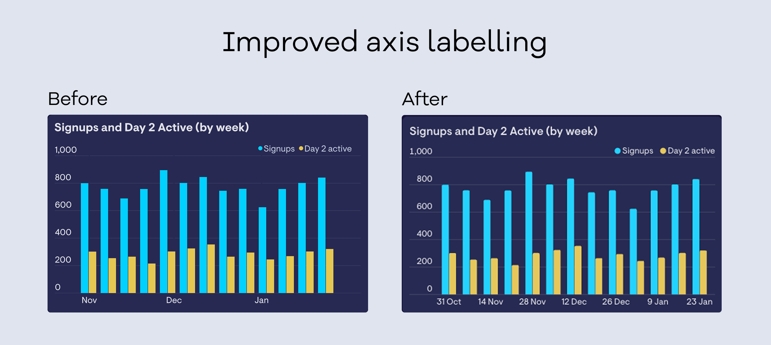
Clearer axis labels - We've improved how axis labels are displayed, with fewer gaps and more useful information at a glance.
A friendlier look - Subtle rounded edges give column charts a cleaner, more modern feel.
These improvements are rolling out now over the next few weeks - no action is needed on your end, but do get in touch with any feedback.
Zendesk Voice call leg metrics now supported
You can now track call leg metrics from Zendesk Voice in our Zendesk Support integration, giving you a more detailed view of everything that happens inside a call.
Call legs break a call down into individual segments (each time an agent's phone rings, each transfer, each period on hold...), helping you understand patterns that whole-call metrics can miss; for example, how often calls are declined before being answered, how long hold or wrap-up really take, or why a “missed call” wasn’t really missed.
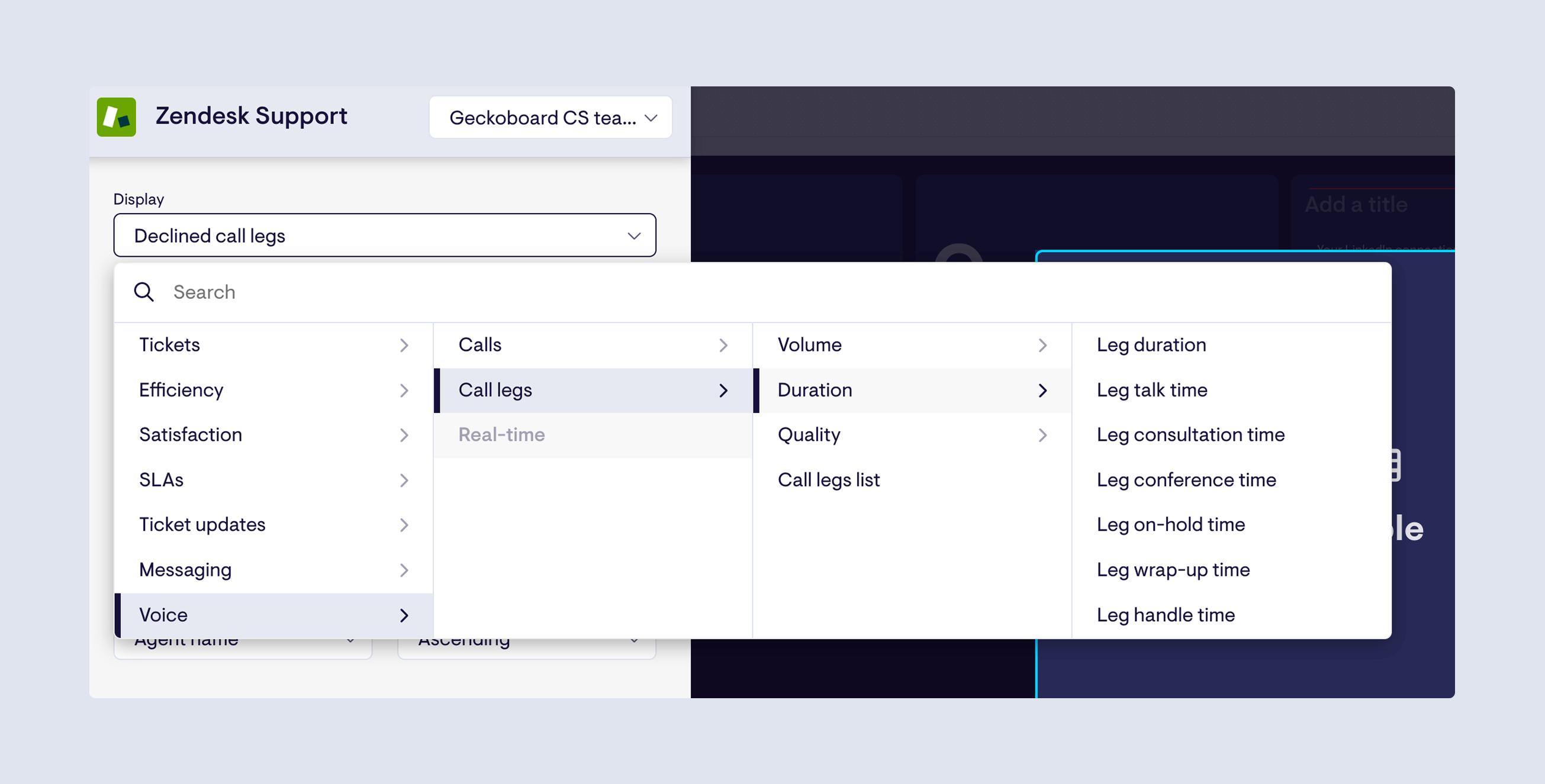
What’s included:
-
Volume: Total legs, Accepted call legs, Missed call legs, Declined call legs, Agent legs, End-user legs, External legs.
-
Duration: Leg duration, Leg talk time, Leg consultation time, Leg conference time, Leg on-hold time, Leg wrap-up time, Leg handle time.
-
Quality: Good quality legs, Bad quality legs, Good quality agent legs, Bad quality agent legs, % Agent leg quality rate, % Leg quality rate.
-
List: Call legs list.
Find the new metrics under Voice → Call legs in the Zendesk Support data source.
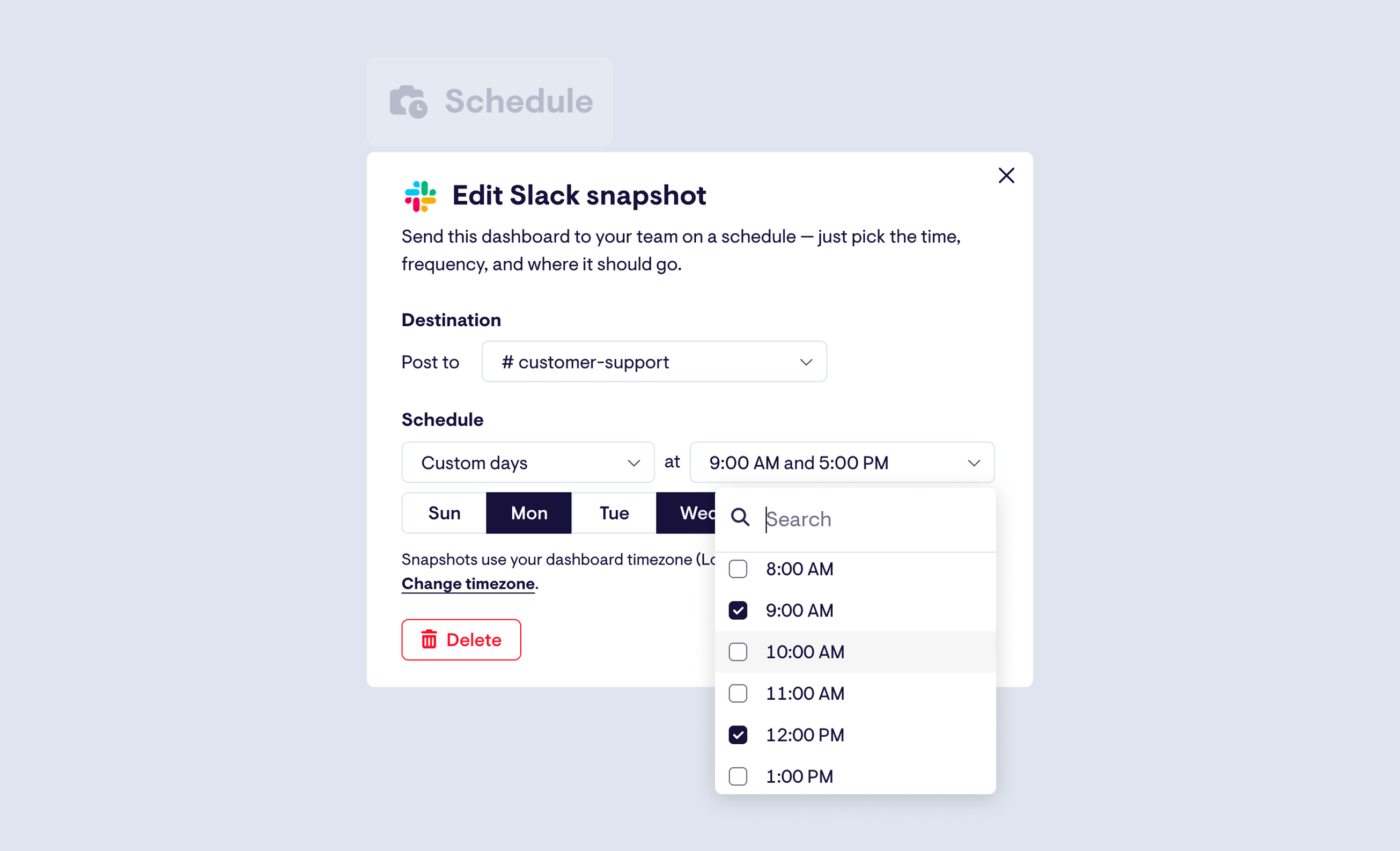
Schedule multiple snapshots per dashboard
You can now schedule multiple snapshots of the same dashboard, making it easier to keep different teams in the loop throughout the day.
Whether you want to send a dashboard at morning standup, again for an afternoon review, or as a handover between teams in different timezones, you're no longer limited to a single schedule. You can also send the same dashboard to multiple Slack or Microsoft Teams channels, each at different times.
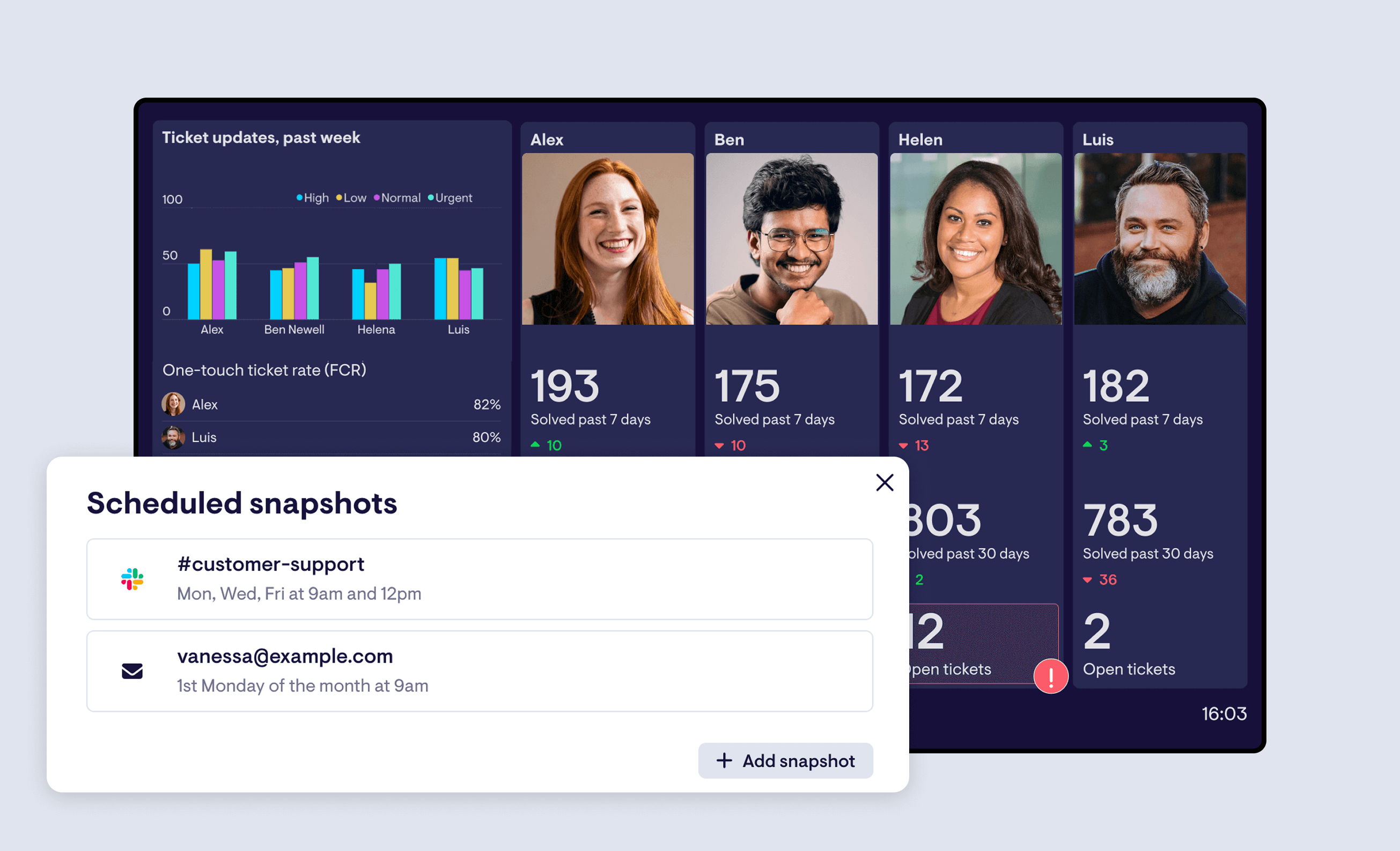
To manage your snapshots, head to the reworked Schedule tab when editing a dashboard. From there, you can see all channels and schedules at a glance, and quickly add, edit, or remove any of them.
Numeric filtering now available on all Geckoboard plans
Numeric filtering allows you to filter on numeric properties - for example, “Number of tickets where first reply time > 2 hours”, or “Number of deals where deal value is > $10k”.
Previously only available on our Pro plan, we've made this powerful functionality available on all Geckoboard plans from today. Enjoy!
Map visualization now available on our Shopify integration
Just in time for the holiday season - you can now visualize Shopify data using our map visualisation.
See New Orders come in, track Average Order Value for a specific period, or monitor Gross Sales - our map visualisation works with all our Shopify metrics.
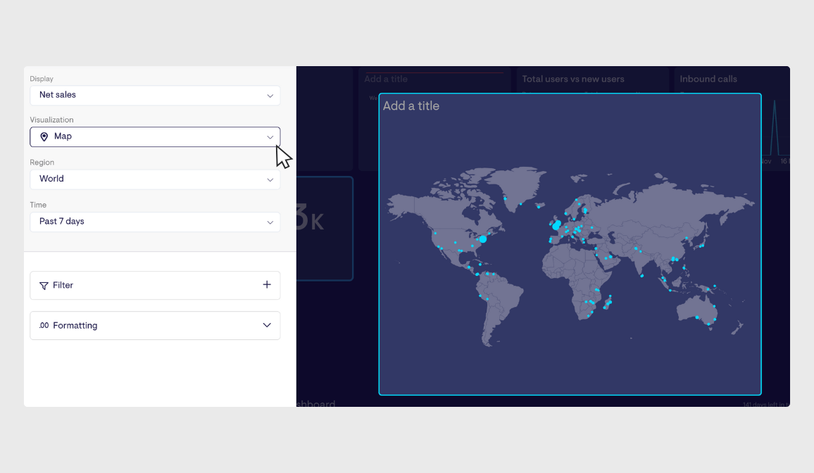
You can choose between a global view, or zone in on specific regions or counties too - perfect for tracking how your store is performing in different places, in real-time.