OKR dashboard examples
An OKR dashboard makes progress toward your Objectives and Key Results visible to the whole team, not just the people tracking it in a spreadsheet. When everyone can see how the Key Results are moving, it's easier to evaluate whether current efforts are sufficient — and act earlier if they're not.
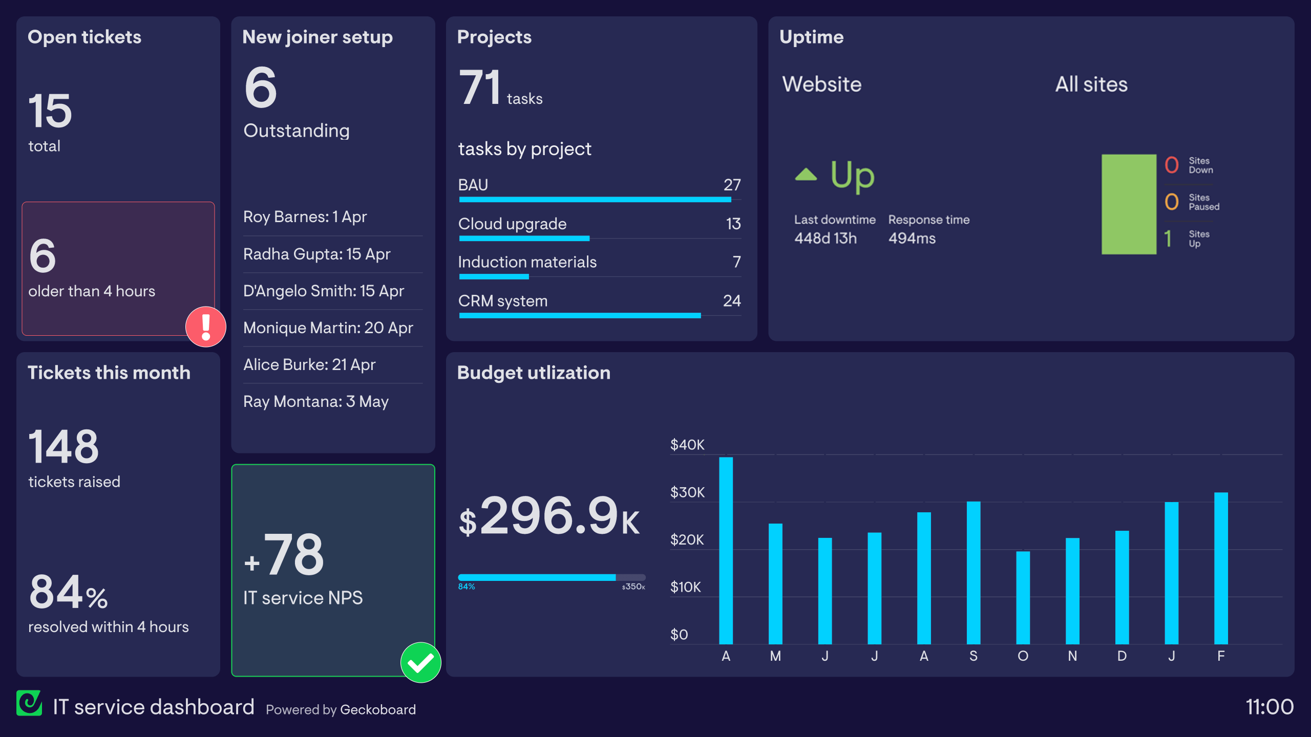
OKR dashboard
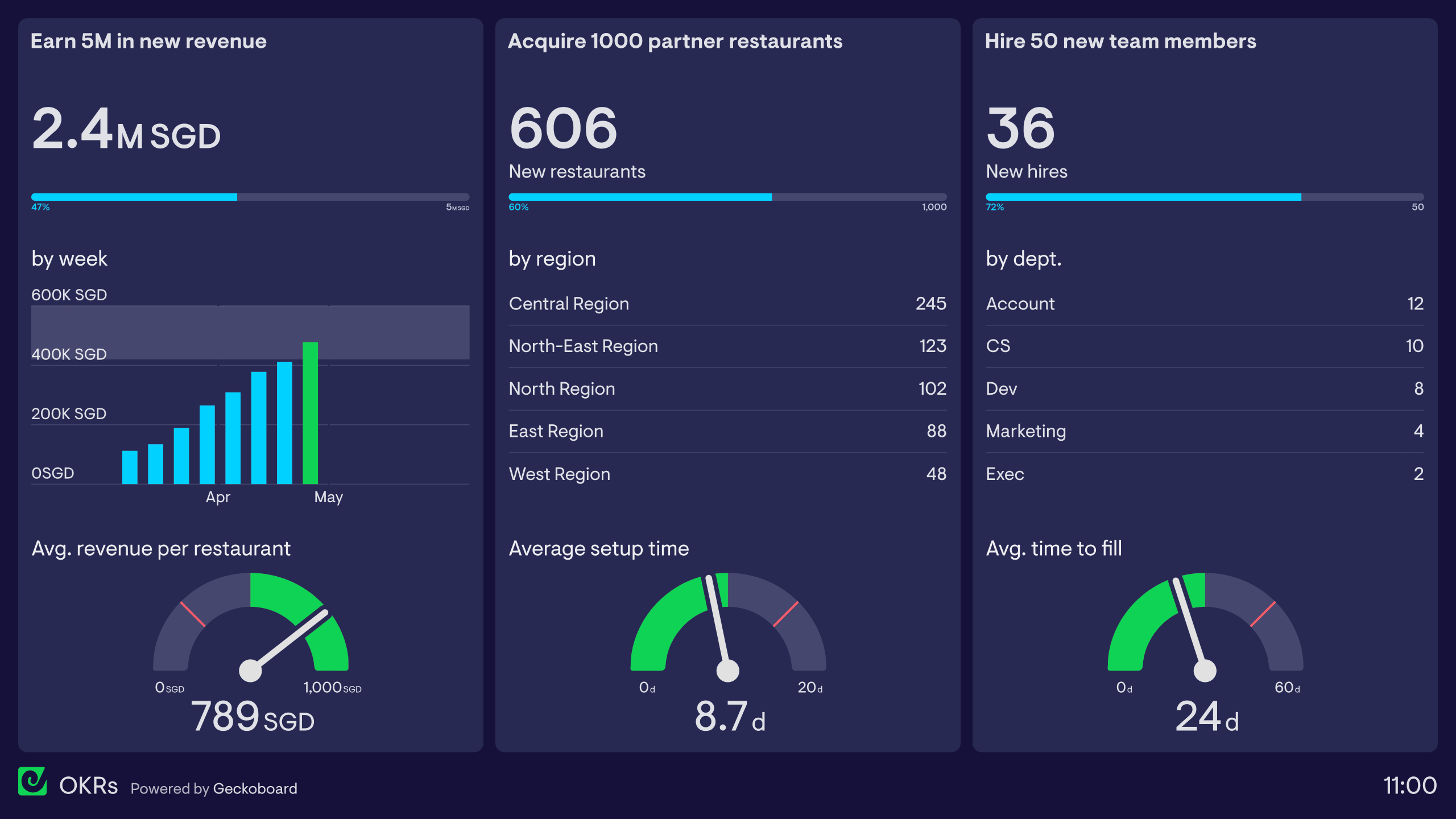
This OKR dashboard has been designed by a restaurant booking company, which is setting up operations in Singapore. The company is planning ambitious growth in the city, and this quarter has written the following OKR:
Objective: become the third-biggest restaurant booking app in Singapore.
- Key Result: Earn 5 million SGD in new revenue
- Key Result: Acquire 1000 new partner restaurants
- Key Result: Hire 50 new team members
As you can see, the three sections of the dashboard visualize metrics related to the three Key Results. This includes their ultimate progress toward each ‘Result’ but also includes some related KPIs that help the team to put their numbers in context. By monitoring metrics holistically, they can better judge whether or not they are on track.
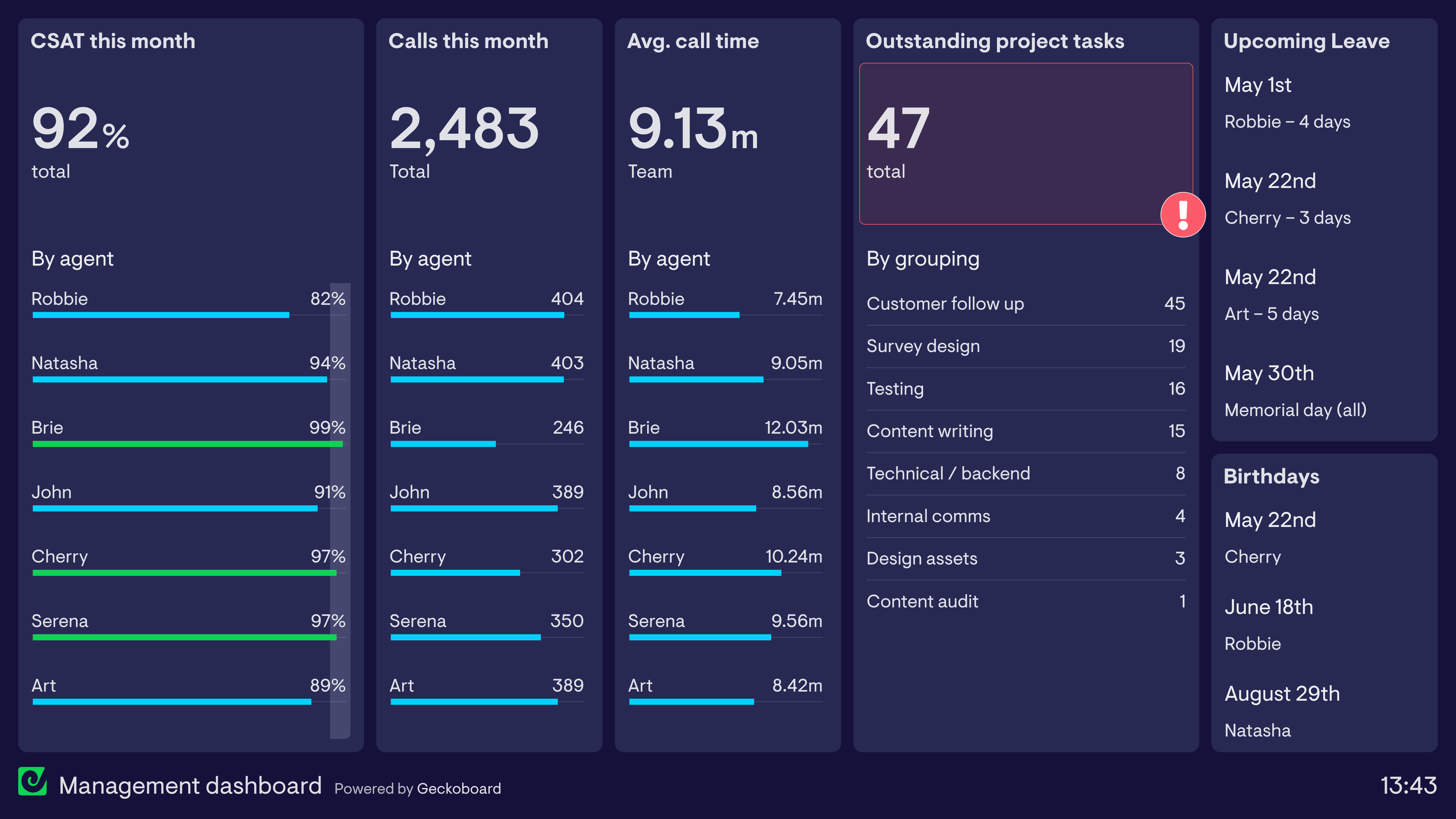
Cascading OKRs dashboard
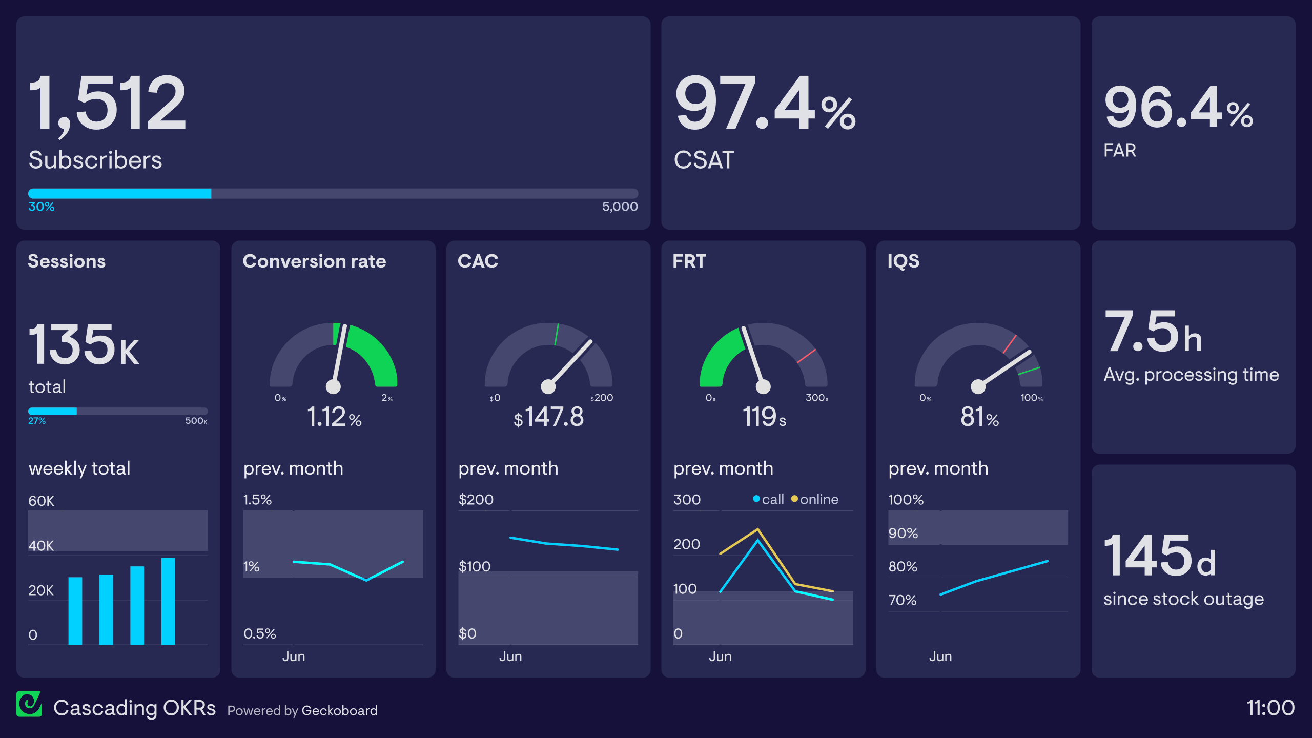
Often, companies who adopt OKRs choose to set them at multiple levels. This means not just setting OKRs at an organizational level, but also at a team level and individual level too. The general principle is that OKRs should support and feed into higher-level OKRs. This ensures that the entire company is aligned and everyone is pulling in the same direction.
This dashboard contains different Key Results from OKRs set in the Marketing team, Customer Support team and Operations team.
The Marketing Key Results can be seen on the left-hand side of the dashboard. These are primarily concerned with Customer Acquisition, Customer Acquisition Cost (CAC) and New Subscribers. The Customer Support Key Results can be seen in the center-right section of the dashboard. These track Customer Satisfaction (CSAT), First Response Time (FRT) and IQS (Internal Quality Score). Finally, on the right-hand side, we can see the Operations team’s Key Results which relate to Fulfillment Accuracy Rate (FAR), Processing Time and reducing stock outages.
OKR status dashboard
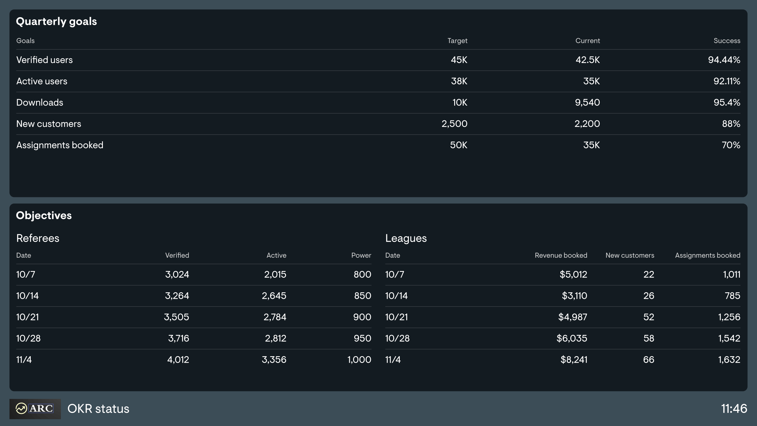
This dashboard represents a simpler way of visualizing OKRs. The team has set five Key Results, with progress updated each week. This progress is recorded by the team leader in a spreadsheet .
He has chosen to visualize this information with a dashboard so it is more visible to team members (who would not otherwise open up a spreadsheet file) and therefore becomes top of mind. The dashboard is referenced each week during team standup meetings.
An OKR dashboard tracks progress against Objectives and Key Results across a team, department, or company — giving everyone a live view of how they're tracking against quarterly or annual goals. It helps teams move OKRs from a document that gets reviewed once a quarter to a live reference point that shapes daily decisions.
Geckoboard is a live dashboard tool that connects to the data sources where your key results live — spreadsheets, product analytics, databases, support tools — and pulls them into one shared view. It's used by teams who want OKR progress visible throughout the quarter, not just at review time.
OKR dashboards display progress percentages, current vs. target values for each key result, and status indicators (on track, at risk, behind). Teams pull in data from the tools where key results are actually generated — product, sales, support, or finance.
Building a custom OKR dashboard is straightforward with Geckoboard's dashboard builder. Connect Google Sheets, Mixpanel, Zendesk Support, or SQL databases and custom data sources depending on where your key result data lives, then pick your metrics and build the view you need. Share with your team as a TV dashboard, shared link, or scheduled snapshot. Start a free trial or learn more about how Geckoboard works.
Use it to make team performance visible — putting OKR progress in front of the whole team rather than locked in a planning doc. It also helps deliver executive visibility by giving leadership a live read on whether the company's most important goals are on track without waiting for quarterly review meetings.