Intercom dashboard examples
An Intercom dashboard brings agent performance metrics out of Intercom reports and onto a shared screen — so individuals can track their own numbers and see how they're doing against the team. Agent photos make it more personal, and a TV display means the data is always visible, not buried in a tab.
Intercom agent leaderboard dashboard
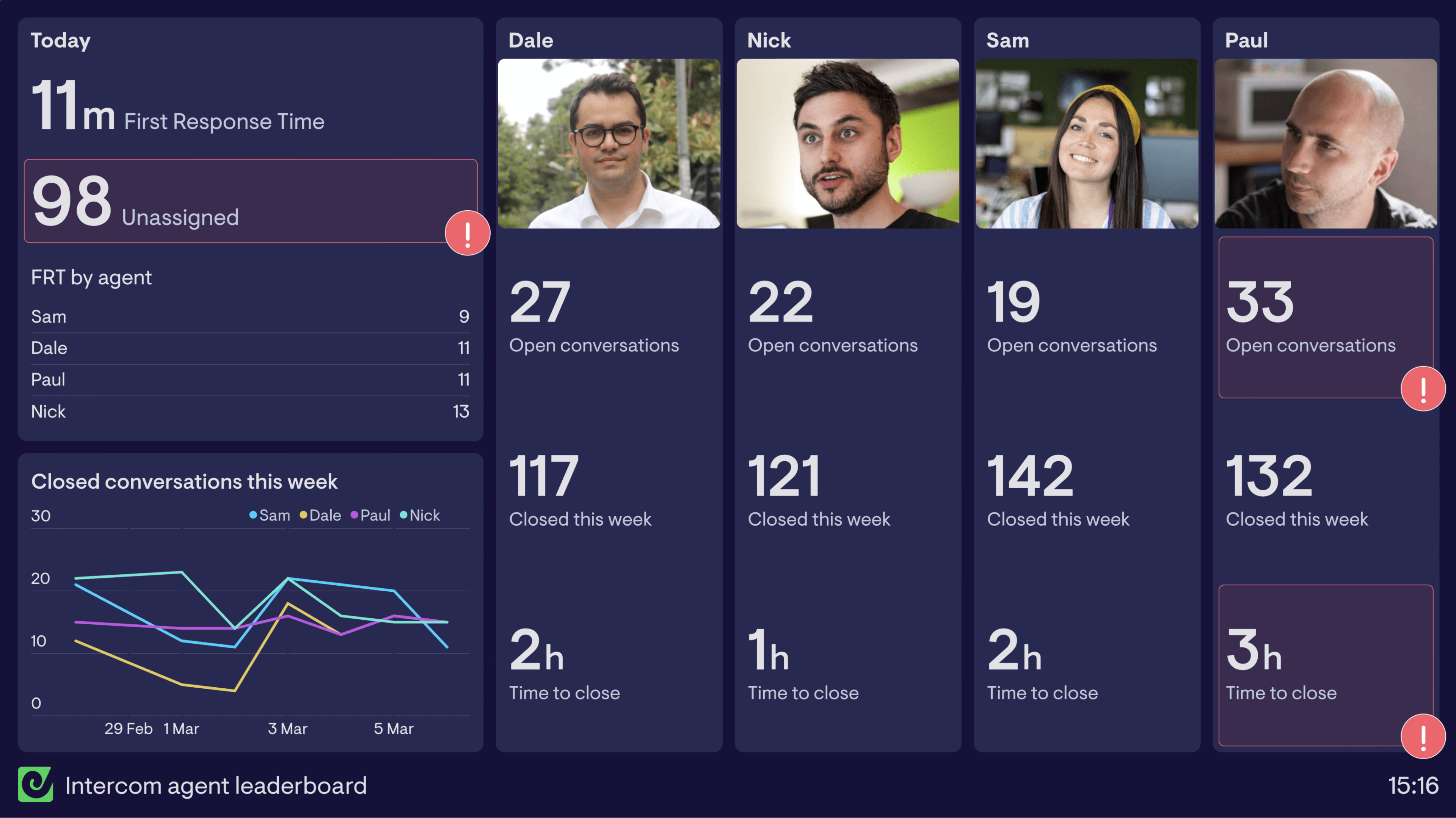
This Intercom agent leaderboard dashboard has been created to motivate the team to meet their goals. The goals they’re focused on are; keeping First Response Time (FRT) below 15 minutes, and keeping Time to Close beneath two and half hours.
In the top left corner of the dashboard there’s today’s average FRT as well as a leaderboard to show each individual agent’s average FRT. Also included in this group is the number of unassigned conversations. When unassigned conversations go over a certain amount it makes it more likely for the team to miss their FRT goal, so it’s important to keep a close eye on this number.
Beneath this data is a line chart sharing closed conversations for the week by agent. This allows everyone to see their performance in closing tickets across the week compared to the rest of the team.
Including direct comparisons by agent (such as the leaderboard and line chart) is a great way to motivate team members and often spurs on friendly competition.
The main portion of the dashboard takes KPIs for each agent and breaks down their performance beneath a photo of themselves. Over the years we’ve often heard that including photos of the team really helps boost engagement with dashboards, and therefore the metrics being displayed.
Intercom overview dashboard
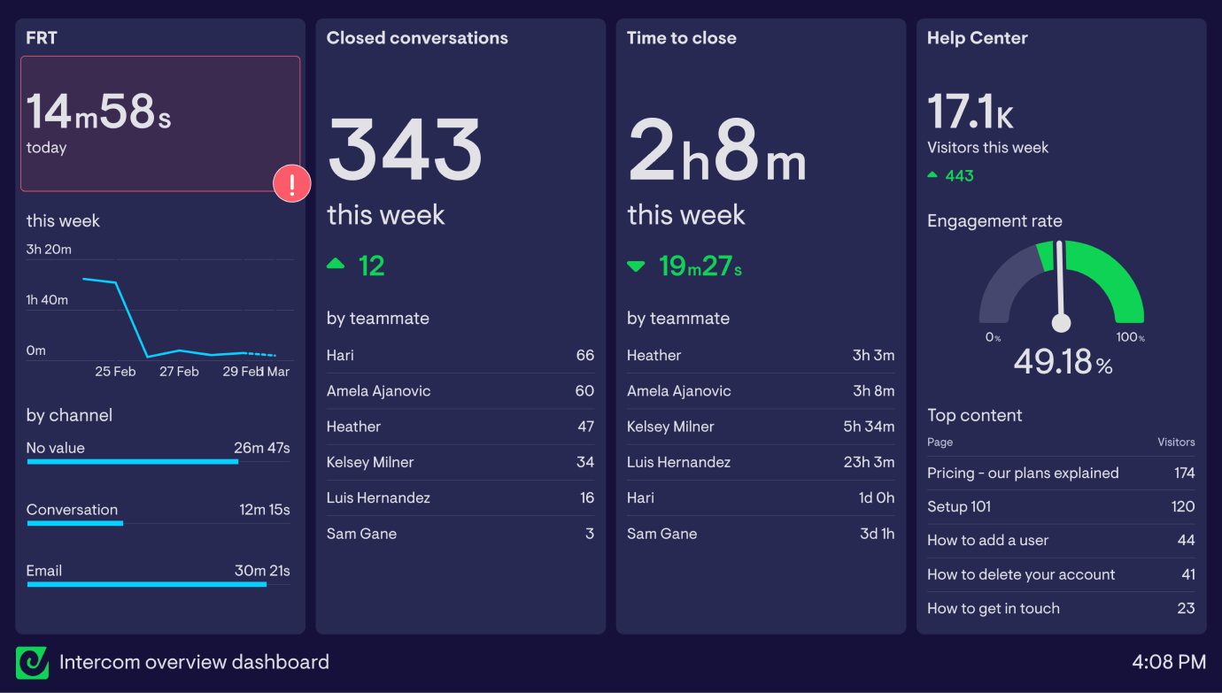
This dashboard is an example of how Geckoboard can pull together metrics from across different parts of your support operation, to make monitoring important metrics easier.
Loosely based on Intercom's team performance reporting, it's designed to give a quick indication of how the team is performing as a whole. First response time is a particular focus here, with widgets on the left of the dashboard showing today's FRT alongside the trend for the week, and with a breakdown by channel.
In the middle of the dashboard, a manager (or the team itself) can easily see how many conversations have been closed during the week in total and by each teammate, as well as average time to close.
Finally, to the right of the dashboard are a few metrics showing help centre performance. Unlike Intercom's built-in reports, it's possible to add data from different sources to the same dashboard - Google Analytics in this case - to help teams access the metrics that matter in a glance
Intercom inbox performance dashboard
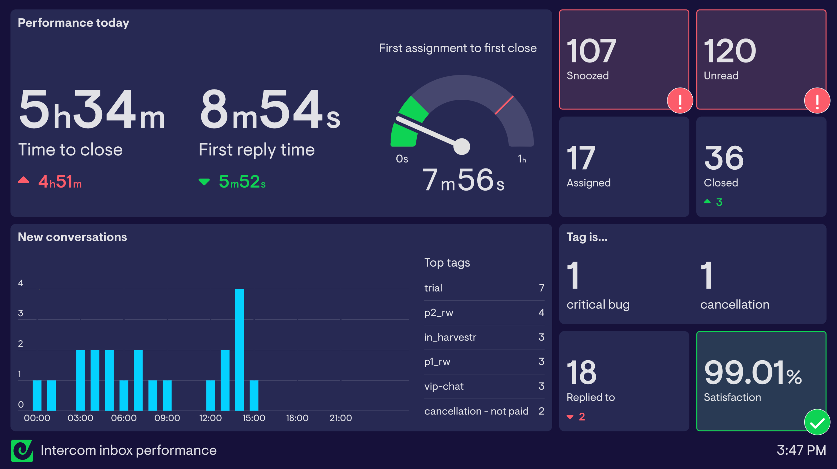
This inbox performance dashboard gives managers and teammates a real-time view of how their team inbox is performing throughout the day, and would be ideal to display on a large screen or TV.
Eyes are naturally drawn to New conversations in the bottom left of the dashboard, which also breaks conversation volume out by tag for some extra detail.
Above are large widgets that let the team monitor time to close, first reply time and First assignment to close time during the day, enabling them to make sure they're matching expectations.
Rounding out the dashboard, a number of widgets show more detail around the current flow of conversations being dealt with by the team, including how many conversations son are currently snoozed or remain unread, and what today's average satisfaction score is.
Browse other popular examples
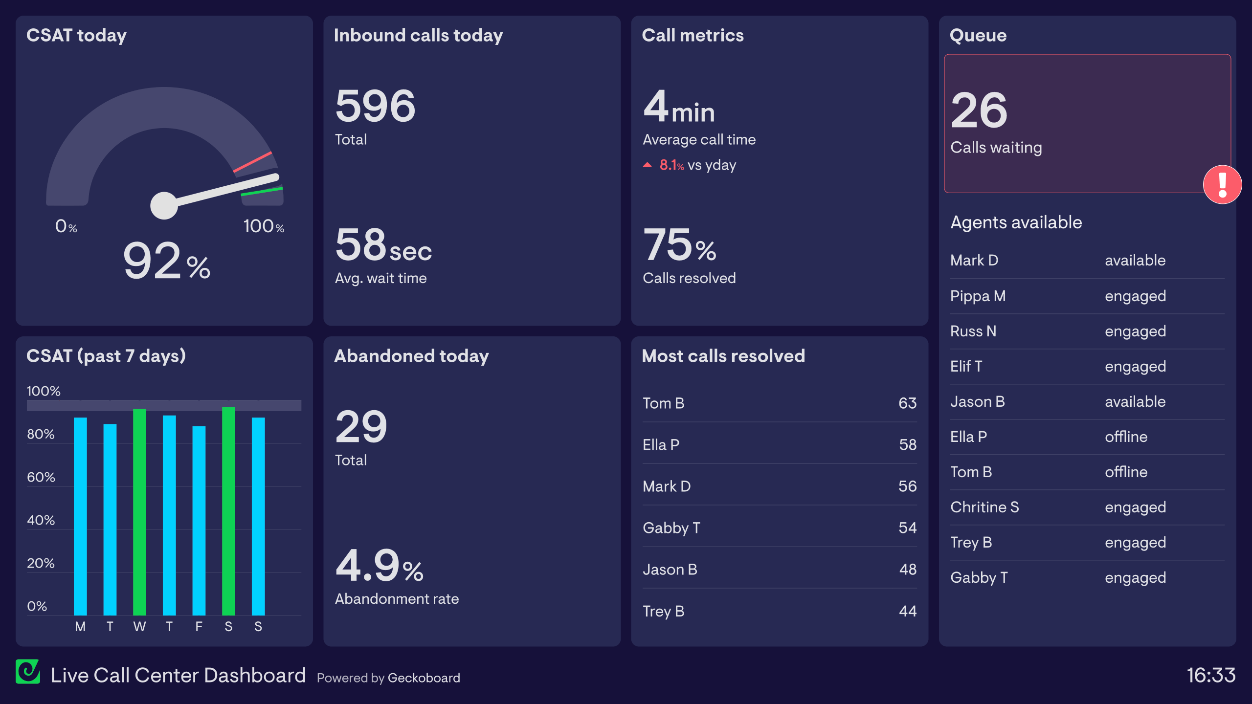
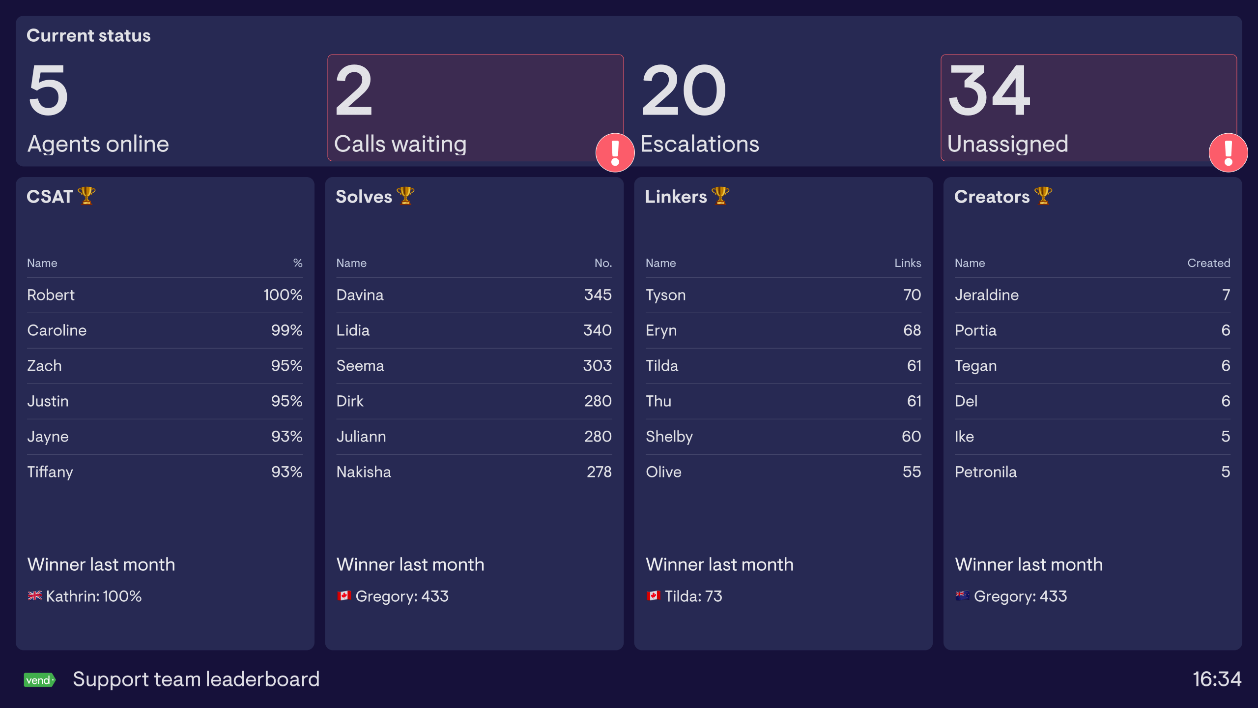
An Intercom dashboard gives support and customer success teams a live view of conversation volume, agent response times, and inbox performance pulled from Intercom. It's used by teams who want to monitor support activity in real time and hold agents accountable to response and resolution targets.
Geckoboard is a live dashboard tool that connects to Intercom to give support teams a real-time view of agent and team performance. It brings metrics out of Intercom reports and onto a shared screen that everyone can see — including agent photos and individual performance data to drive engagement.
Common metrics include open conversations, median response time, conversations closed, CSAT, conversations per agent, and team inbox volume. Leaderboard dashboards rank agents by conversations handled and satisfaction scores.
Building a custom Intercom dashboard is straightforward with Geckoboard's dashboard builder. Connect Intercom to pull conversation and agent data, and supplement with Google Analytics if you want to connect support volume to web traffic, then pick your metrics and build the view you need. Share with your team as a TV dashboard, shared link, or scheduled snapshot. Start a free trial or learn more about how Geckoboard works.
Use it to track customer service performance live so team leads can see conversation volume and response times without checking Intercom’s reporting section throughout the day. It also helps put a live leaderboard on a shared screen that keeps agents aware of how they’re performing relative to their teammates.