Product update
New!
Improved column chart visualization
We've made several improvements to our column chart visualization, making it easier to read and better at presenting your data.
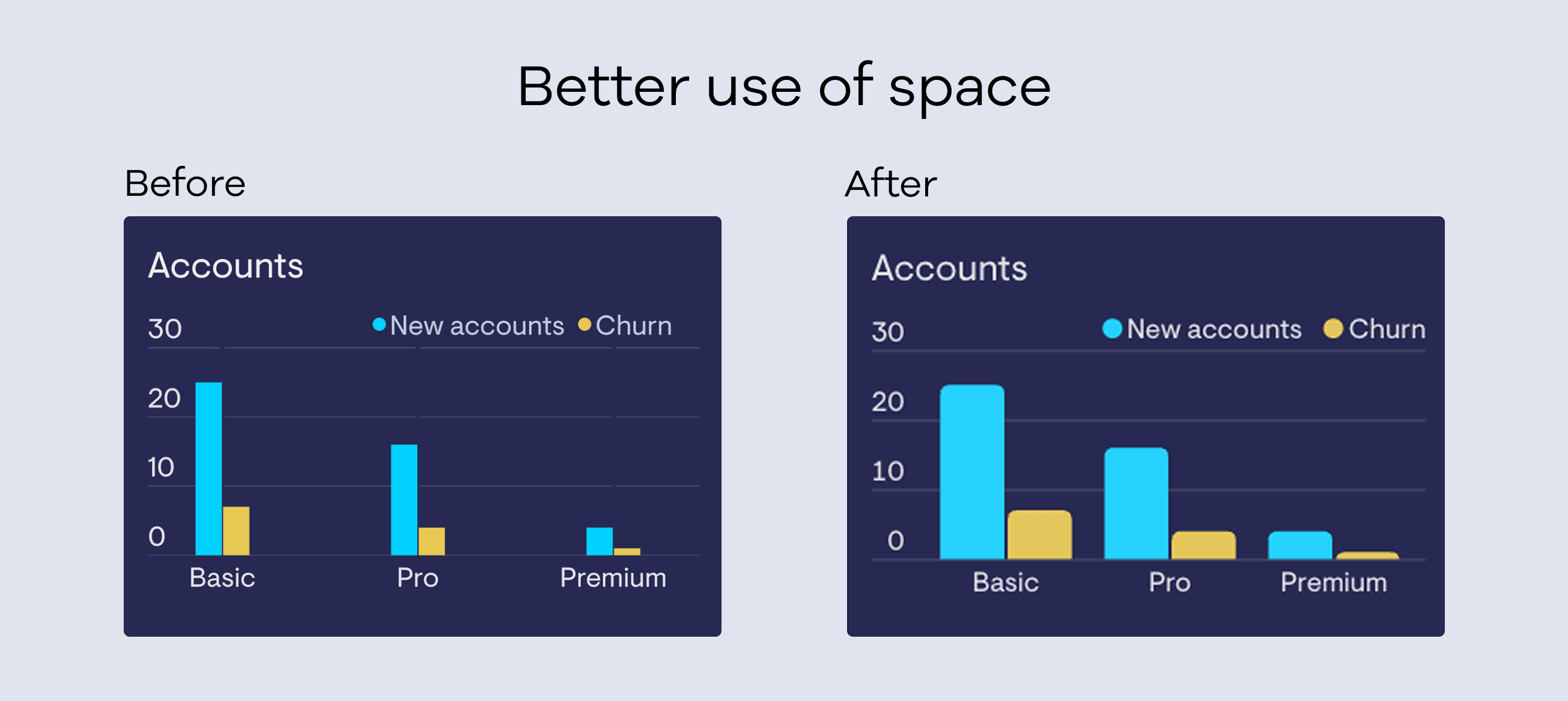
Improved use of space - Column charts now scale more intelligently to fit your data, reducing unnecessary blank space and giving your metrics more room to breathe.
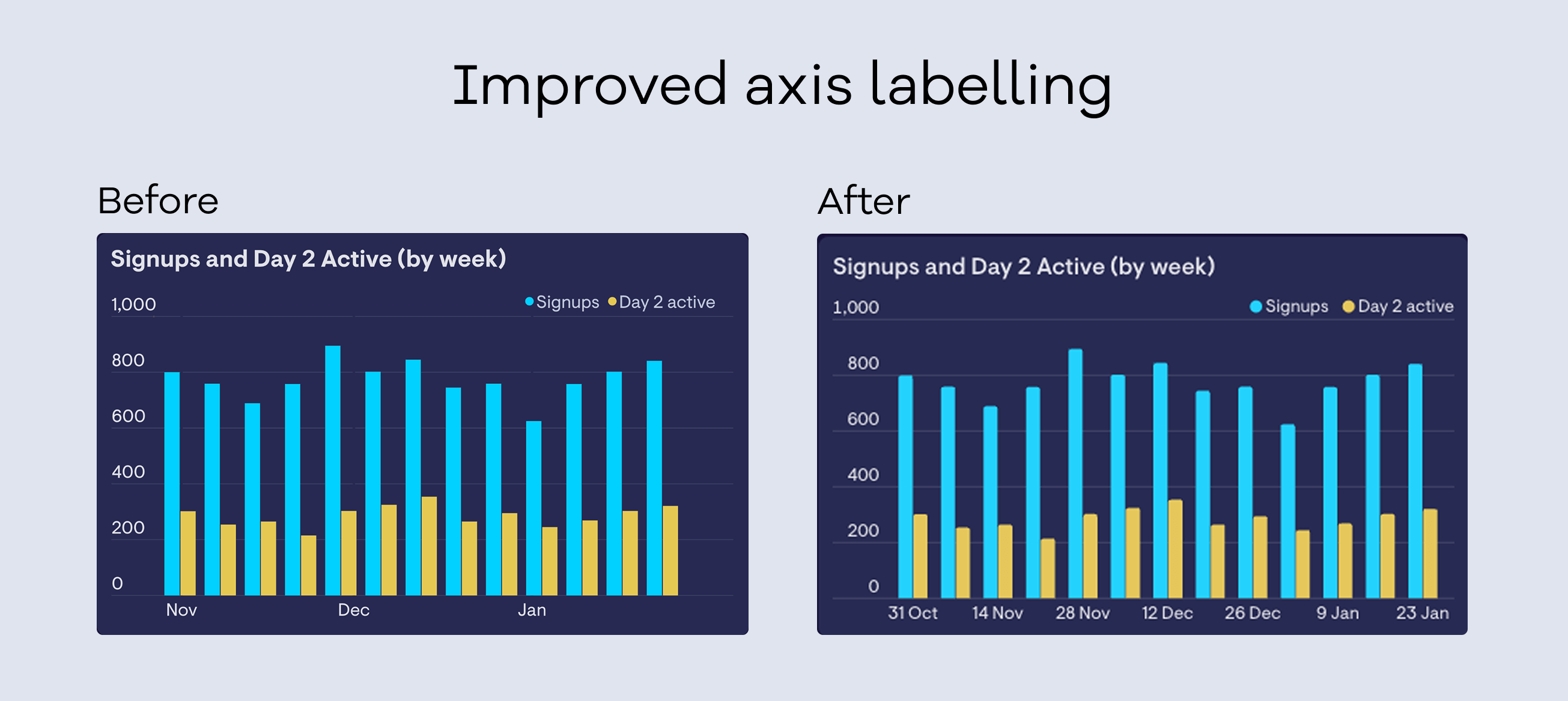
Clearer axis labels - We've improved how axis labels are displayed, with fewer gaps and more useful information at a glance.
A friendlier look - Subtle rounded edges give column charts a cleaner, more modern feel.
These improvements are rolling out now over the next few weeks - no action is needed on your end, but do get in touch with any feedback.