Product update
Stacked column charts
We've added a new visualization to Geckoboard: the stacked column chart.
It's the first entirely new visualization we've shipped in several years, and it opens up a type of analysis that wasn't previously possible - seeing both a total value and its breakdown in a single chart, without having to build two separate widgets.
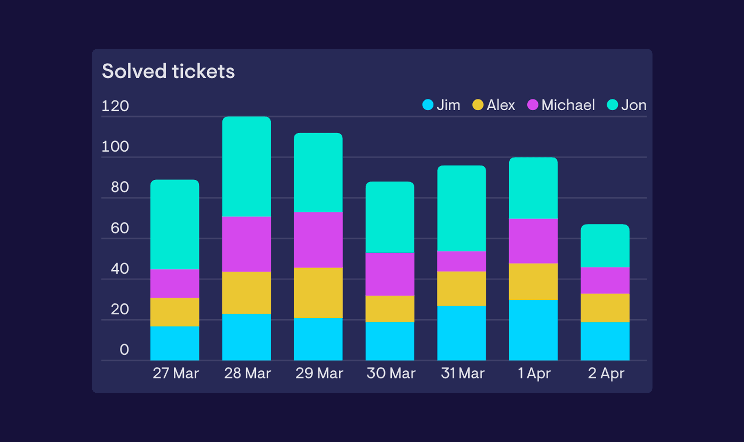
A stacked column chart works like a standard column chart, but instead of placing multiple series side by side, it layers them on top of each other within each column. That makes it easy to understand what a total is made up of - whether that's by category, stage, team, or any other dimension.
When to use it - Stacked column charts are a good fit when the relationship between the parts and the total matters as much as the individual values. For example, you might use one to track total support tickets per week while also showing how those tickets break down by type - making it easier to spot whether a spike in volume is being driven by one category, or spread across all of them. If you're more interested in comparing individual values side by side, a standard column chart is likely the better fit.
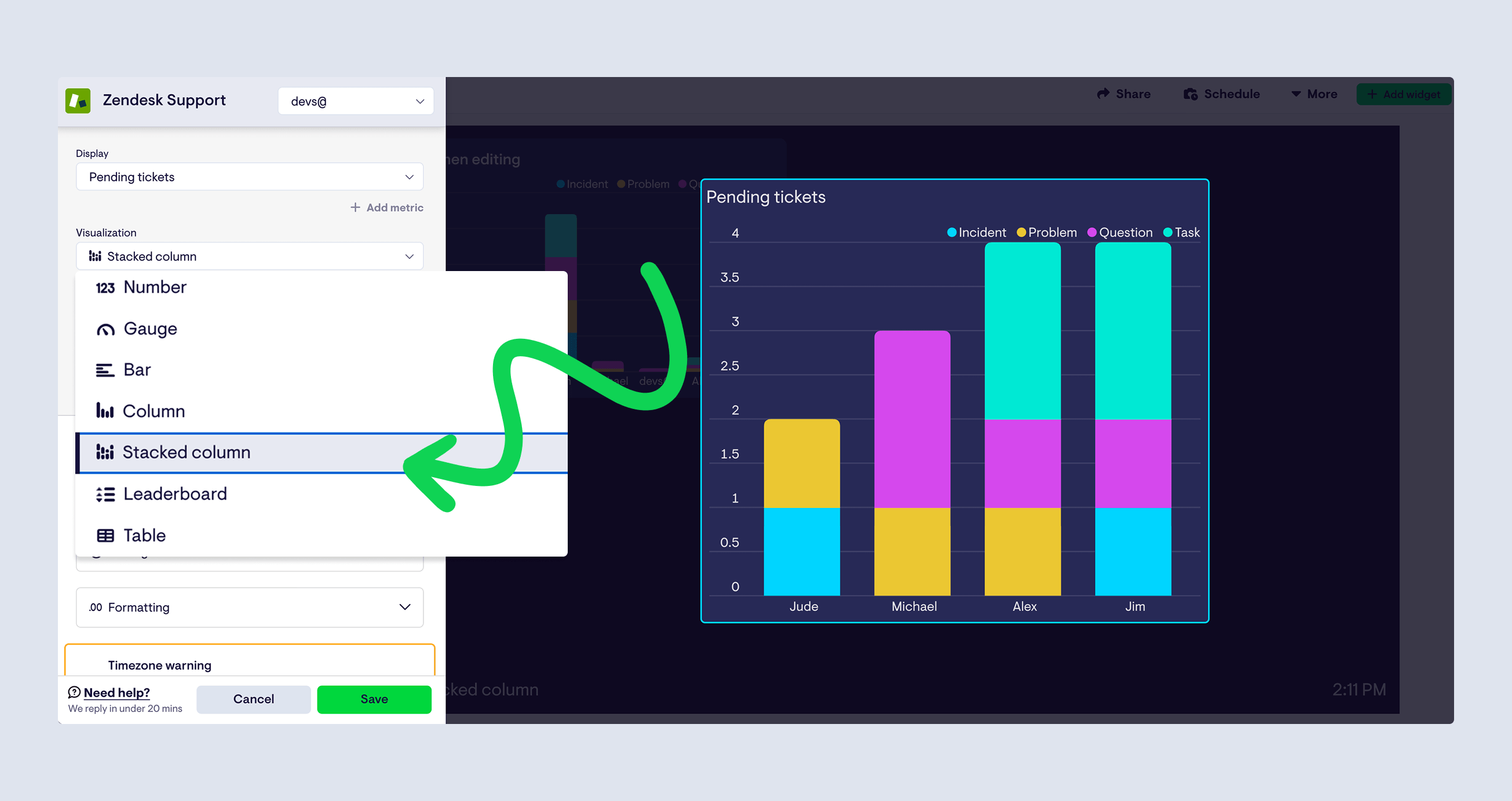
The stacked column chart is available now across most data sources. To use it, select 'Stacked column' from the visualization picker when building or editing a widget. Take it for a spin and let us know what you think.