Product updates
Cumulative line charts
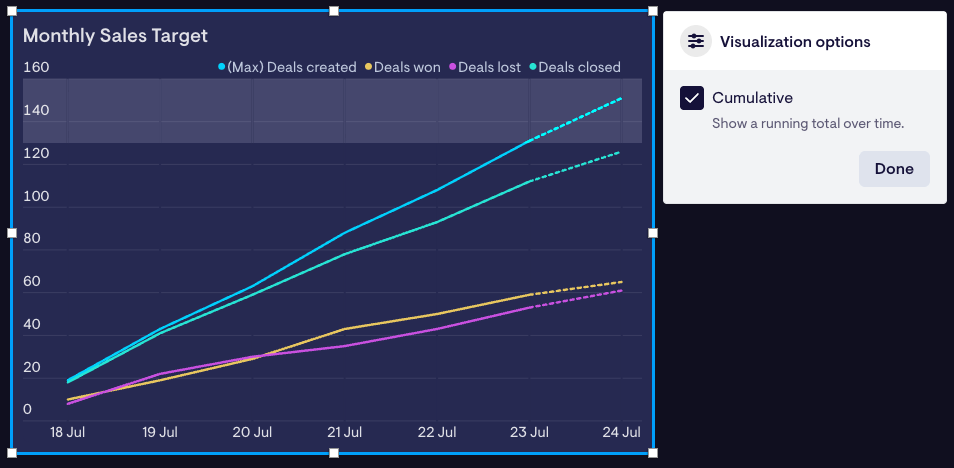
Line charts now support a cumulative option, showing a running total of your data over the selected period. This is a great way to track your progress towards an overall target. Enable it now on your dashboards via the Visualization options > Cumulative setting.
Available now for all our integrations.
Add trophies and change indicators to leaderboards
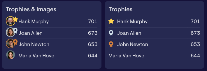
Leaderboards can now display Gold, Silver and Bronze trophies for your top performers, and change indicators to show who's climbing and who's slipping, encouraging friendly competition throughout the day.
Enable them both via the Visualization options > Show trophies setting.
Available now for HubSpot, Zendesk, Aircall, Pipedrive, Salesforce, Spreadsheets and Datasets.
Make every win impossible to miss with Celebrations

A closed-won deal in HubSpot can now trigger a full-screen celebration on your dashboard so the whole team sees the win the moment it happens, not just the rep who closed it. Choose to celebrate every deal, or set a minimum value so only the big wins get the spotlight.
Available now in the HubSpot integration, under Deals > Feeds > Deals won.
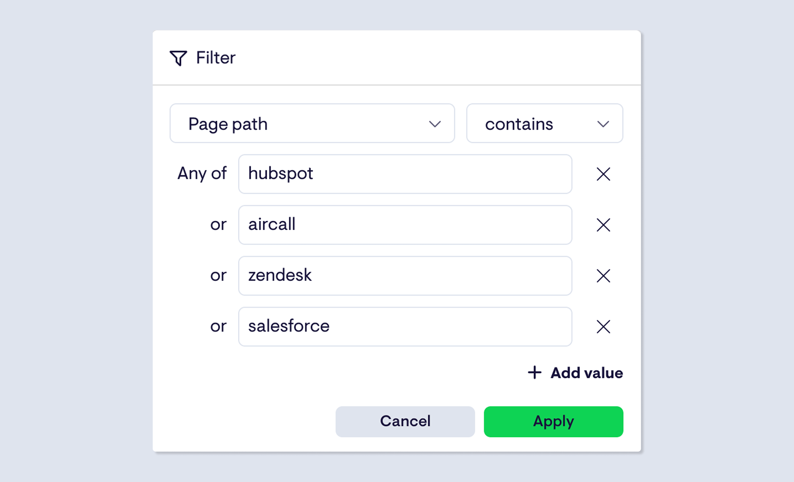
GA4 "contains" filters now support multiple values
When filtering GA4 data, you can now add multiple values to a single "contains" filter. Each value is matched with OR logic, so a filter like blog | docs | pricing will return data for any page path that contains any of those strings.
Previously you could only filter on one value at a time, which made it awkward to group traffic across multiple related pages or events in a single widget.
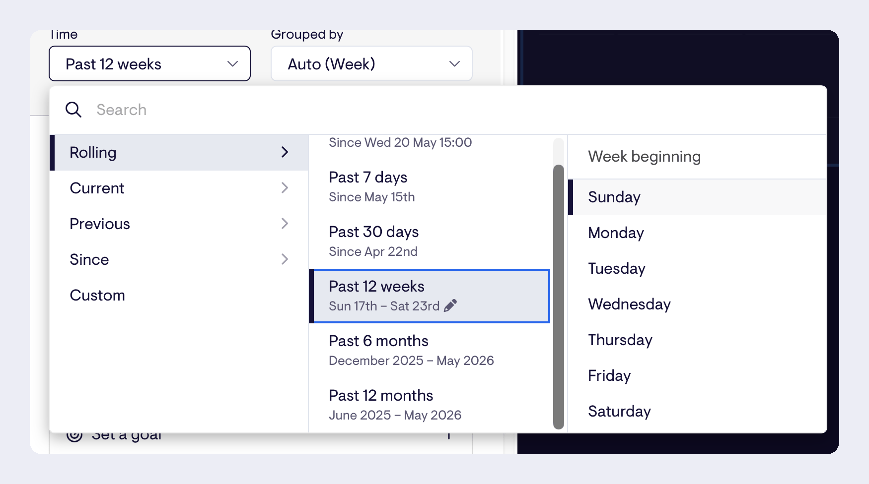
Choose your week start day
When using a week-based timespan, you can now set any day as the start of the week.
Not every team runs Monday to Friday. Retail and hospitality teams often track weeks from Sunday or Saturday; US-based teams expect Sunday while European teams expect Monday. Until now, Geckoboard always started weeks on Monday regardless. You can now pick whichever day matches how your team actually works, and Geckoboard will remember your choice.
Available now for HubSpot, Zendesk, Aircall, Pipedrive, and Shopify.
Track data from a fixed date with "Since" timespans
You can now set a widget to show data from a specific date in the past — not just rolling windows like "last 30 days", but a fixed point you choose.
That means you can finally track things like deals closed since January 1st, tickets resolved since a new process went live, or calls handled since the start of Q2 — all without workarounds.
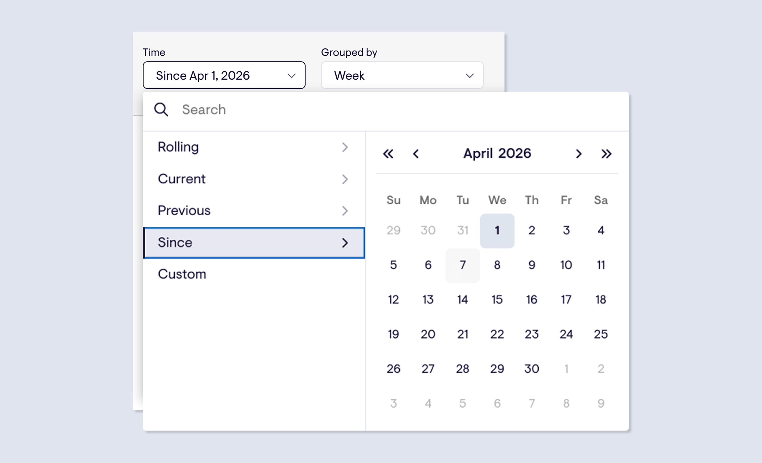
To use it, open any supported widget and look for the "Since" option in the time range selector. Pick your date, and the widget will always show data from that point to now.
Cross-object filtering for HubSpot
Our HubSpot integration now supports cross-object filtering, letting you filter metrics based on properties from associated objects — not just the object you’re measuring.
This is particularly powerful for Deal metrics, where you can now filter by properties of associated Contacts, Companies, or related activity:
- “Value of all deals where the associated company’s country is the UK”
- “Win rate for deals where the associated contact is an ICP”
- “Number of deals that have at least one meeting booked”
You can also filter Contact metrics by associated Company properties — for example, “Number of contacts where the associated company’s industry is SaaS.”
Available now in the HubSpot data source. Get in touch via the in-app chat if you have any feedback or questions.
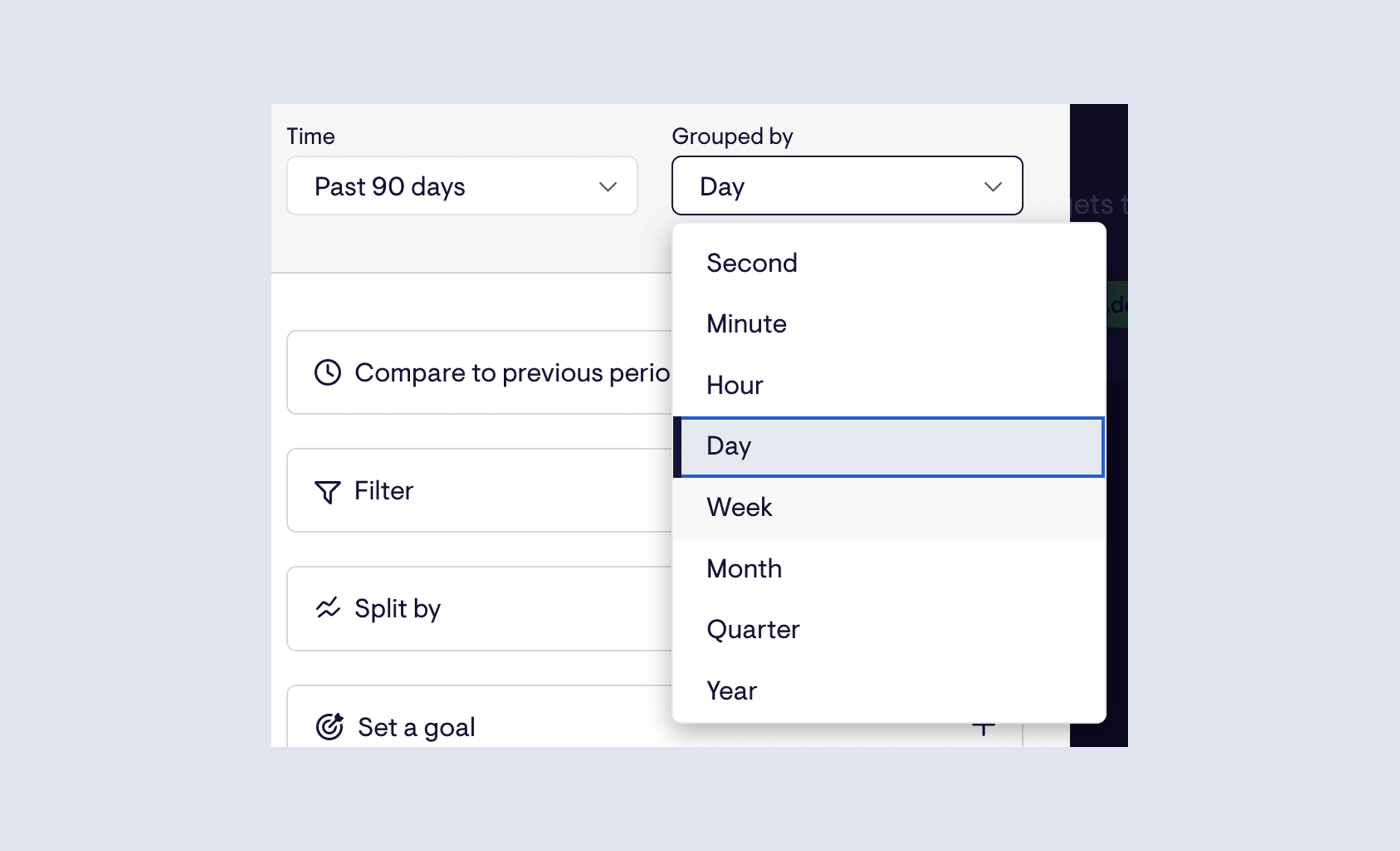
Set chart granularity independently of your timespan
Timeseries charts can now have their bucketing — the granularity of each data point — set independently of the time range.
Previously, the two were linked: if you wanted 90 days of data, you were stuck with whatever grouping that implied. Now you can choose any combination that makes sense for what you're tracking. Last 90 days by week. Last 12 weeks by day. The Grouped by control is its own setting.
Available now for HubSpot, Zendesk, Aircall, Pipedrive, and Intercom, with Shopify and Stripe coming soon.
Faster updates for Zendesk Agent Status
If you're using Geckoboard's Zendesk Agent Status data source, your dashboards now reflect what's happening in Zendesk more quickly - making them more useful for teams who need an accurate, up-to-the-minute view of agent availability and workload.
Instant agent and channel status updates - Agent and channel status changes now appear on your dashboard the moment they happen in Zendesk, via webhooks. No more lag between an agent going on a break and your dashboard catching up.
Faster work item refresh - Data related to work items now refreshes every two minutes, down from before.
These improvements are rolling out now - no action needed on your end. If you have any feedback, get in touch via the in-app chat.
Stacked column charts
We've added a new visualization to Geckoboard: the stacked column chart.
It's the first entirely new visualization we've shipped in several years, and it opens up a type of analysis that wasn't previously possible - seeing both a total value and its breakdown in a single chart, without having to build two separate widgets.
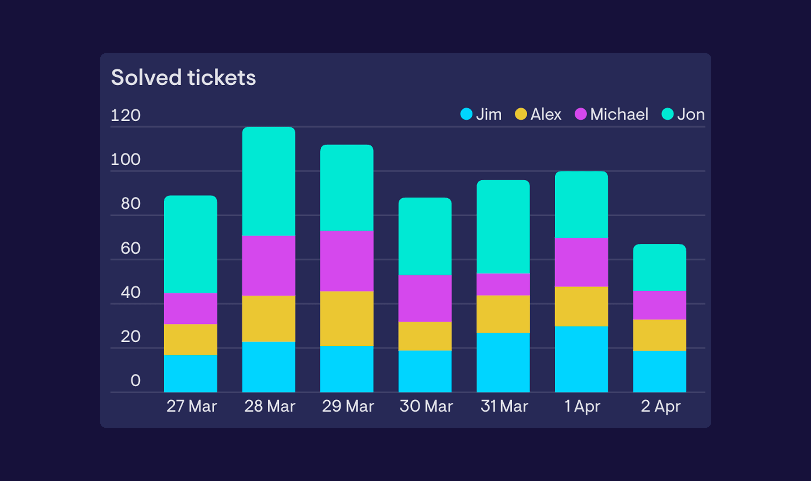
A stacked column chart works like a standard column chart, but instead of placing multiple series side by side, it layers them on top of each other within each column. That makes it easy to understand what a total is made up of - whether that's by category, stage, team, or any other dimension.
When to use it - Stacked column charts are a good fit when the relationship between the parts and the total matters as much as the individual values. For example, you might use one to track total support tickets per week while also showing how those tickets break down by type - making it easier to spot whether a spike in volume is being driven by one category, or spread across all of them. If you're more interested in comparing individual values side by side, a standard column chart is likely the better fit.
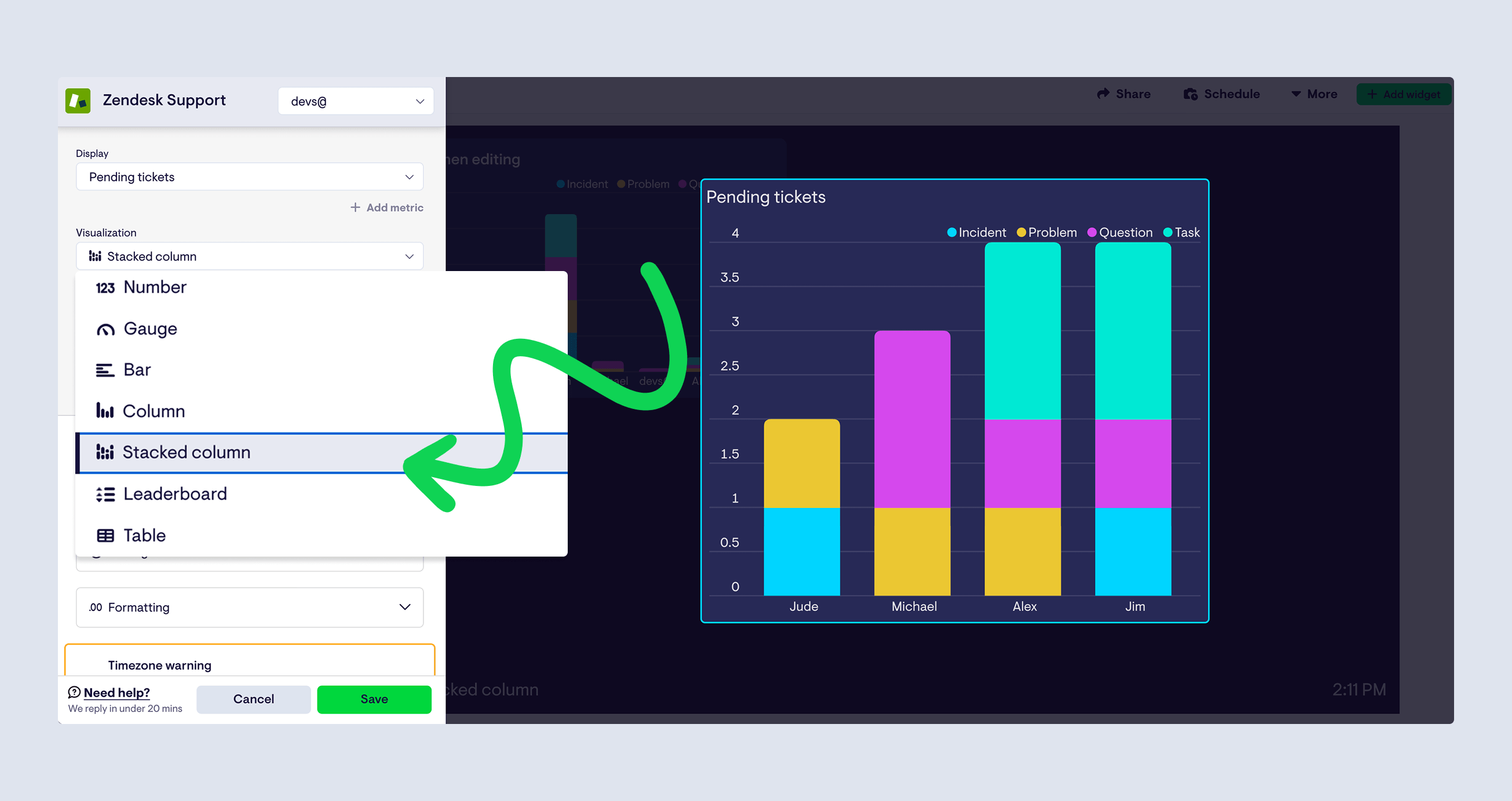
The stacked column chart is available now across most data sources. To use it, select 'Stacked column' from the visualization picker when building or editing a widget. Take it for a spin and let us know what you think.