Interactive view now available for view-only users
We’ve introduced a new user type called ‘Explorer’ that gives trusted teammates access to Interactive View and Source Data on the dashboards they can see.
Like regular view-only users, Explorers can’t make changes to your dashboards or account settings. But they can now slice and dice metrics using Interactive View and explore the underlying data behind any metric using Source Data.
This means you can give team members deeper access to explore data insights without worrying about them accidentally modifying your carefully crafted dashboards.
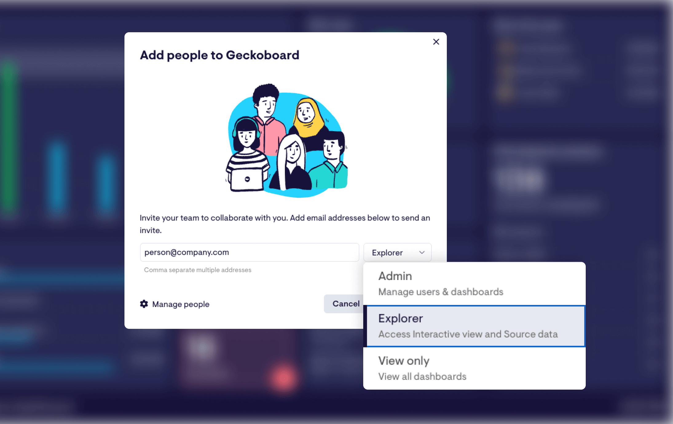
To add an Explorer user, head to the People menu and select Explorer from the dropdown when adding your teammate’s email address. You can also give existing view-only users access by going to the Admin section of your account, select People, and change each user’s type using the drop down.