New: Google Analytics 4 data source beta
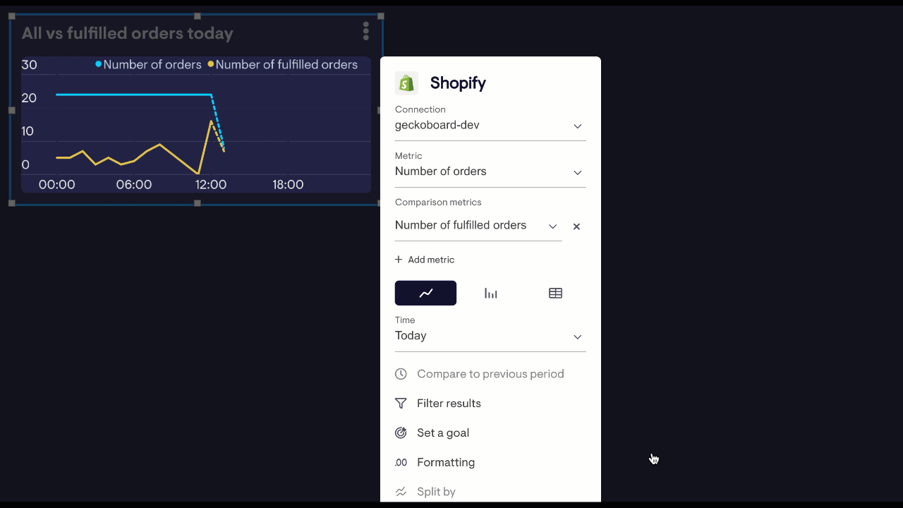
Now you can visualise data from your Google Analytics 4 properties using our brand new data Google Analytics 4 data source. Our existing Google Analytics data source remains unchanged, but has been renamed to Universal Google Analytics.
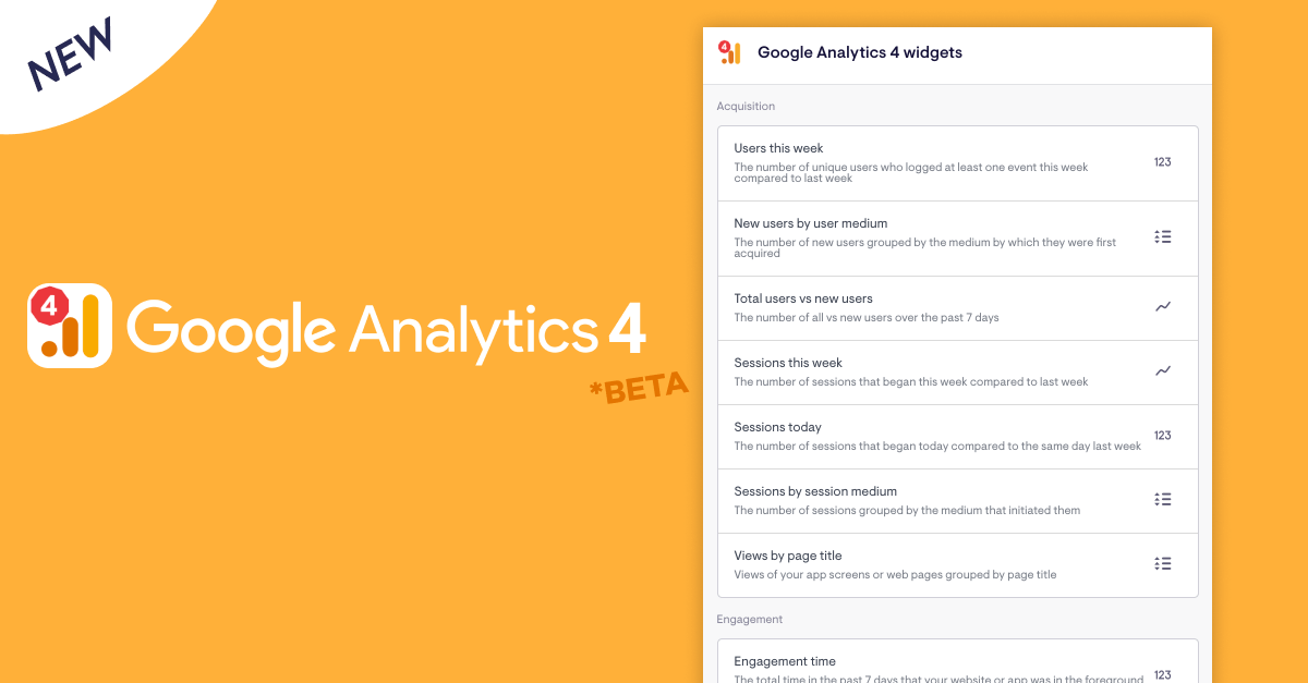
Additional metrics and filtering on GA4 metrics is coming soon, but the initial release already includes handy presets for things like new users by medium, new users Vs total users, views per page, engagement time and more.
We’d love to know how you get on - get in touch if you have any feedback to share!
Note: To avoid discrepancies between what you see in GA Vs Geckoboard, please double-check your dashboard’s timezone matches the timezone of your GA property.