What is a Jira dashboard?
Jira dashboards visualize useful data and ticket information from Atlassian’s Jira, enabling project managers (and the wider organization too) to keep track of one or more workflows in real-time.
Geckoboard, which these example Jira dashboards were built with, makes it easy to create your own Jira-powered dashboards that can be shared on desktop, mobile and TV wallboards, helping you to raise the visibility of KPIs from Jira and over 90 other tools.
Examples of Jira dashboards
Jira Kanban dashboard
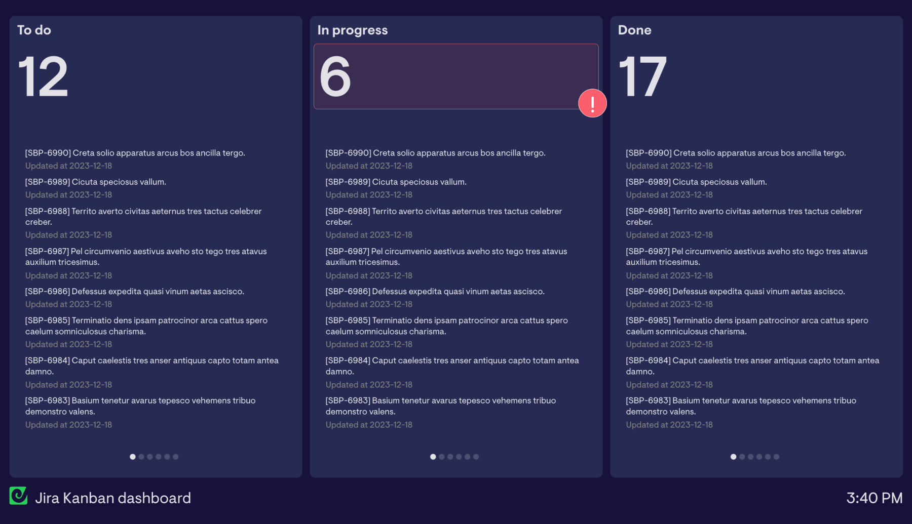
At the heart of the Kanban methodology is the Kanban board, which helps managers and workers to visualize their progress and process from start to finish. Being able to see tasks - and where they are in the system - at a glance, is a powerful approach to balancing workload and preventing bottlenecks.
Whilst Jira is brilliant at managing tasks and keeping your Kanban system running day-to-day, there are more powerful ways to visualize your project’s progress, starting with this basic Kanban dashboard.
What's on this Jira Kanban dashboard?
Much like Jira’s own Kanban board view, it’s split into sections that contain a number of tasks at different stages of your workflow - to do, in progress and done. Unlike a traditional Kanban board though, it also includes a running total of how many tasks are at each stage. This is particularly handy if a project or release has a reasonably fixed number of tasks associated with it that need to be completed; when a task moves into a different stage in Jira, this dashboard will automatically update the tickets and ticket counts, so you and your team can keep track of how things are progressing with the dashboard open in a browser tab, on mobile, or displayed on an office TV.
Focus area
Monitoring a Kanban workflow in Jira
Who looks at it?
Product and engineering teams, project managers
How often?
Throughout the day
- Jira
Jira ticket dashboard
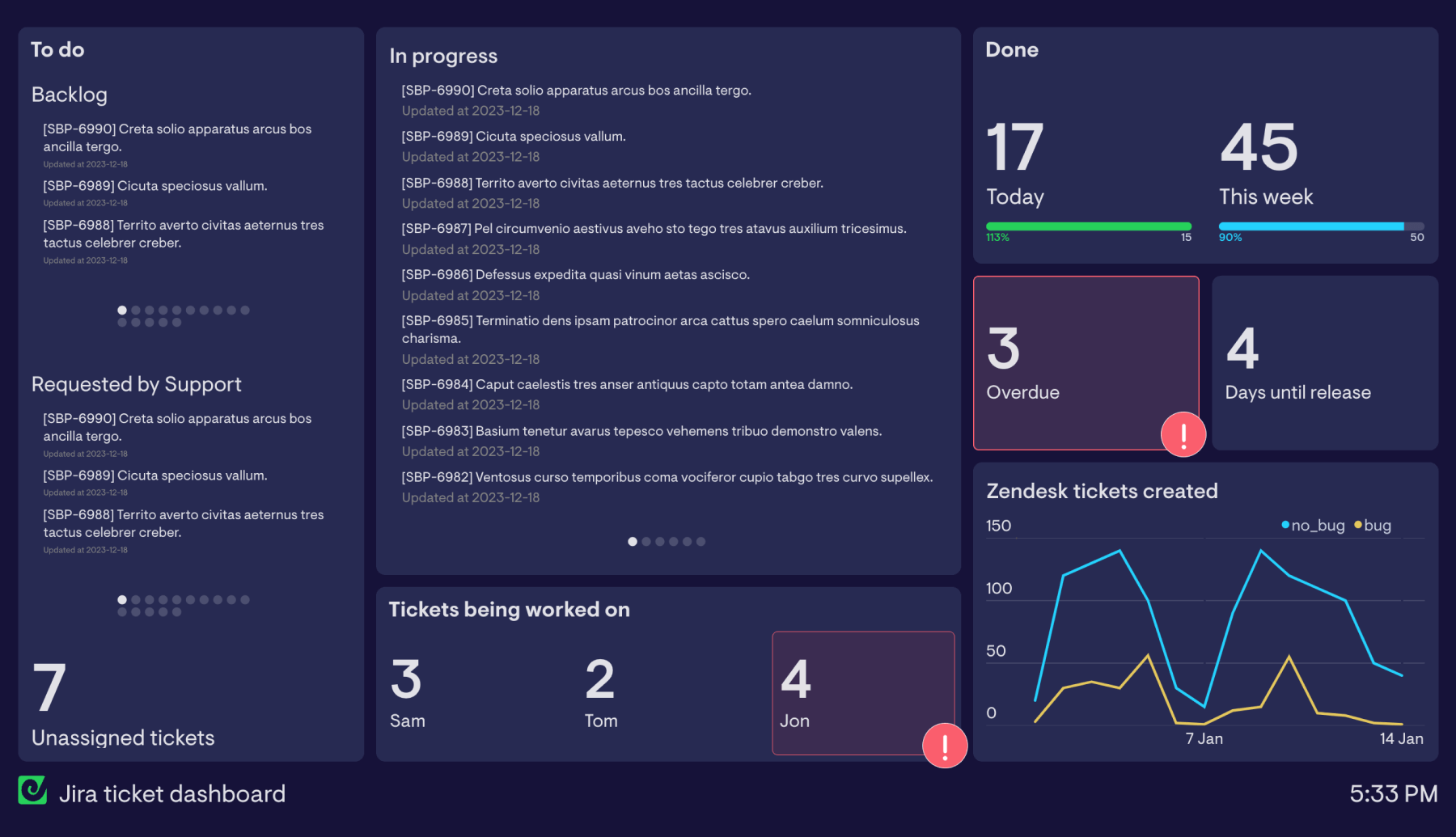
Adding project-related metrics alongside your board is a useful way to get a top-down view of how things are going. This example Jira ticket dashboard goes one step further.
What’s on the dashboard?
Like the previous example, this Jira ticket dashboard example includes elements of a Kanban board, making it easy to see tickets at the ‘To do’ and ‘In progress’ stages. To make it more useful for tracking fast-moving tickets though - perhaps as part of a customer support operation - some information has been added and removed to provide clearer context.
Tasks that are at the ‘To do’ stage have been split out by requester, so it’s easier to see which upcoming tickets are part of the backlog, or have been requested by Support. Using a little JQL, it’s possible to focus ticket lists and counts on a dashboard like this around everything from ticket requester, to assignee, to due date, or even how many votes a ticket has received.
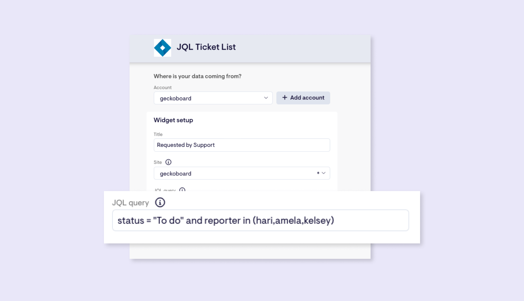
For more information on how JQL works, check out this article.
The dashboard has several metrics along the bottom that give an indication of how the team is balancing their work, and whether there are any bottlenecks, in the form of unassigned tickets, how many tickets have been picked up by each team member, and how many tickets are overdue. This data stays in sync with Jira throughout the day, and status indicators have been set up to draw attention to numbers if they increase to the point of being a concern.
Rather than listing a column of ‘done’ tickets, this dashboard provides an indication of the team’s productivity, by showing how many tickets have been completed today and this week, and how that compares to a set target.
Finally, in the bottom right of the dashboard is a visualization of ticket volume in Zendesk, which the frontline support team at this organization are using to manage support queries. Standalone dashboard tools like Geckoboard give a level of customizability that baked-in dashboards often don’t have, and this is a great example of this in action. With Zendesk integrated alongside Jira, this team can now keep one eye on support ticket volume - and in particular, tickets tagged as bugs - as an early heads-up to any major issues they may need to address.
Focus area
Monitor Jira projects and team workload
Who looks at it?
Product and engineering teams, project managers
How often?
Every day
- JiraZendesk Support