Product updates
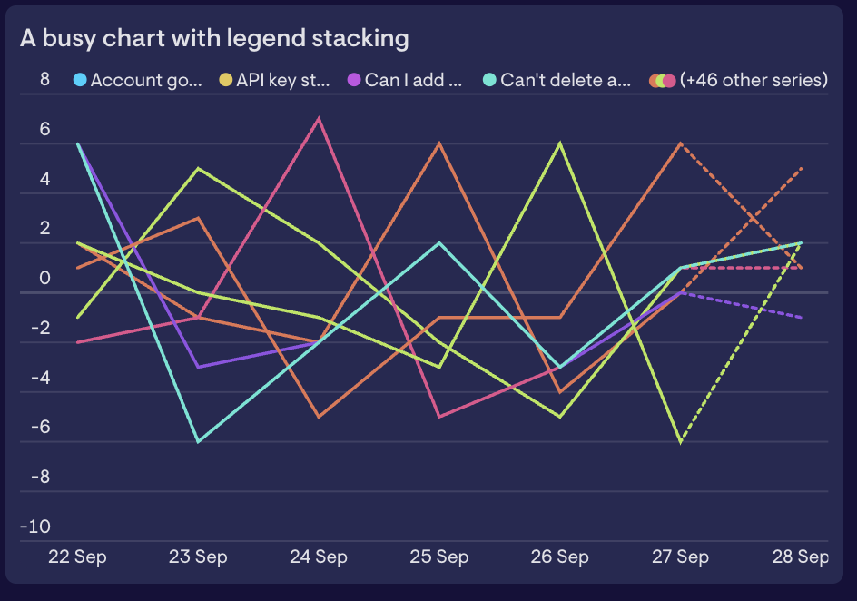
Updated line chart
We’ve recently updated our line chart visualization and we’re beginning a gradual rollout over the coming days and weeks.
This should be a transparent change, with only some very minor differences in the way things appear. Expect to see slightly clearer fonts as well as our new stacked legends, which allow you to see the first few series on a very busy line chart.
If you see anything that looks unusual or unexpected, please reach out to our support team.
Count down to your next big moment
Got a launch, a deadline or an event coming up? The new Countdown widget keeps the time left in front of your team.
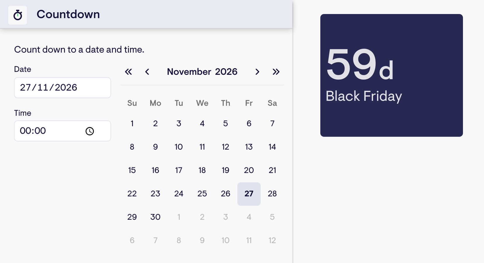
Pick a date and time, and the countdown ticks down live. Dates that are a while off show in days, and as the moment gets closer you’ll see hours, minutes & seconds.
Already track your dates in a spreadsheet? Build a Number widget from a single date cell and it’ll count down to that date too, so it stays up to date when the date in your sheet changes.
Available now. Find Countdown under Dashboard Tools when adding a new widget, or use your Spreadsheets data.
Meet the Geckoboard Metrics MCP
Ask more from your business data
Today we’re launching the Geckoboard Metrics MCP, a new way to give AI tools access to your business metrics.
AI assistants like ChatGPT and Claude make incredible data analysts, but only when they have access to the right metrics.
Unfortunately, most of the time they don’t. Many apps still don’t offer a way to connect their data to AI assistants. Those that do often only return raw records (e.g. lists of tickets, calls, deals, leads, etc.), and so require the AI assistant to compute metrics itself. This is an error-prone process that can’t guarantee consistent results between runs.
The Geckoboard Metrics MCP fixes this by giving AI assistants access to accurate, real-time, pre-calculated metrics, using the same proven data pipelines that have powered our dashboards for over a decade.
With the Geckoboard Metrics MCP, you can investigate questions that previously would have taken days, create reports that adapt to the data, and build your own custom tools, confident that the numbers underpinning them are accurate.
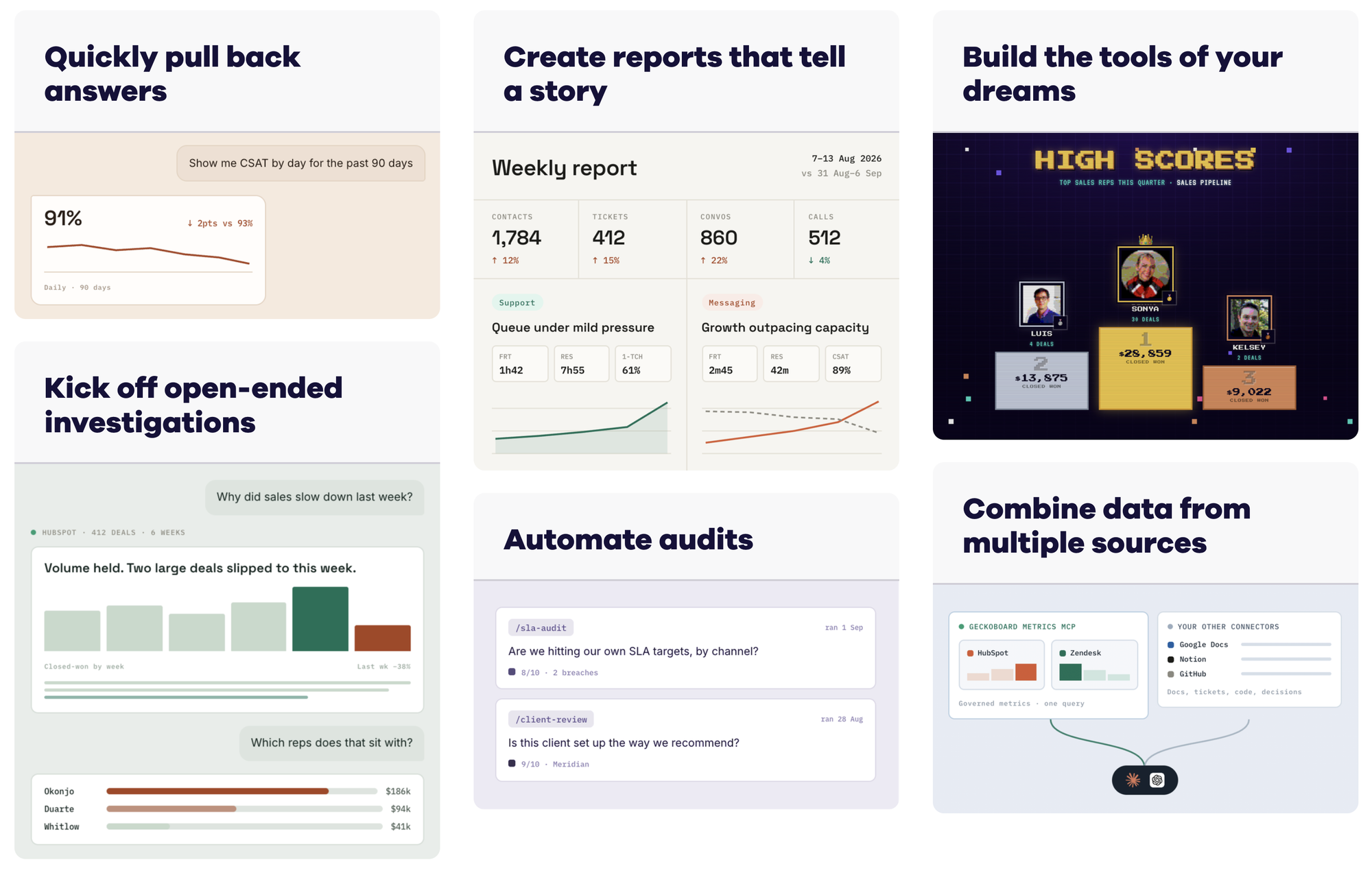
Simply ask your question and get an answer:
- “What caused support volume to increase last week?”
- “How has first-response time changed over the past three months?”
- “Where are deals stalling in our pipeline?”
- “Summarize last week’s performance and flag anything unusual.”
- “Turn this analysis into a report I can rerun every Monday.”
- “Audit our SLA adherence against the checks we agreed.”
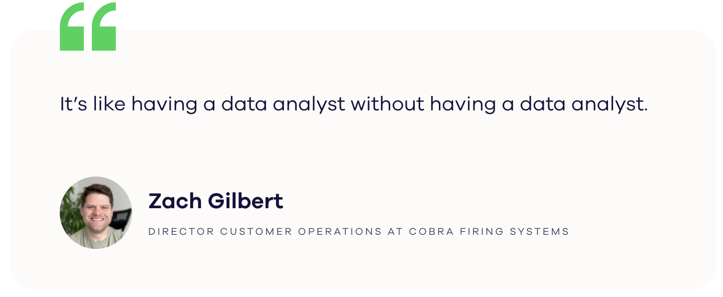
Use your metrics in the AI tools you choose
MCP is the standard for connecting apps to AI tools, and is supported by a growing range of services, including Claude and ChatGPT.
Working with your metrics in your own AI assistant is significantly more powerful than the analytics tools built into services like HubSpot or Zendesk. The context your assistant has about your business means it's able to ask better, more targeted questions when doing analysis. It's also able to combine metrics across multiple apps: either to provide a holistic view of performance or to create new calculated metrics.
Because Geckoboard calculates the metrics before passing them to your AI assistant, you can be confident you’re working from the right numbers. Answers come back faster and require fewer tokens. More complex analysis becomes possible.
Give AI access without giving it the keys
Geckoboard’s MCP is read-only by design. Your AI assistant can access your metrics without gaining write access to the systems they came from, removing the risk of making accidental changes to your underlying data.
We also minimize the data we process. Geckoboard doesn’t need to collect customer email addresses or ticket content to give your AI assistant access to your business metrics.
Available now
The Metrics MCP launches with over 15 integrations, including Zendesk, HubSpot, Pipedrive, Intercom, and Aircall, with more coming over time.
The MCP is included with every Geckoboard plan and is available as part of our 14-day free trial.
Want to see it working with your own metrics?
New data source: Dialpad
If your team takes calls in Dialpad, you can now put those calls on a Geckoboard dashboard. Our new Dialpad integration covers live queue activity, inbound and outbound call performance, and agent availability.
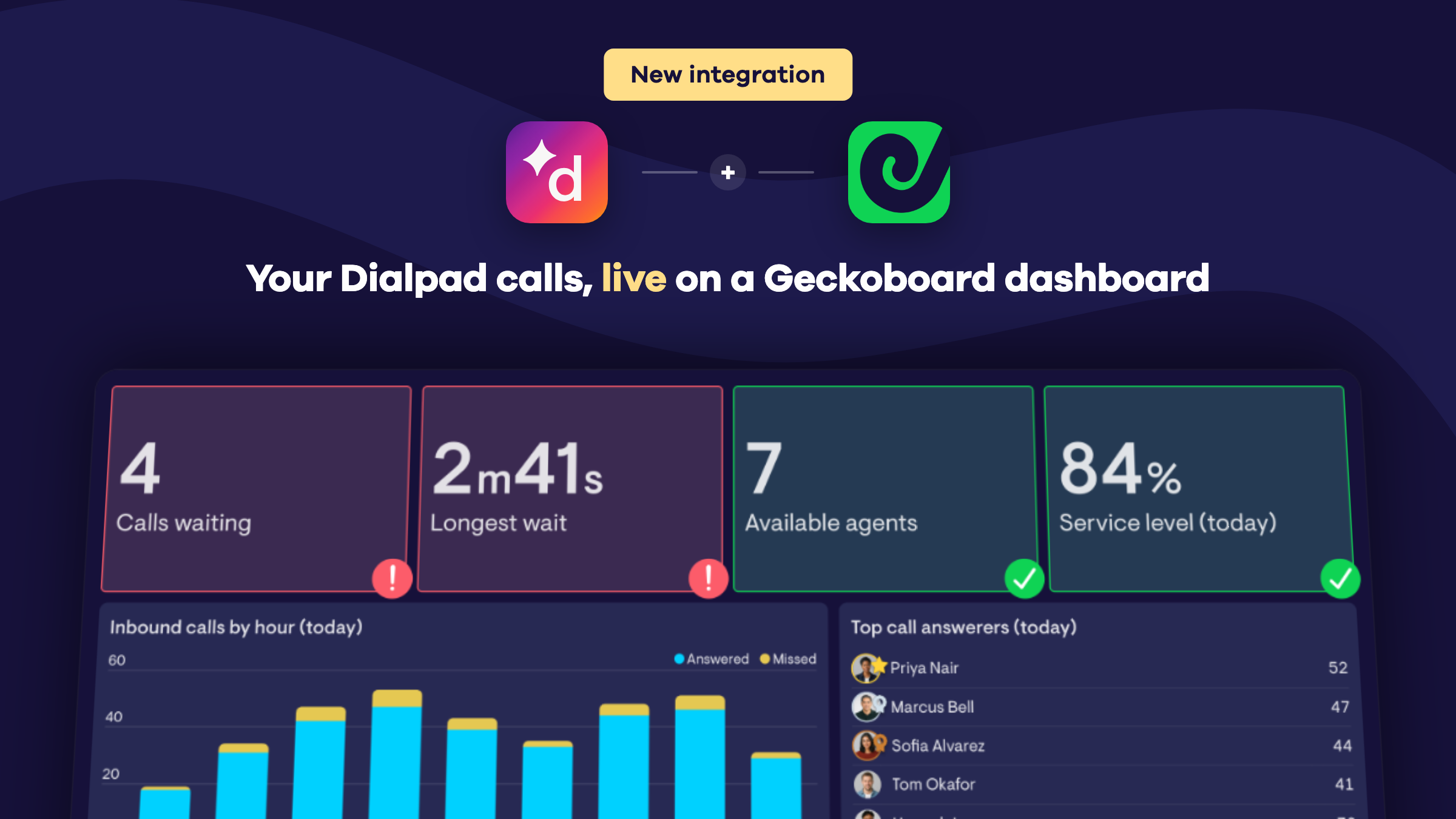
Live queue metrics. Calls waiting, longest wait, active calls and longest active call update as soon as something changes in Dialpad.
Inbound calls. Track inbound, answered and missed calls, answered call %, voicemails, speed to answer, wait time and inbound call duration.
Outbound calls. Track outbound calls, connected calls, connected rate and outbound call duration.
Queue health. Abandoned calls, abandon rate and service level. We measure service level against your custom target in Dialpad.
Agents. See how many agents are on duty, available, on a call, in wrap-up, unavailable or busy. Or show the whole team’s current status in a table.
CSAT. See the average rating callers give after a call, overall or per agent.
Build a leaderboard of top call answerers, chart calls by hour, and set up Slack or MS Teams alerts for when the queue gets too long.
Available now. Select Dialpad from the list of data sources in Geckoboard and connect with a Dialpad company admin account.
Celebrate great Zendesk Support CSAT ratings
A new positive CSAT rating in Zendesk Support can now trigger a full-screen celebration on your dashboard.

Available now in the Zendesk Support integration, under Satisfaction > Satisfaction comments.
See Aircall missed calls broken down by agent
Geckoboard now supports Aircall missed calls broken down by agent.
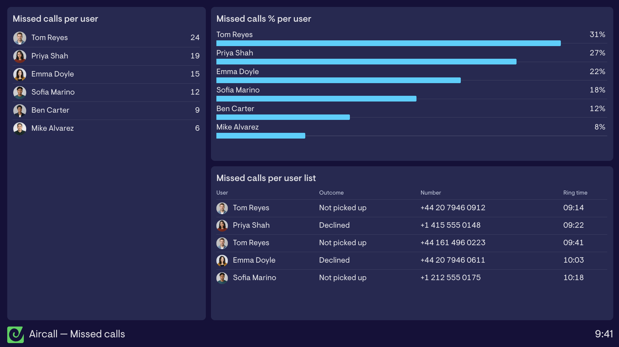
The new Missed calls per user and Missed calls % per user metrics show who's missing calls and each agent's miss rate. The Missed calls per user list gives you more detail on each missed call, allowing you to see who declined and who simply didn't pick up.
Available now for Aircall.
Zendesk custom queue metrics
If you use omnichannel routing in Zendesk you can now build widgets displaying data from your custom queues. See at a glance how many tickets are waiting per queue, the longest wait time, whether exits are outpacing entrances, and more.
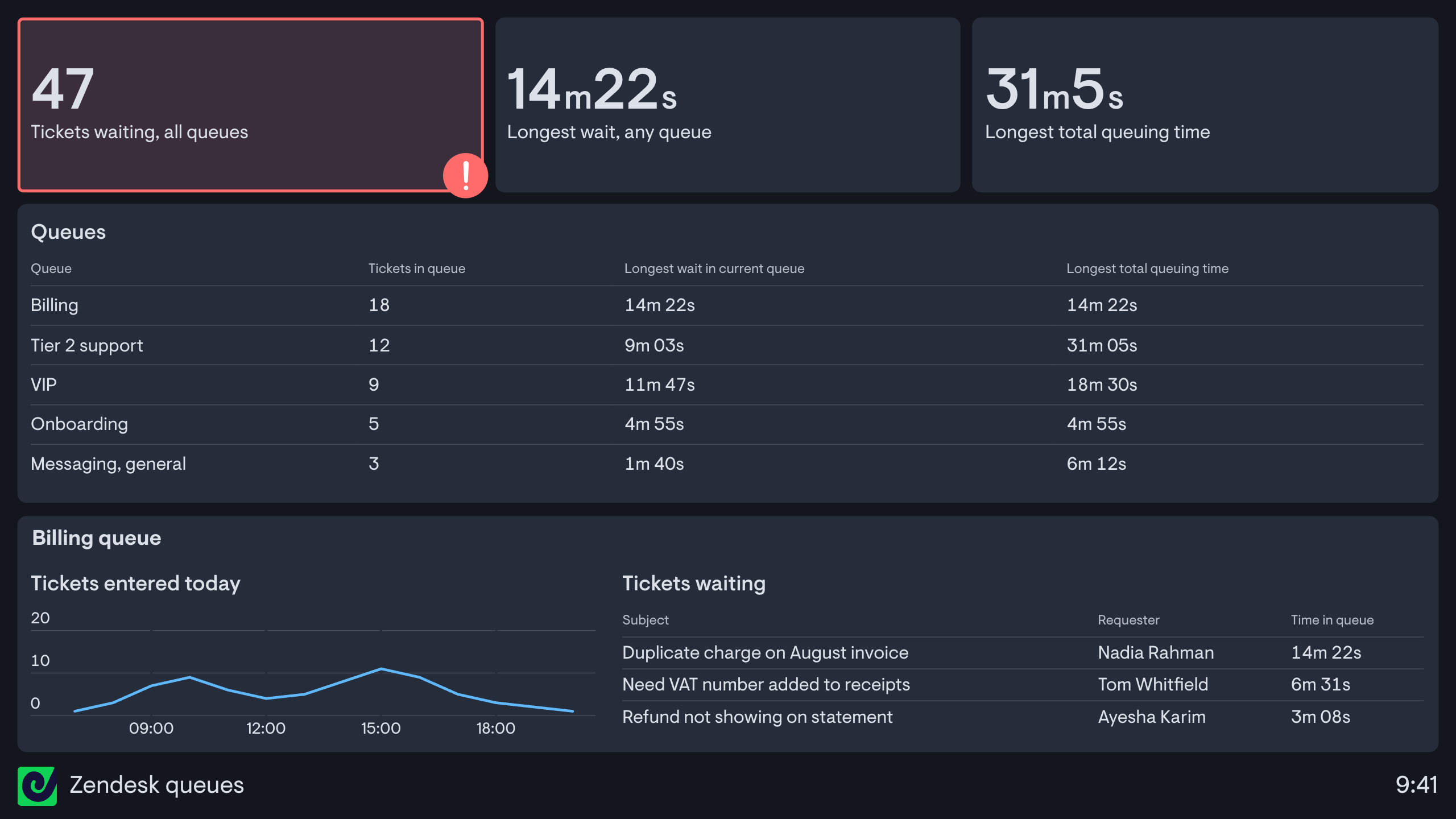
The new metrics are:
- Tickets in queue
- Longest / average time in current queue
- Longest / average total queuing time, which shows how long a ticket has spent in all queues across its whole lifetime, and isn't available in Zendesk's own reporting
- Tickets entered / exited queue
- Wait time, which enables tracking the trend over time in the average or longest wait time
Each can be filtered or broken down by queue, channel, primary or secondary group, or the reason work entered or left the queue.
Since these widgets live on a Geckoboard dashboard, not a locked-down report, they're fully customisable and instantly shareable, meaning you can put live queue data in front of the people who can actually make an impact on performance - the team.
And, as well as displaying on dashboards, these new queue metrics can be hooked up to Slack and MS Teams alerts to make the team aware of any sudden spikes that they need to get on top of.
Available today in the Zendesk integration.
Search your dashboards from the sidebar
Got a lot of dashboards? You can now search for them right from the sidebar, instead of scrolling through dashboards to find the one you want.
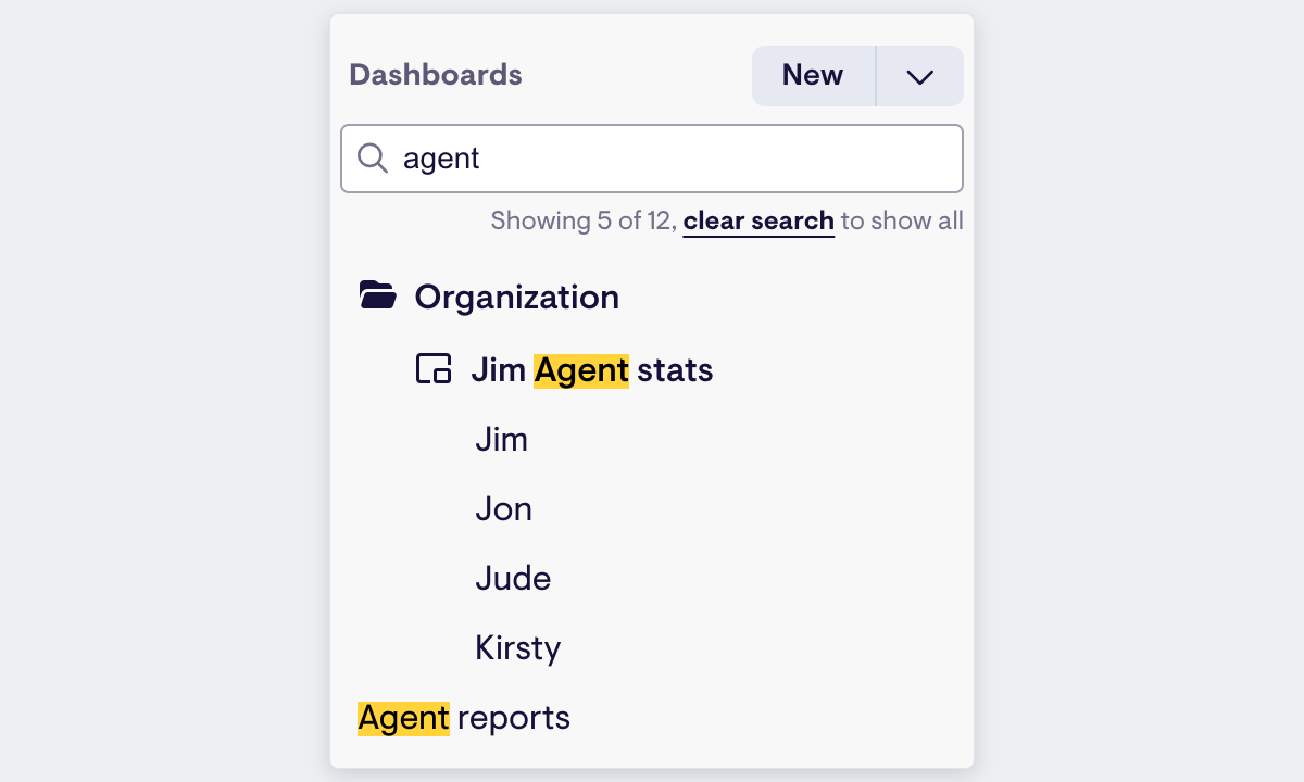
Start typing in the search bar and the list filters to matching dashboards, automatically opening any folder that contains a match and highlighting the matching text.
Delete a group of widgets in one go
We now support deleting a group of widgets at once, so there’s no longer any need to delete them one by one within a group.
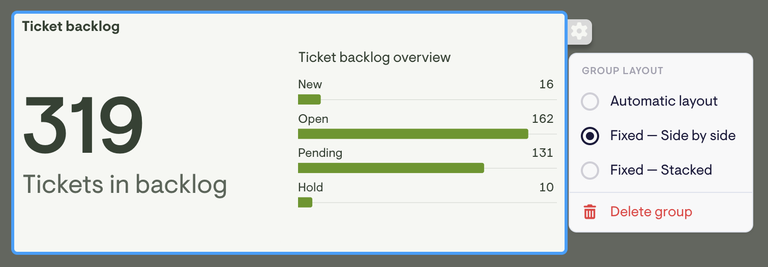
Hover over a group and click the gear icon to open its settings menu, then choose Delete group to clear the whole group in a single action.
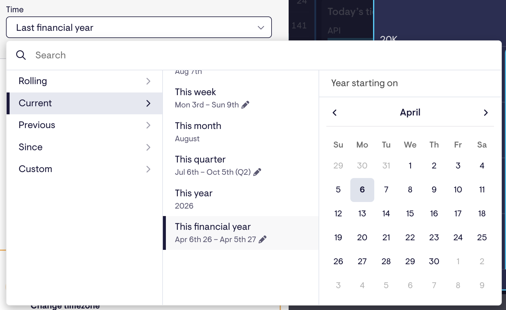
Set your own financial year start
If your financial year doesn’t start January 1st, “This year” and “This quarter” never quite matched how your business actually reports.
You can now pick whichever date matches how your team actually works, and Geckoboard will remember your choice. This financial year, Last financial year, and every quarter option shift to match it, consistently across charts, date filters, and the underlying data.