Excel dashboard examples
An Excel dashboard (or Excel dashboard template) makes your most important spreadsheet data visible to the whole team — on a screen, updating automatically, without anyone needing to download or open a file. It's the difference between metrics that get checked and metrics that get missed.
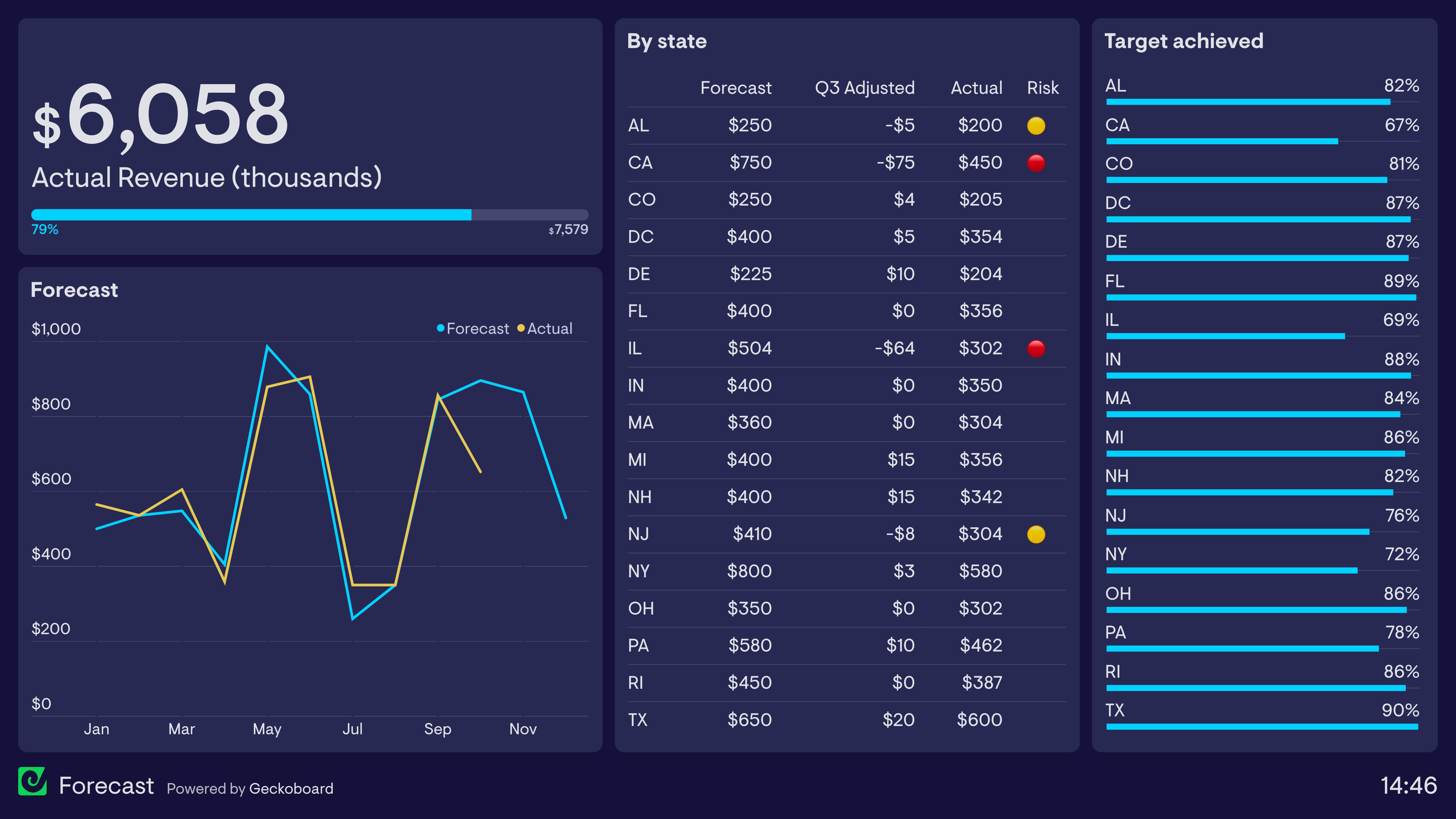
Company KPI dashboard
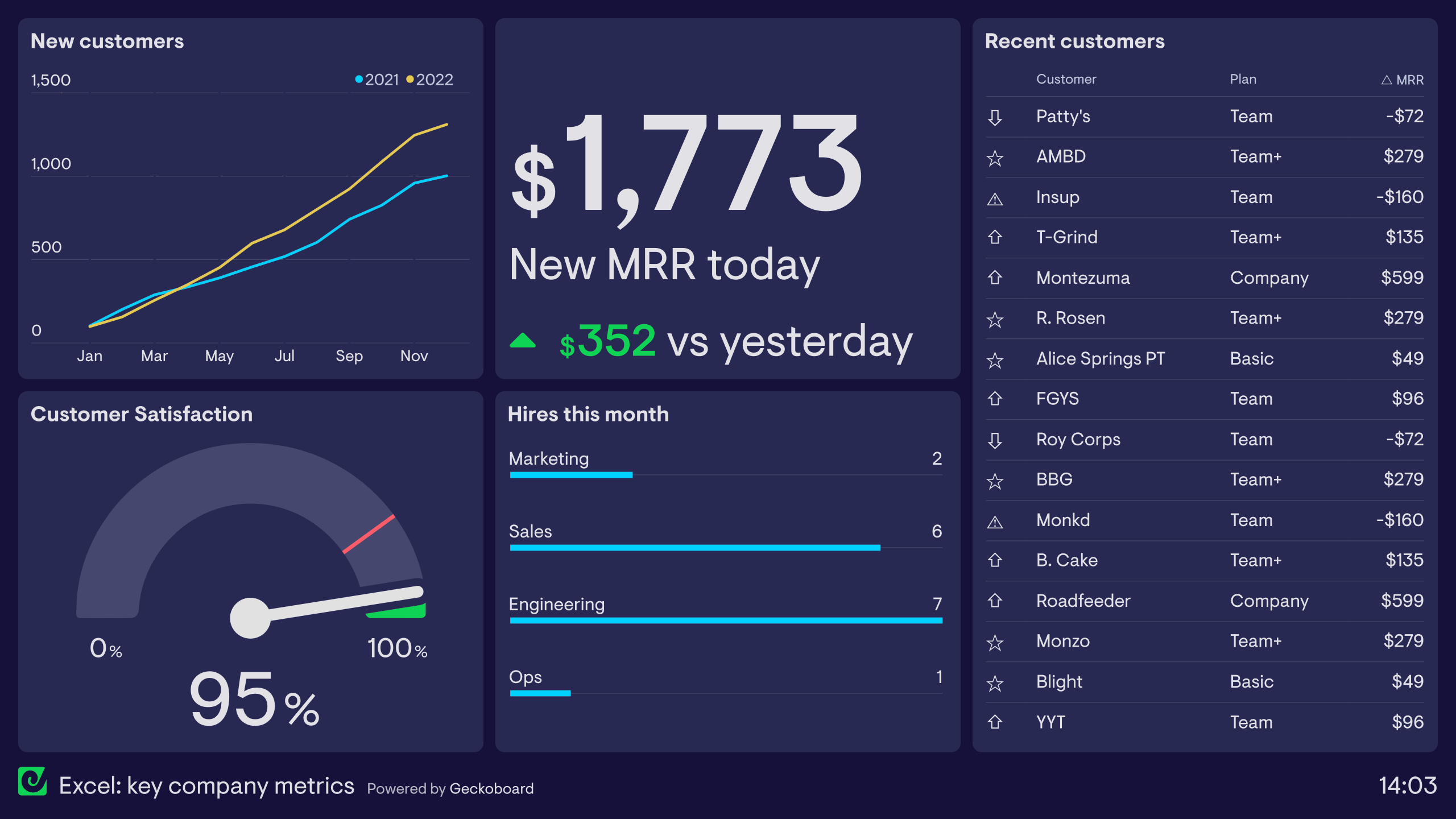
This dashboard visualizes high-level company KPIs from a small SaaS company. All the raw data on this dashboard comes from a single Excel file uploaded to Dropbox. Any saved changes to the Excel file are synced with the dashboard automatically, and this ensures that only up-to-date information is displayed to the team.
As a result, everyone in the company has a real-time view of company performance. They have a clear view of the company’s progress towards its goals (in the form of new customers and new Monthly Recurring Revenue – MRR). They also can keep track of important health metrics like Customer Satisfaction (CSAT). And if any of these metrics suddenly change, the team will be aware, meaning they can investigate and take action.
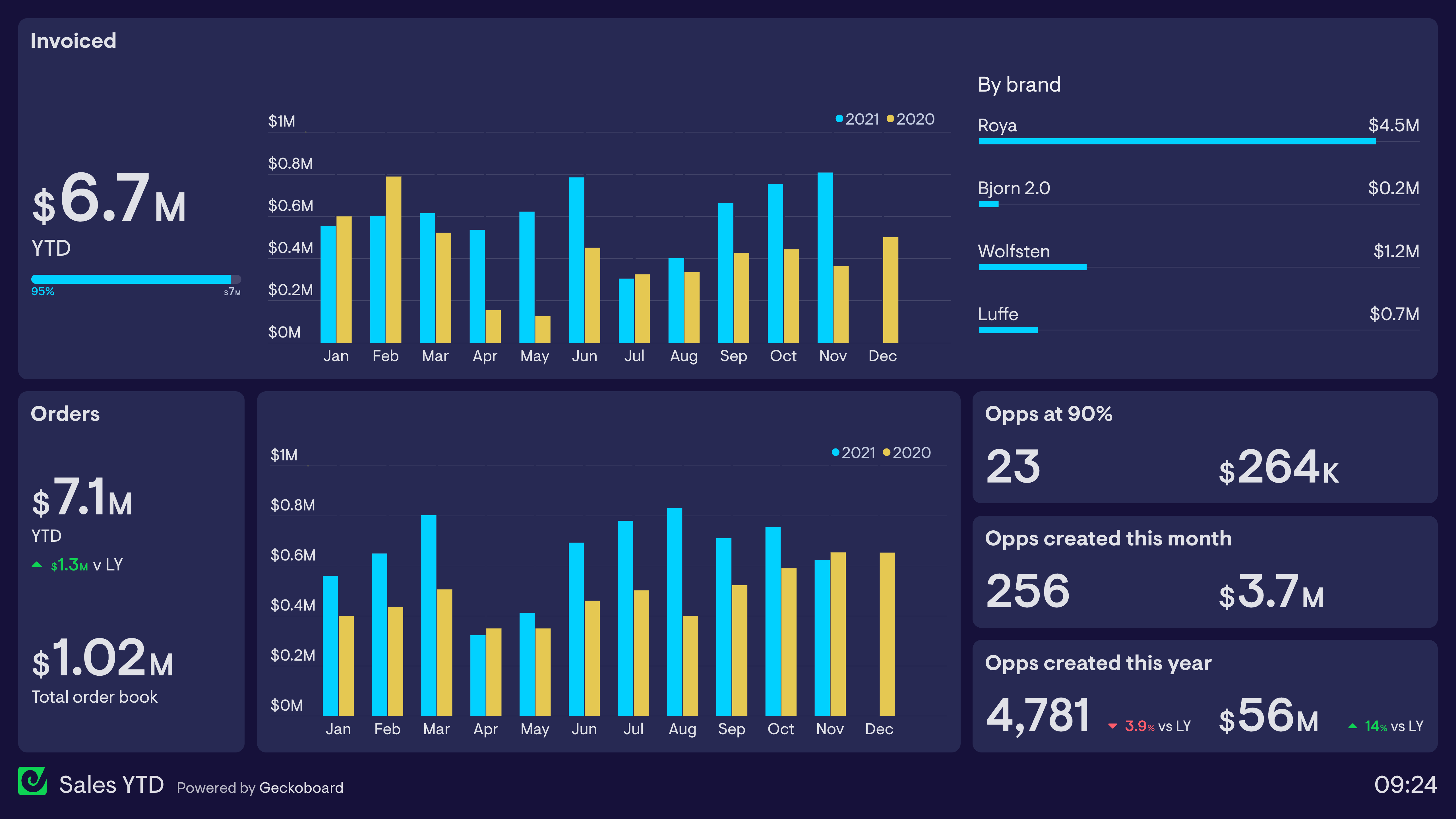
Sales dashboard
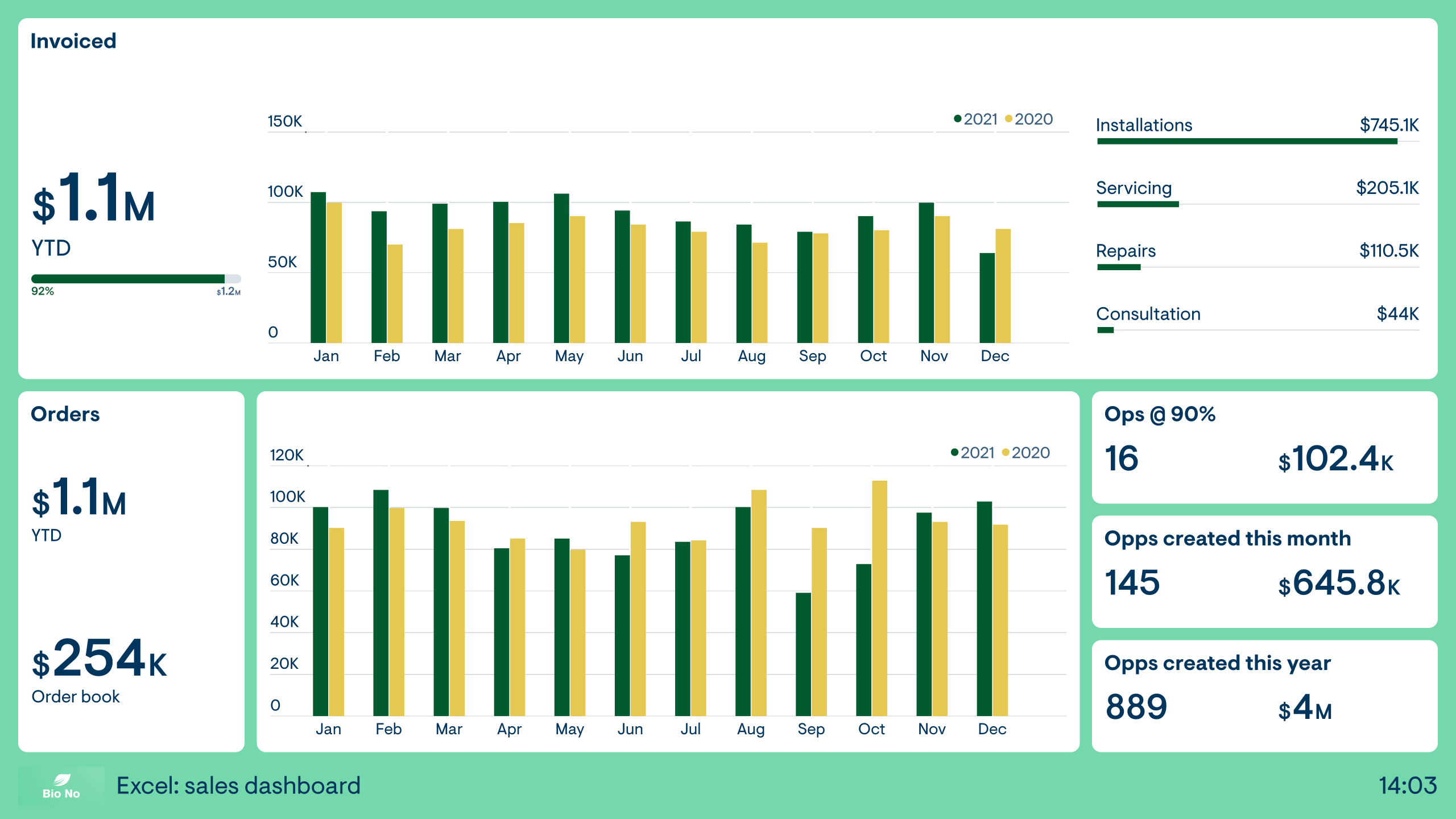
This dashboard focuses on sales KPIs across the financial year. The Sales team is responsible for generating new orders, as well as seeing that invoices are paid when the work is completed. As a consequence, the team needs to stay aware of metrics related to both order and invoices.
The dashboard also shows metrics related to sales activity higher up the funnel, in the form of new opportunities and opportunities at 90% (i.e. those which are expected to convert very soon.)
Like all the examples on this page, the data in this dashboard is generated in real-time from a single data source – an Excel file. It brings the data together in one place, so the Sales team can become more aware of big-picture, company trends.
Finance dashboard
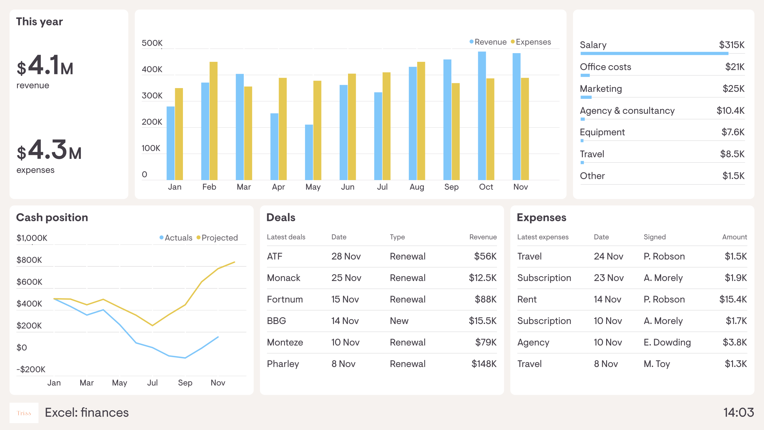
This dashboard visualizes company finances, so everyone in the business can stay up to date on the financial health of the organization. It tracks revenue, expenditure and the overall cash position of the company. As we can see, it has been a tough year, with revenue not matching initial projections.
The benefit of visualizing financial KPIs like this is that everyone has a clear understanding of the company’s financial projections. This means the Finance Director or CEO can spend less time explaining the basics of financial performance, and more time explaining goals, priorities and overall company direction.
An Excel dashboard connects your spreadsheet data to a live, shareable display — so the numbers in your spreadsheets become a real-time view rather than a static file someone has to open and interpret. Teams use it when their data lives in Excel or Google Sheets and they want to share it without manually updating a report.
Geckoboard is a dashboard tool that connects directly to spreadsheets — Excel and Google Sheets — and turns your most important data into a live, shareable view. Connect your sheet, choose your metrics, and the dashboard updates as the data changes — no design work or coding needed.
Any metric you track in a spreadsheet can be displayed — from KPIs and financial targets to sales pipeline and headcount. Common use cases include company-wide KPI tracking, sales performance, and financial summaries.
Building a custom Excel dashboard is straightforward with Geckoboard's dashboard builder. Connect spreadsheets or Google Sheets to pull data from your existing files directly into a dashboard, then pick your metrics and build the view you need. Share with your team as a TV dashboard, shared link, or scheduled snapshot. Start a free trial or learn more about how Geckoboard works.
Use it to automate reporting by turning a spreadsheet that someone updates manually into a self-refreshing dashboard. It also helps deliver executive visibility — giving leadership a live view of key numbers without needing to ask for the latest version of a file.