Customer Support Dashboard Examples
Call center dashboards
A call center dashboard (or contact center dashboard) visualizes live metrics such as number of calls, wait time, and customer satisfaction.
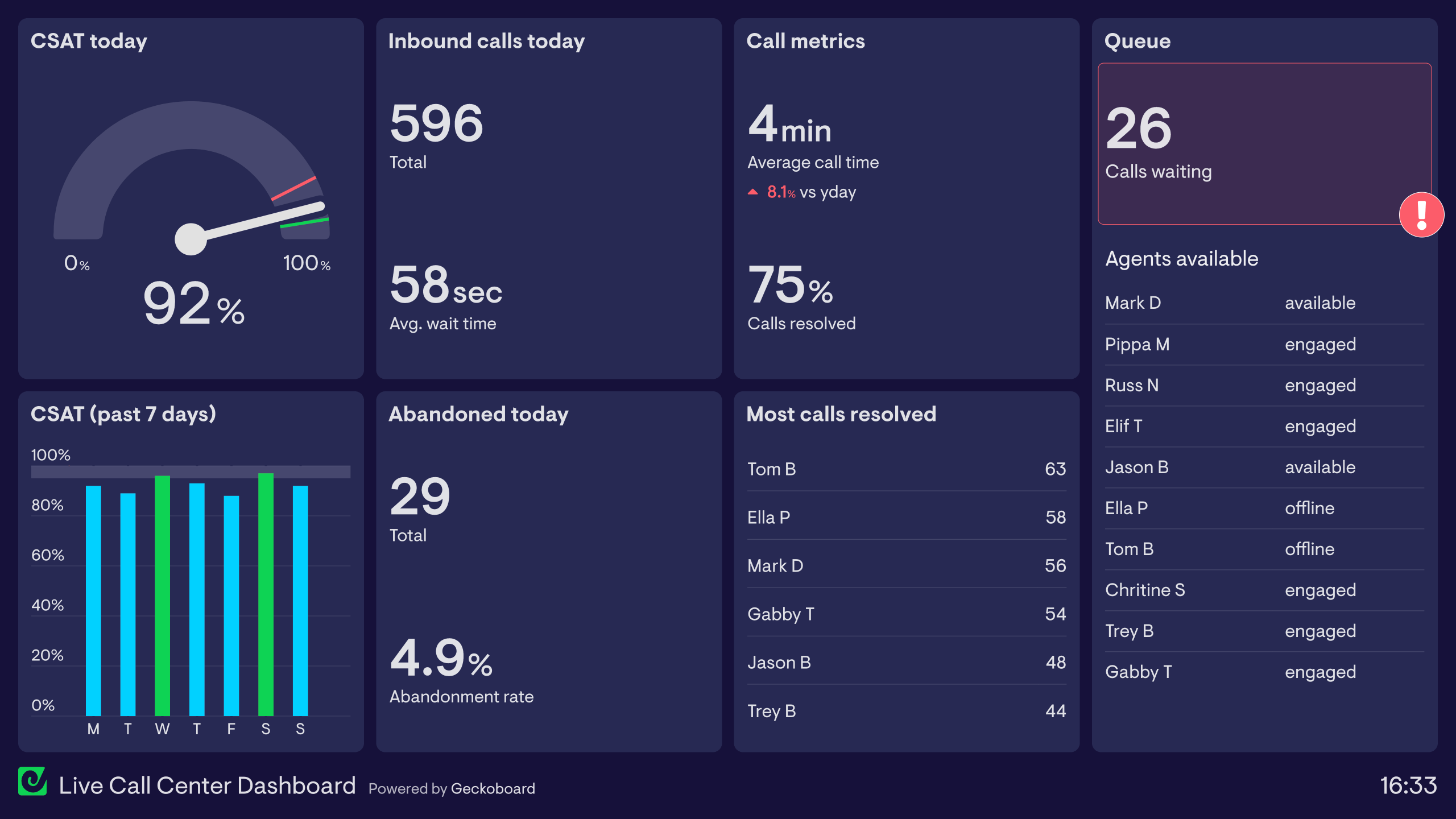
Want to see two more examples of call center dashboards?
Read moreHelpdesk dashboards
Enables helpdesk teams to monitor key metrics and make sure they’re hitting KPI targets.
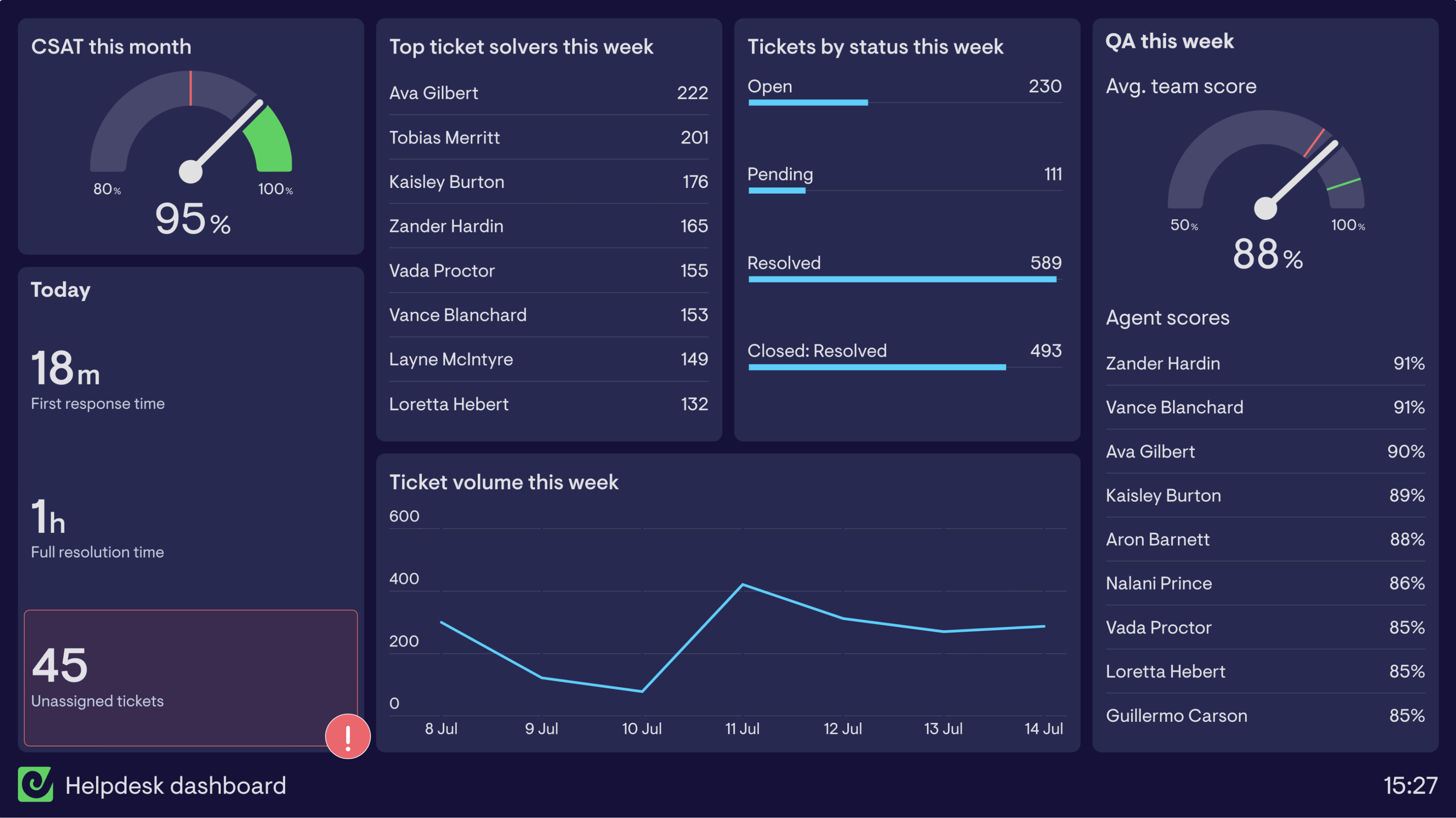
Want to see four more examples of helpdesk dashboards?
Read moreCustomer Experience dashboards
A Customer Experience (CX) dashboard highlights customer interaction metrics important to ensuring a positive experience.
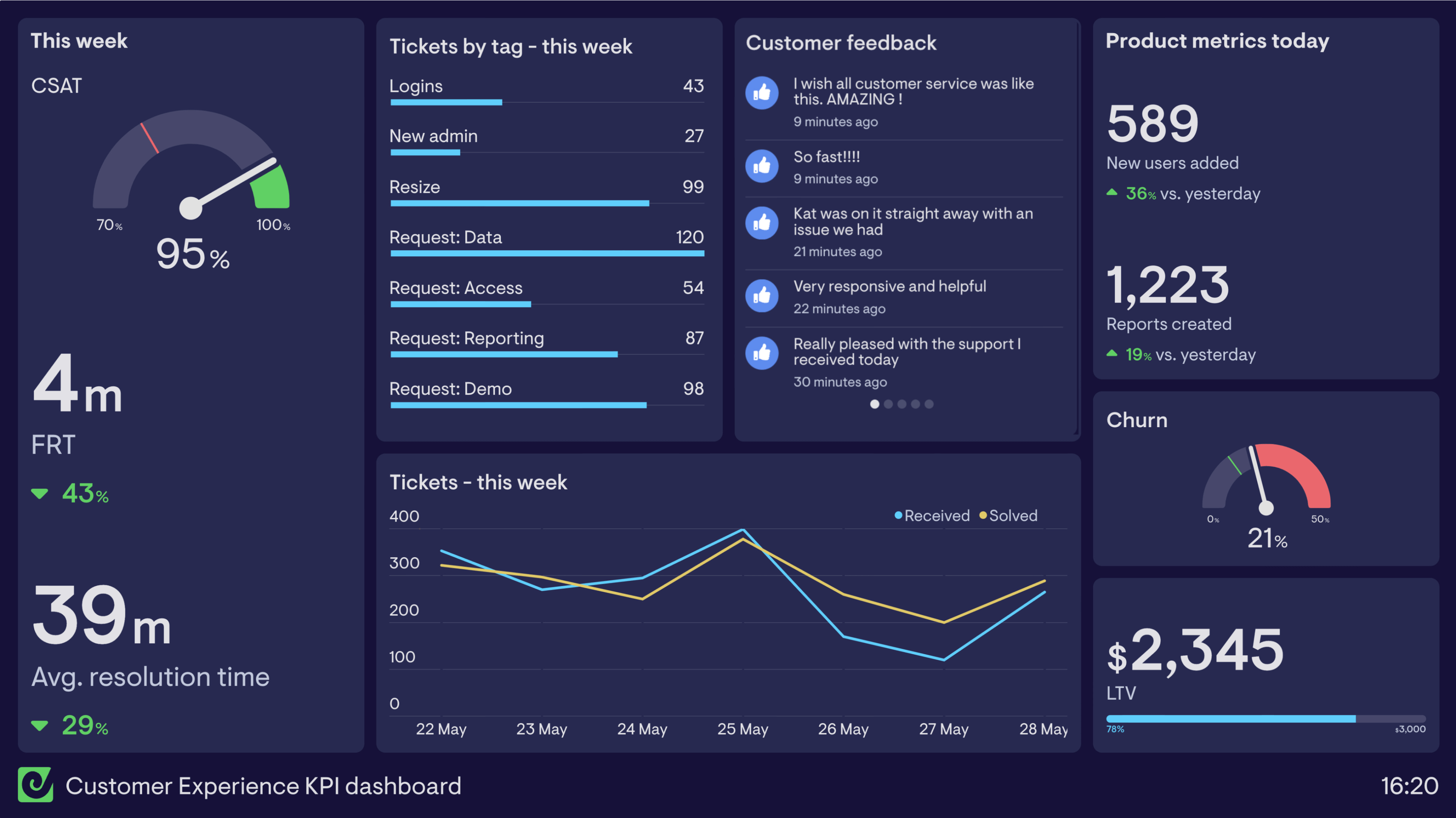
Want to see another Customer Experience dashboard?
Read moreCustomer service dashboards
A customer service dashboard visualizes a support team’s performance in real-time, so they can react to important changes and make progress toward their goals.
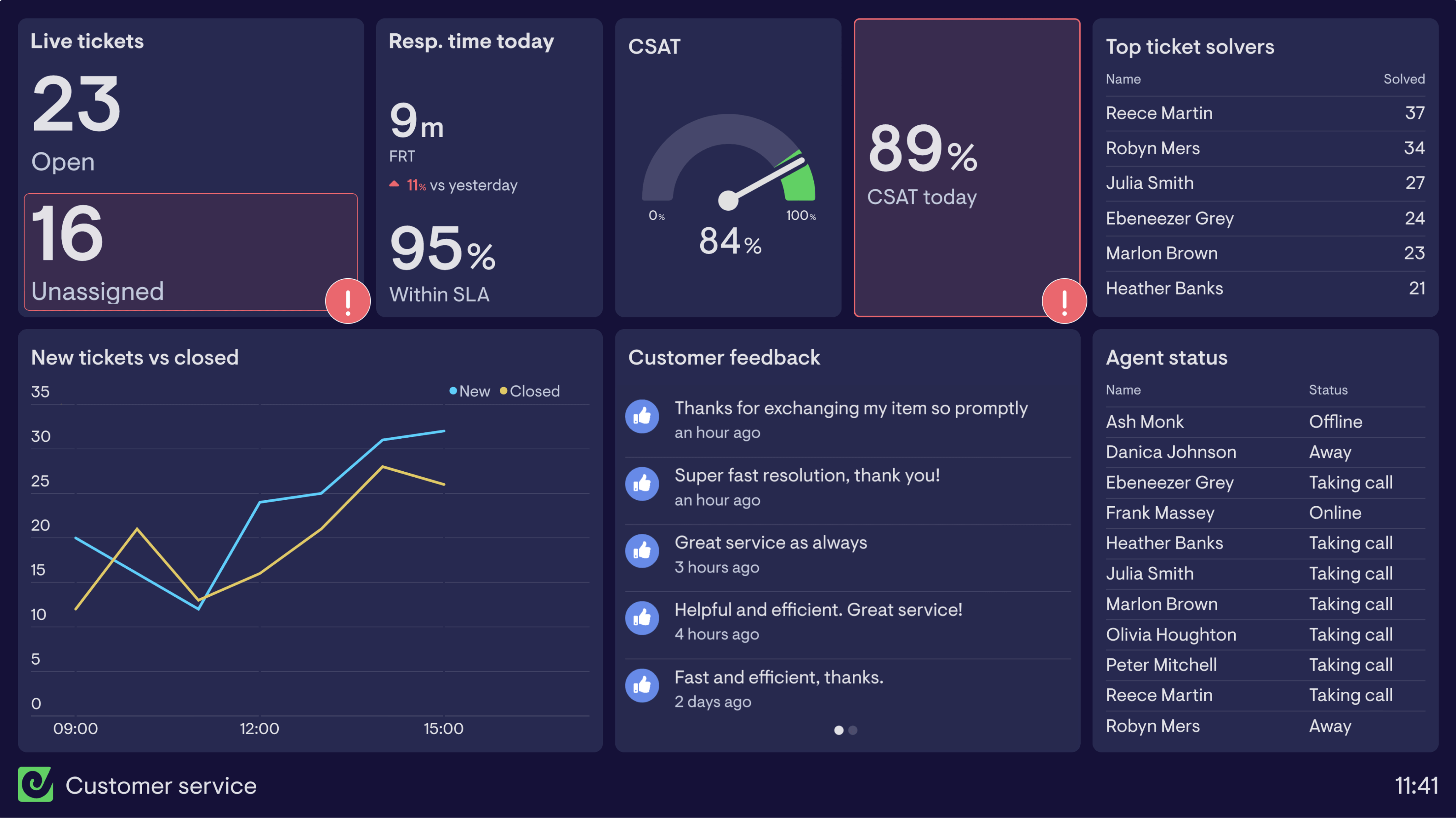
Want to see two more examples of customer service dashboards?
Read moreCSAT dashboard
A CSAT dashboard breaks down one of the most important Customer Support KPIs, Customer Satisfaction (CSAT), helping teams better understand how and why it’s changing.
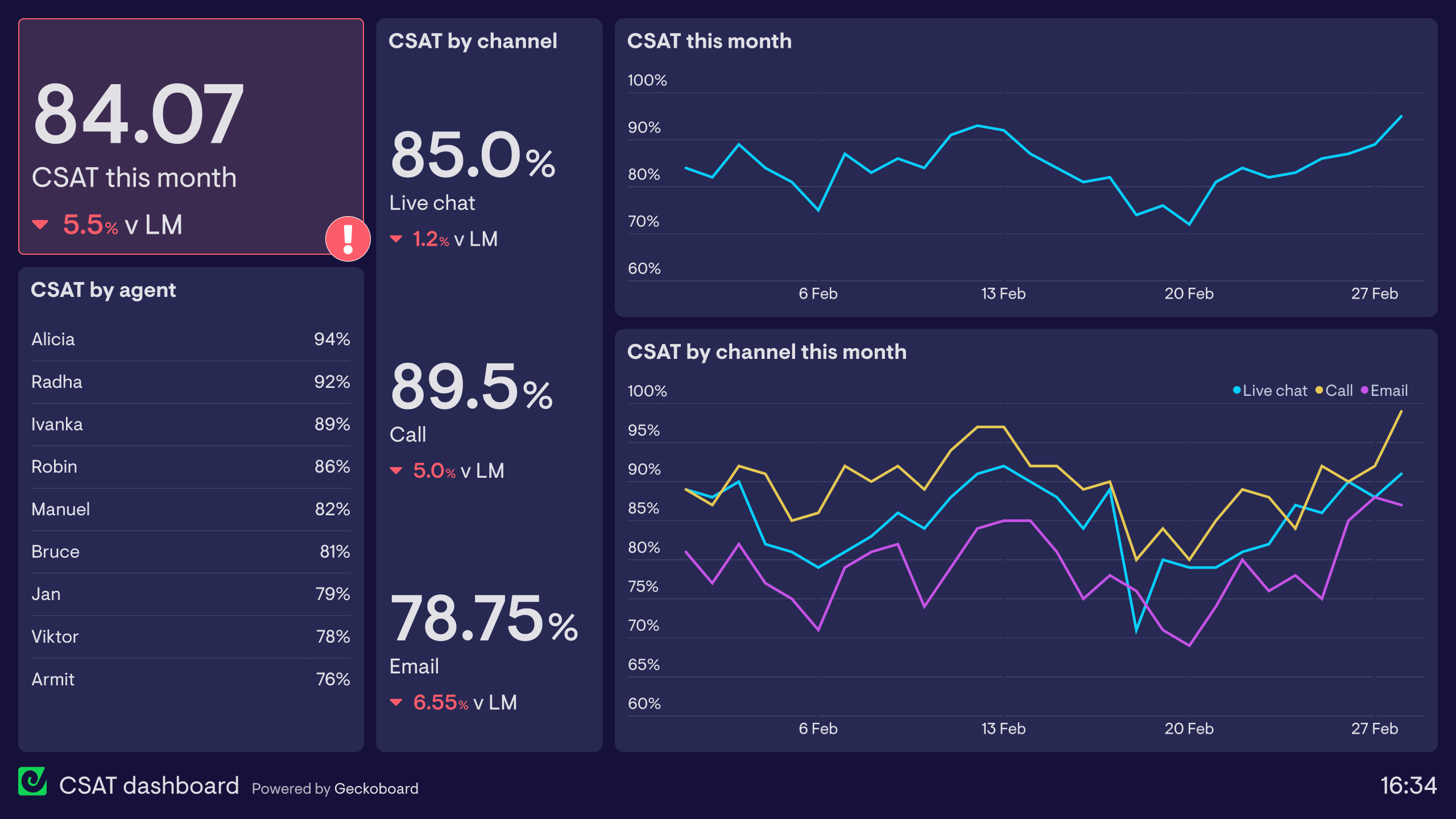
Learn more about this dashboard and how it’s used.
Read moreSLA dashboards
A Service Level Agreement dashboard (SLA dashboard) helps customer service teams understand if the level of support they are providing meets set standards.
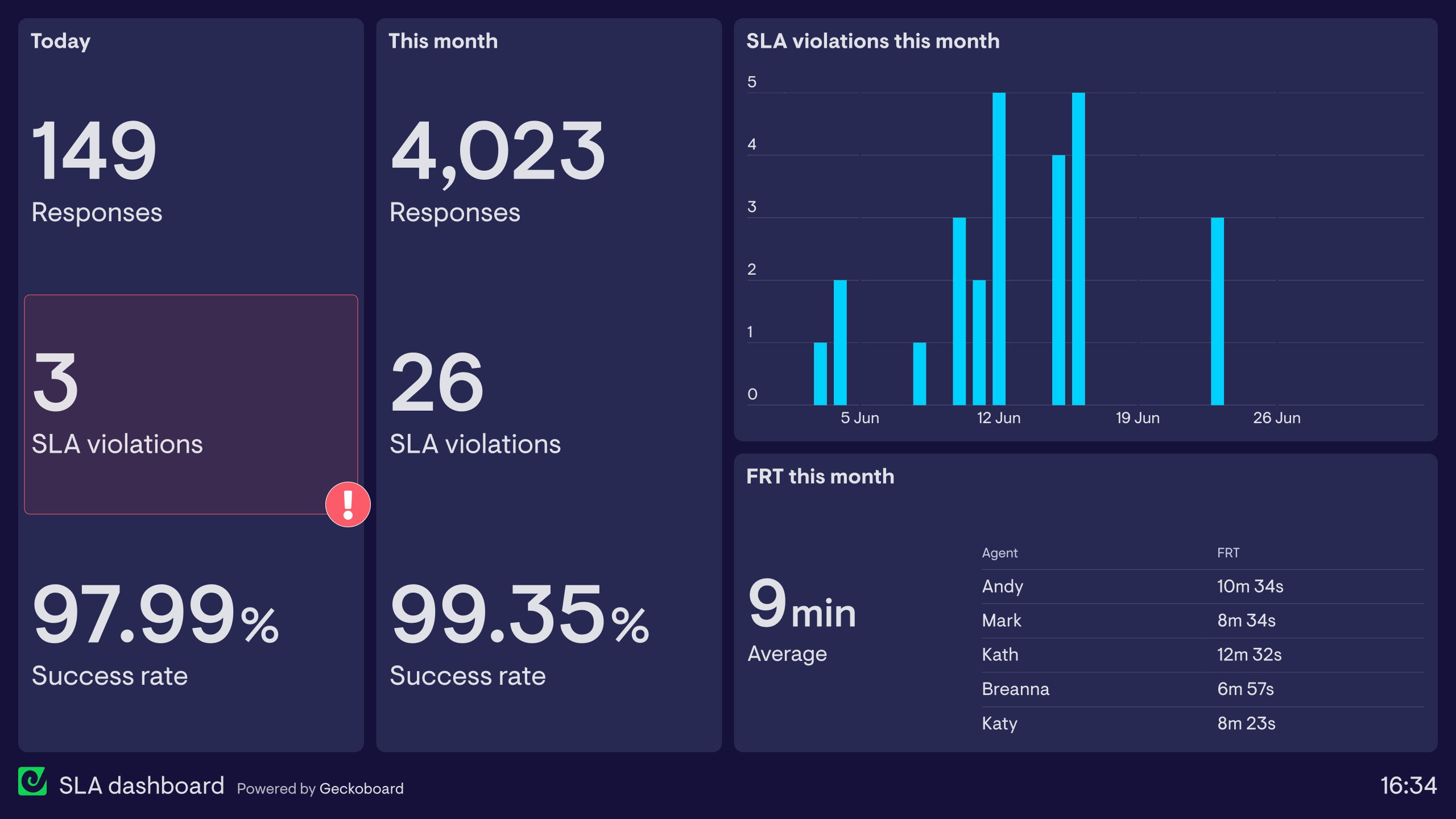
Want to see two examples of SLA dashboards?
Read moreSupport agent dashboards
A support agent dashboard visualizes the performance of individual CS agents in order to foster a spirit of friendly competition.
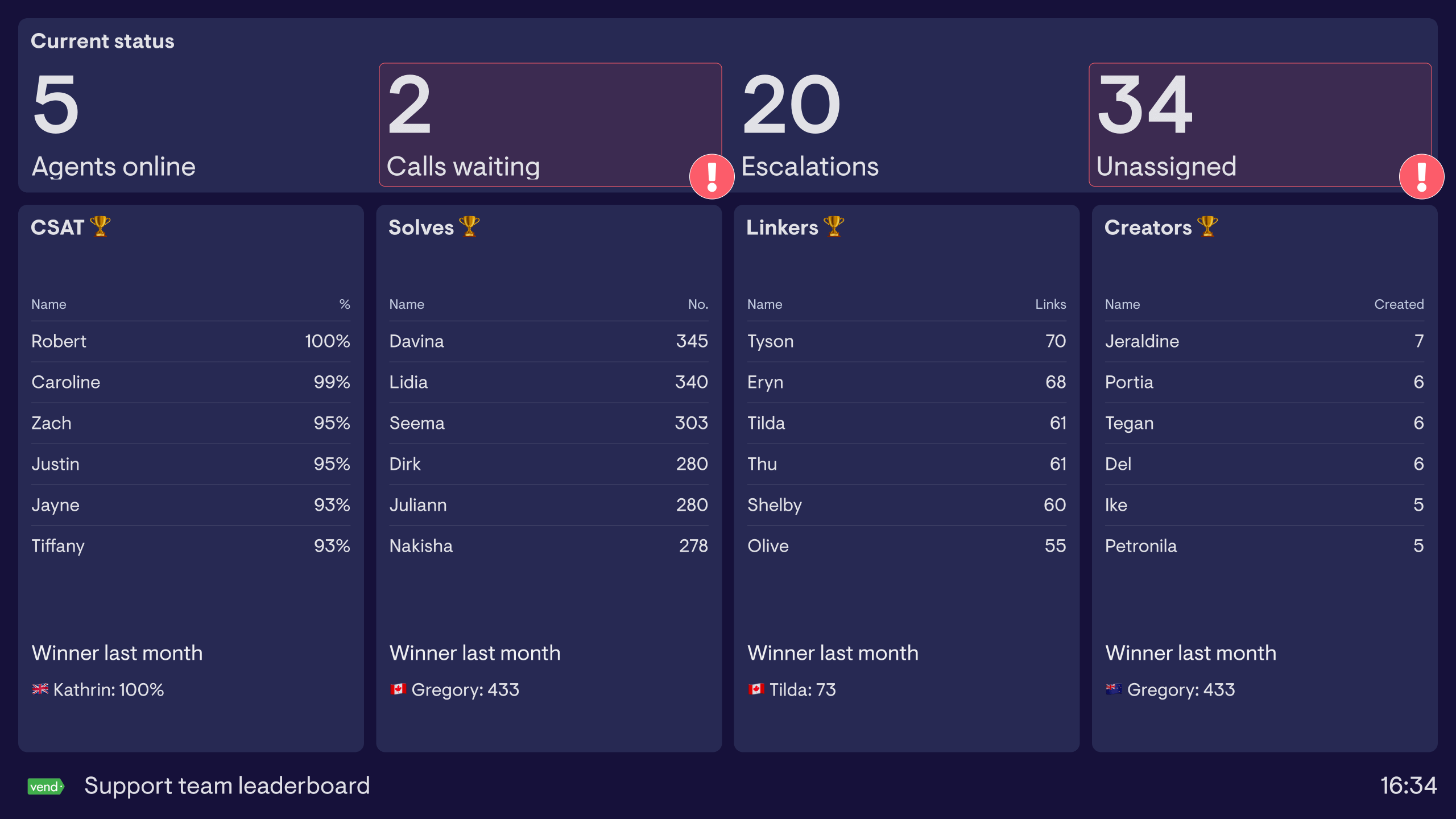
Want to see two more examples of support agent dashboards?
Read moreZendesk dashboards
A Zendesk dashboard surfaces real-time KPIs and ticket information from Zendesk, allowing managers and agents to monitor the queue throughout the day, be more responsive, and deliver stellar support
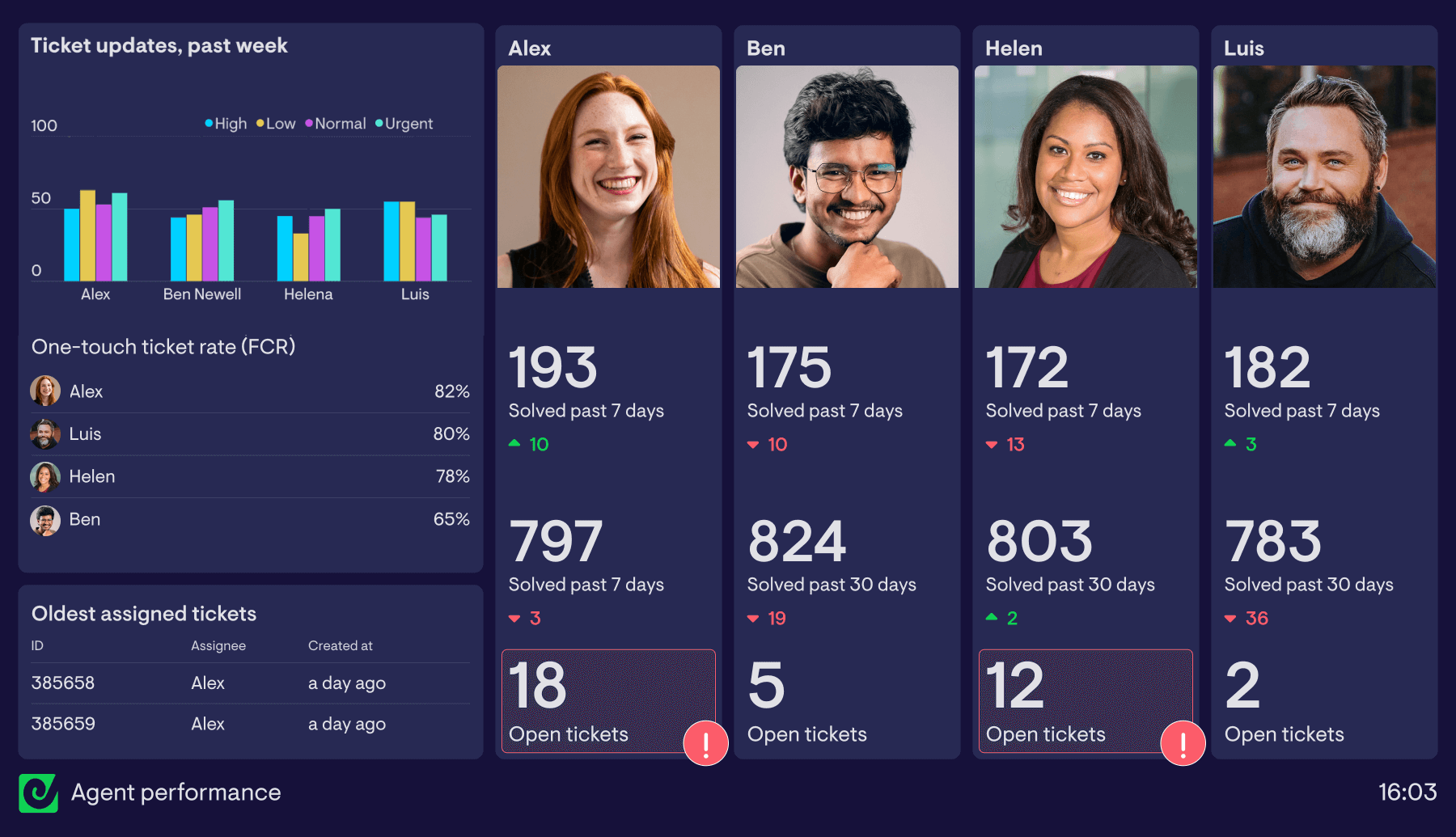
See more easy-to-build Zendesk dashboards
Read moreJira dashboards
Custom Jira dashboards surface real-time KPIs and ticket information from Jira and other sources, allowing teams to monitor workload more effectively.
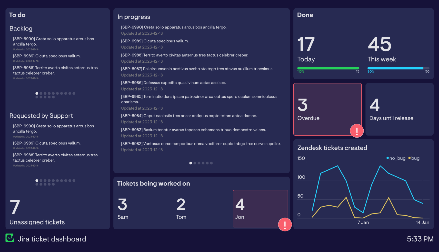
See more easy-to-build Jira dashboards
Read moreIntercom dashboards
Using data from Intercom to create agent leaderboards for motivating Customer Support teams.
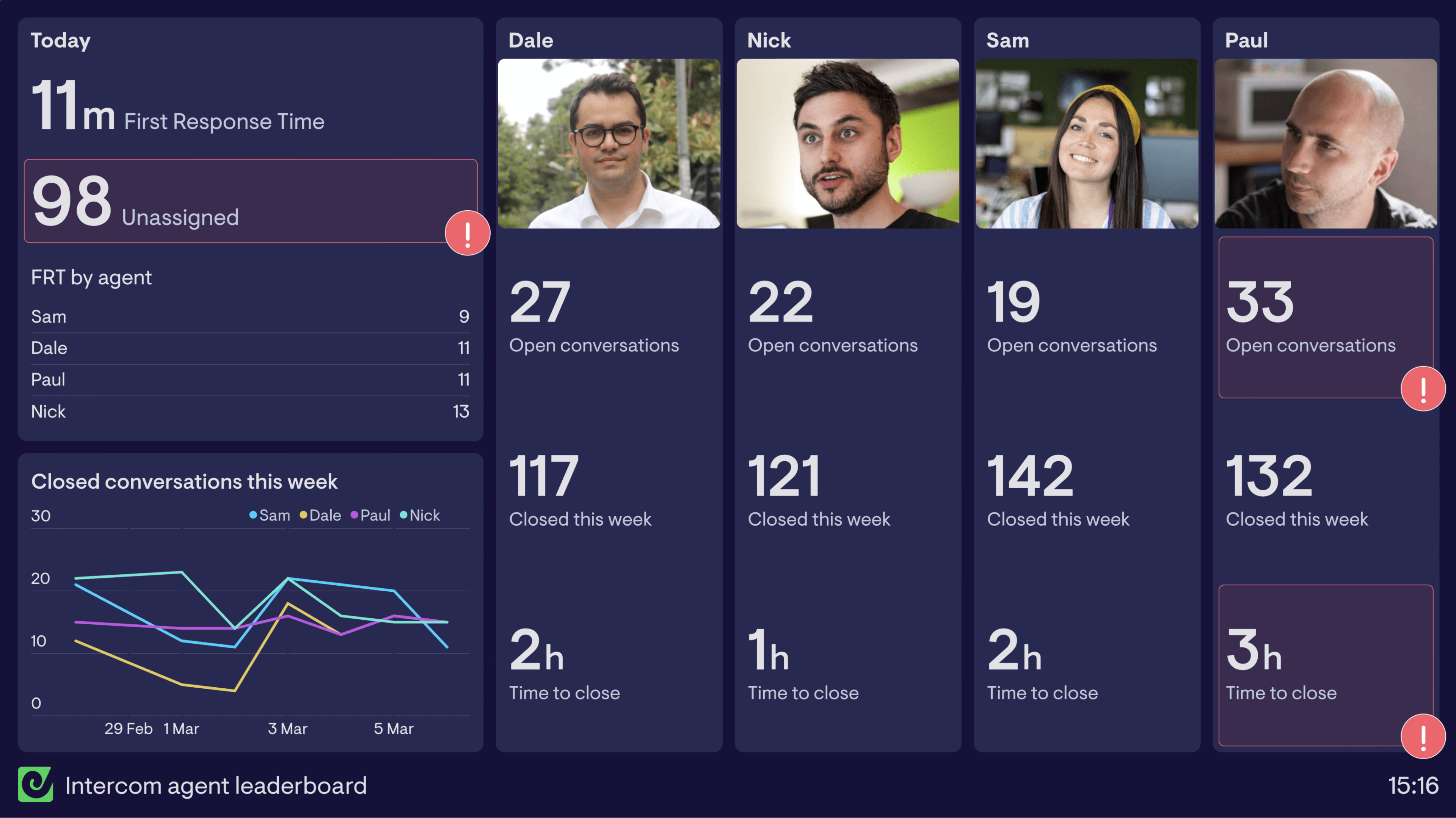
Learn more about this dashboard and how it’s used.
Read moreAircall dashboards
Sharing metrics from Aircall to help monitor calls and motivate teams to perform.
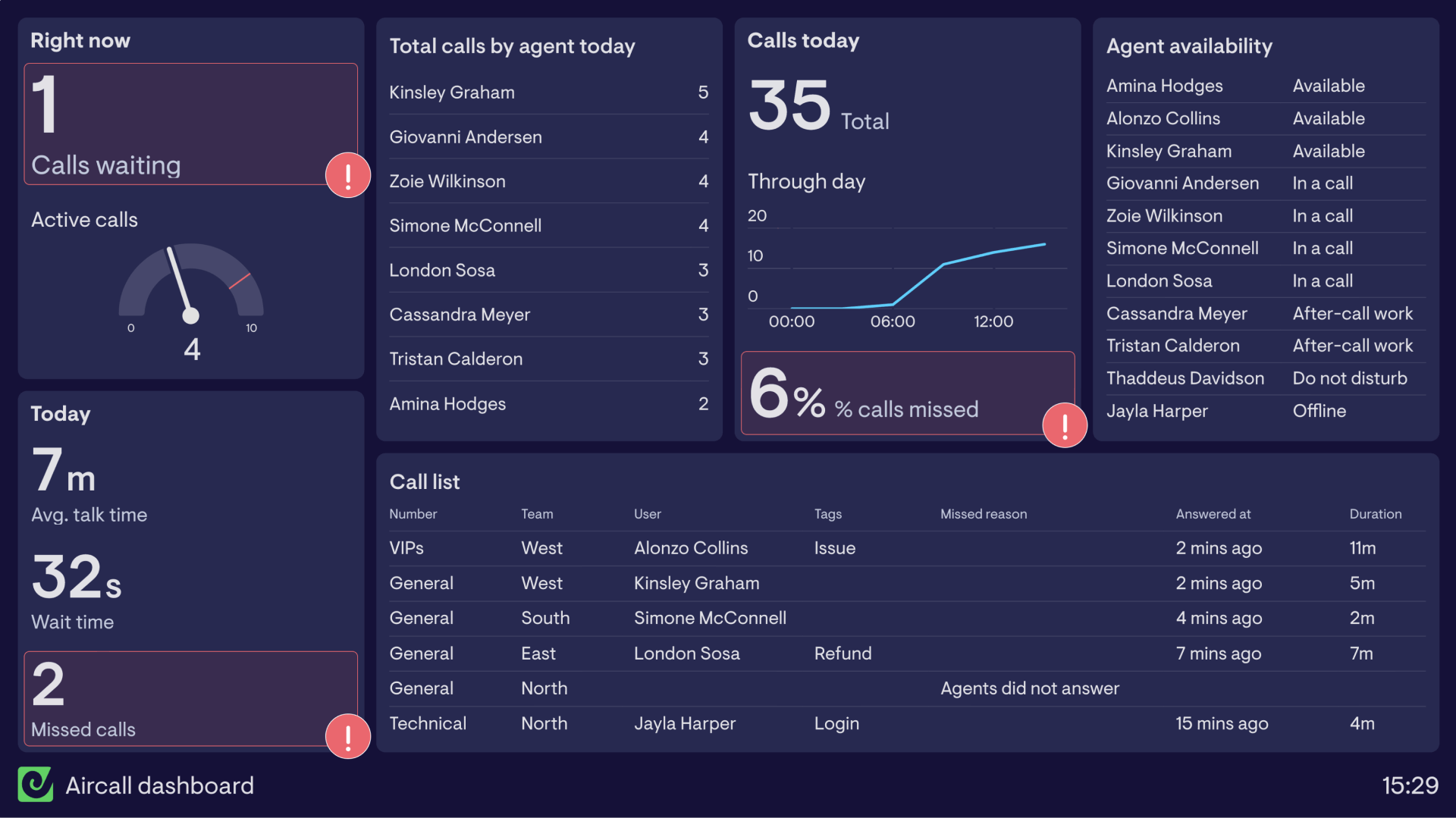
Want to see two more examples of Aircall dashboards?
Read more